Table of Contents

Ever since I learned how to program and make things move on the screen, I've tried to star blue circles in the role of "the elements" in many of my experiments. I've never tried to hide my fondness or admiration of them, and (as much as the jealous smiley blocks may try) today is going to be no different. Through the eyes of the blue circles, you will learn how many elements can be brought to life.
In this deconstruction, you are going to learn how the following effect works:
While this effect is pretty cool and you will learn all about it, the real lesson isn't in learning what it will take to re-create this example. It is much more than that.
By the end of this article, you will have learned how to use CSS transitions, the transitionEnd event, a few spoonfuls of JavaScript, and a giant bowlful of tribal knowledge to make this work. Pretty much everything you knew about transitions (or thought you knew about them) will come into play in some form or fashion here, so roll up your sleeves and let's get started.
Onwards!
This deconstruction isn't exactly for beginners. There is an assumption that you know enough about CSS transitions to think outside the box with them. If you need a refresher or want to learn about them for the first time, check out the following tutorials: All About CSS Transitions, The TransitionEnd Event, Looping a Transition, Vendor Prefixes in JavaScript, and Animating Movement Smoothly Using CSS.
Before getting ready to look at the first lines of HTML, CSS, and JavaScript, let's first talk about and understand at a high level how something like making our circles randomly move around would work.
To simplify things, let's start by looking at just a single circle:
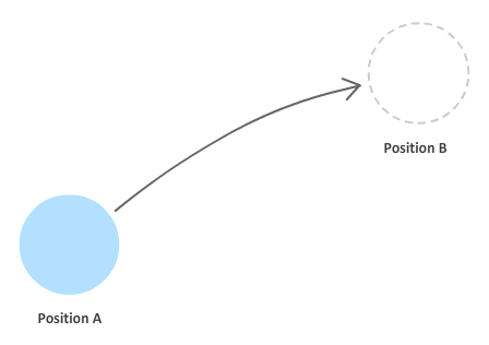
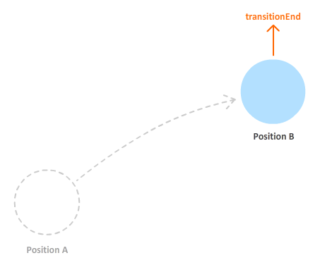
Let's say that our circle starts off at Position A. Its goal is to get to Position B:
The our circle can achieve this goal is pretty simple. This change in position can be accomplished by setting any one of the handful of properties that deal with an element's position on the screen. Because we want this position change to be animated, the property will set is the transform property's translate3d function. If you are curious as to why this property is used, read this article that I referenced in the "Some Pre-Requisite Reading" note earlier.
To have the change actually animate and not be sudden, we will be using a CSS transition. In order to have the transition work, we need to specify the CSS property it is going to be listening to. Transitions are kind of needy like that. Because we are changing position using a transform, the property we will specify is the transform property. At any time the transform property is modified, our transition will kick into high gear. That's good.
Let's get back to our circle. At this point, our transition starts running for a specified duration until it hits Position B:
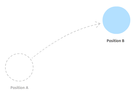
Traditionally, once a transition has run to completion, it is done. It just stays there unless the property that the transition is listening for changes. Since we are anything but traditional here, what we want to do is now have our transition move over to a new position - a position we will affectionately call Position C:
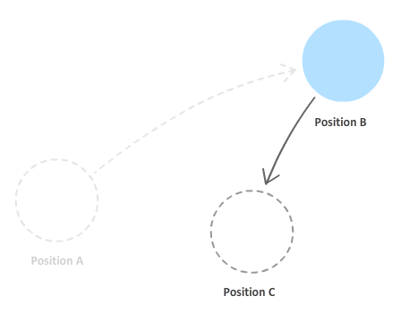
The way the circle got to Position C is the same way it got to Position B from Position A. The transform property's translate3d function was used to specify the new position. Because the transform property was modified, the transition kicked in and animated the circle to its new position, Position C. By now, you should see a pattern start to emerge in how our blue circle operates. The circle's journey will never end. Just when you think the circle is going to take a break, a new position will be picked and the circle will animate over to that location.
Ok, great. At this point, you should have a high-level understanding of what our circle does. Let's dig in a little deeper by covering some gaps that our current explanation left in its wake.
The first gap is the easiest to cover, and that is around how the position is chosen. The position is picked randomly by JavaScript. As you will see shortly, the transition doesn't care whether the position was specified in a CSS style rule or by using JavaScript. As long as the transform property was changed somehow, the transition will kick in and animate the change.
The next gap is the looping behavior. When our circle hits its destination, it doesn't stop. A new position is chosen and it starts animating towards it. To make this work, we rely on the transitionEnd event that gets fired when the transition ends:
When this event is overheard, we have some code that simply sets the position of the circle to a new, randomly generated point. This gets our transition running again. By using the transitionEnd event as a marker for when to start our transition again, we are able to create a never ending transition that effortlessly glides our circle from one random position to another.
The last gap is probably the most important one...yet also the least eventful. So far, we've looked at how our approach for making everything work applies to a single circle. If you were to apply the things we've seen so far to many circles, what would need to be changed? Nothing. Absolutely nothing. That's right - whether you are animating one circle or many circles, how we implement this effect does not change. The reason is that each circle contains within it all of the data in the form of properties it needs to function:
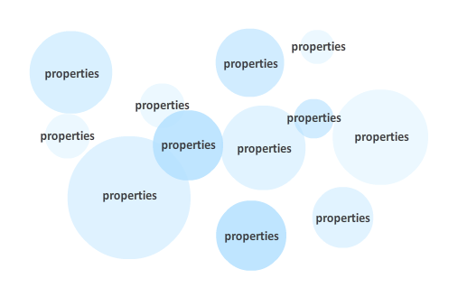
Each circle knows where to go next, how long it should take to get there, what it should look like, and so on. As you will see soon, even our JavaScript has no difficulty keeping track of each circle and ensuring it gets the kind of personalized, individual attention that it deserves. See, told you it was uneventful!
By now, you probably have a good high-level understanding of the various pieces...including the gaps. There are some subtle details that I did not cover, but covering those details and more makes the most sense to just look at our actual example. Let's start our deconstruction where we painstakingly poke and prod at every little piece of markup and code.
The full source code for our moving circles example looks as follows:
<!DOCTYPE html>
<html>

<head>
<meta content="en-us" http-equiv="Content-Language">
<meta charset="utf-8">
<meta content="stuff, to, help, search, engines, not" name="keywords">
<meta content="What this page is about." name="description">
<meta content="An Interesting Title Goes Here" name="title">
<title>An Interesting Title Goes Here</title>
<style>
body {
	background-color: #FFF;
	margin: 30px;
	margin-top: 10px;
}
#box {
	width: 550px;
	height: 350px;
	border: 5px black solid;
	overflow: hidden;
	background-color: #F2F2F2;
}
#contentContainer {
	position: relative;
}
.thing {
	transition-property: transform;
	transition-timing-function: ease-in-out;
	position: absolute;
	width: 100px;
	height: 100px;
	border-radius: 50px;
	background-color: #0066CC;
	opacity: .5;
}

</style>
</head>

<body>
<div id="box">
	<div id="contentContainer">
		<div class="thing"></div>
		<div class="thing"></div>
		<div class="thing"></div>
		<div class="thing"></div>
		<div class="thing"></div>
		<div class="thing"></div>
		<div class="thing"></div>
		<div class="thing"></div>
		<div class="thing"></div>
		<div class="thing"></div>
		<div class="thing"></div>
		<div class="thing"></div>
		<div class="thing"></div>
	</div>
</div>

<script src="//www.kirupa.com/html5/examples/js/prefixfree.min.js"></script>
<script>
var theThings = document.querySelectorAll(".thing");

var transitionDurations = ["transitionDuration", "msTransitionDuration", "webkitTransitionDuration", "mozTransitionDuration", "oTransitionDuration"];
var transitionDurationProperty = getSupportedPropertyName(transitionDurations);

var transforms = ["transform", "msTransform", "webkitTransform", "mozTransform", "oTransform"];
var transformProperty = getSupportedPropertyName(transforms);

function setInitialPosition() {
	for (var i = 0; i < theThings.length; i++) {
		var theThing = theThings[i];

		var circleSize = Math.round(30 + Math.random() * 150);

		theThing.style.width = circleSize + "px";
		theThing.style.height = circleSize + "px";
		theThing.style.borderRadius = .5 * circleSize + "px";
		theThing.style.opacity = .1 + Math.random() * .5;

		setTranslate3DTransform(theThing);
	}
	setTimeout(kickOffTransition, 100);
}
setInitialPosition();


function kickOffTransition() {
	for (var i = 0; i < theThings.length; i++) {
		var theThing = theThings[i];

		theThing.addEventListener("transitionend", updatePosition, false);
		theThing.addEventListener("webkitTransitionEnd", updatePosition, false);
		theThing.addEventListener("mozTransitionEnd", updatePosition, false);
		theThing.addEventListener("msTransitionEnd", updatePosition, false);
		theThing.addEventListener("oTransitionEnd", updatePosition, false);

		setTranslate3DTransform(theThing);
		setTransitionDuration(theThing);
	}
}

function updatePosition(e) {
	var theThing = e.currentTarget;

	if (e.propertyName.indexOf("transform") != -1) {
		setTranslate3DTransform(theThing);
		setTransitionDuration(theThing);
	}
}

function getRandomXPosition() {
	return Math.round(-50 + Math.random() * 650);
}

function getRandomYPosition() {
	return Math.round(-50 + Math.random() * 400);
}

function getRandomDuration() {
	return (.5 + Math.random() * 3) + "s";
}

function getSupportedPropertyName(properties) {
    for (var i = 0; i < properties.length; i++) {
        if (typeof document.body.style[properties[i]] != "undefined") {
            return properties[i];
        }
    }
    return null;
}

function setTranslate3DTransform(element) {
	element.style[transformProperty] = "translate3d(" + getRandomXPosition() + "px" + ", " + getRandomYPosition() + "px" + ", 0)";
}

function setTransitionDuration(element) {
	if (transitionDurationProperty) {
		element.style[transitionDurationProperty] = getRandomDuration();
	}
}
</script>
</body>
</html>
If you copy and paste all of this code into a new document and preview in your browser, you will see the same example from this tutorial working in all of its glory. Let's go through each major section and understand how it all works the way it does.
The relevant HTML for this example is the one that corresponds to the circles themselves:
<div id="box">
	<div id="contentContainer">
		<div class="thing"></div>
		<div class="thing"></div>
		<div class="thing"></div>
		<div class="thing"></div>
		<div class="thing"></div>
		<div class="thing"></div>
		<div class="thing"></div>
		<div class="thing"></div>
		<div class="thing"></div>
		<div class="thing"></div>
		<div class="thing"></div>
		<div class="thing"></div>
		<div class="thing"></div>
	</div>
</div>
The circles are nothing more the collection of div elements that have a class value of thing. This class value is really the only important thing for you to keep in mind, for the rest is handled by the CSS and JavaScript.
Our transition will need to kick-in when the position of any of our circles changes. The best place for our transition to live, then, would be in a style rule that targets all of our circles. That style rule is the one with the .thing selector:
.thing {
	transition-property: transform;
	transition-timing-function: ease-in-out;
	position: absolute;
	width: 100px;
	height: 100px;
	border-radius: 50px;
	background-color: #0066CC;
	opacity: .5;
}
I've highlighted our transition-related properties, and you can see that we are using the longhand form for defining our transition. Our transition listens for changes on the transform property which, as we mentioned earlier, is needed for the translate3d function that we use for positioning the circles. The timing function is set be an ease-in-out function, and the duration is 0 by default since we are not declaring it.
Now, you may be wondering, why does our transition have a 0 second duration? The answer to this is a little tricky to explain right now, but rest assured that I will cover it shortly.
The CSS is pretty simple. What is less simple is our JavaScript - where a bulk of the heavy lifting is done. To help understand what is going on, I am going to plainly list what all of the code does first.
The JavaScript code...
These five steps are essentially a simplified version of the longer, verbal explanation you saw a few sections earlier. In the next couple of sections, let's see how these steps translate to the actual code that you see.
Inside the script tag, the first thing we do is a get a reference to all of the circle elements we have in our document and store them in the theThings variable:
var theThings = document.querySelectorAll(".thing");
This is easy because all of the circles have a class value of thing on them. Knowing that little detail, you can use the querySelectorAll function to quickly get at them from our DOM.
Up next is some code to deal with vendor prefixes:
var transitionDurations = ["transitionDuration", "msTransitionDuration", "webkitTransitionDuration", "mozTransitionDuration", "oTransitionDuration"];
var transitionDurationProperty = getSupportedPropertyName(transitionDurations);

var transforms = ["transform", "msTransform", "webkitTransform", "mozTransform", "oTransform"];
var transformProperty = getSupportedPropertyName(transforms);
Our example makes use of two properties that are still not fully supported by the major browsers. These two properties are transitionDuration and transform. For our CSS in markup, we have the -prefix-free library that takes care of them. For JavaScript, though, we need to handle it on our own. Key to all of this are the variables, transitionDurationProperty and transformProperty.
The goal is to have the transitionDurationProperty and transformProperty point to something meaningful that takes the browser you are using into account. For example, in a WebKit-based browser, your transformProperty's value would be webkitTransform. On IE9, your value would be msTransform. You get the picture on what I desire. I just want to use transitionDurationProperty and transformProperty. I don't want to have to check every time which property exists and should be used every time I want to use these two properties in my code.
The approach I use for solving this problem is based on what I wrote in my Vendor Prefixes in JavaScript tutorial. Just know that after these lines of code have executed, both transitionDurationProperty and transformProperty will point to something usable on a modern browser.
Finally, we are starting to get to the fun stuff. There are really three things at play here when it comes to setting the initial position of each circle and adjusting how they look, so let's look at all three of those things.
We are going to be going back to CSS for a short bit. Take a look at the .thing selector and, more importantly, the third style declaration in it:
.thing {
	transition-property: transform;
	transition-timing-function: ease-in-out;
	position: absolute;
	width: 100px;
	height: 100px;
	border-radius: 50px;
	background-color: #0066CC;
	opacity: .5;
}
Notice that our circles will have their position property set to absolute. The reason for this seemingly odd decision is not because I am planning on setting the left, top, right, or bottom properties to position each circle. The reason is that I want to move these circles out of the normal document flow so that they can all have their (0, 0) position be in the top left corner:
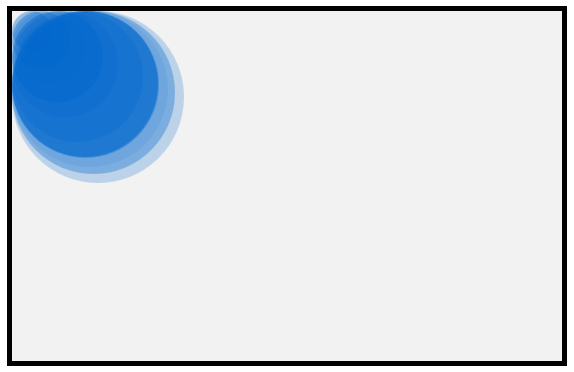
If I didn't set the position to absolute, the circles' starting position will be offset by whatever position they happen to appear in the markup:
You may think that this really doesn't matter since we will be randomly positioning our circles quickly after page load anyway. Nobody would notice the very initial position they have. That is true. The problem isn't that people might or might not see what happens for a millisecond. The problem is that having the circles not start from position 0, 0 makes all of your calculations difficult. All of the calculations we use for moving the circles would now need to be offset by whatever their initial position is. That is just a pain to deal with given that the fix is so elegant.
The elegant fix involves simply setting the position to absolute in the style rule that affects all of these circles - the .thing rule. This simple change solve this problem since every circle's starting point will be 0, 0. No unnecessary offsetting is needed. That's a good thing!
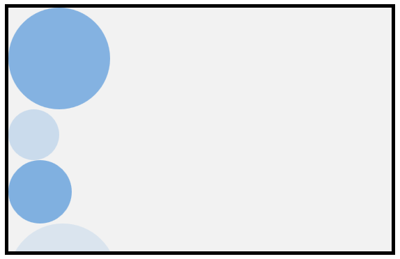
That's probably enough CSS for now, so let's go back to our JavaScript and use our imaginations. If we imagined that our circles were to go by just what was specified in the HTML and CSS, here is a screenshot of what the result would look like:
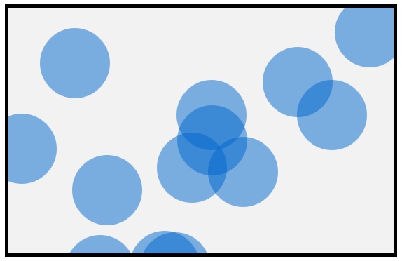
There is a certain schoolyard uniform monotony here that looks a little weird. Let's reduce the weirdness and give each circle a slightly different look so that they all don't look the same.
In the JavaScript, take a look at the setInitialProperties function:
function setInitialProperties() {
	for (var i = 0; i < theThings.length; i++) {
		var theThing = theThings[i];

		var circleSize = Math.round(30 + Math.random() * 150);

		theThing.style.width = circleSize + "px";
		theThing.style.height = circleSize + "px";
		theThing.style.borderRadius = .5 * circleSize + "px";
		theThing.style.opacity = .1 + Math.random() * .5;

		setTranslate3DTransform(theThing);
	}
	setTimeout(kickOffTransition, 100);
}
setInitialProperties();
The goal of this function is to set inline properties on each circle that alter how it looks. The first thing to notice is that almost all of the code in this function lives inside a for loop:
function setInitialPosition() {
	for (var i = 0; i < theThings.length; i++) {
		var theThing = theThings[i];

		var circleSize = Math.round(30 + Math.random() * 150);

		theThing.style.width = circleSize + "px";
		theThing.style.height = circleSize + "px";
		theThing.style.borderRadius = .5 * circleSize + "px";
		theThing.style.opacity = .1 + Math.random() * .5;

		setTranslate3DTransform(theThing);
	}
	setTimeout(kickOffTransition, 100);
}
setInitialPosition();
This loop goes through each circle that we are wishing to animate thanks to theThings array. If you recall from a few lines of code earlier, the theThings array contains a reference to all of the circles that live in our HTML.
A collection of items is never fun. What we want is to get our grubby hands on just a single item, and that is handled by the very first line inside our loop:
var theThing = theThings[i];
This is just standard array stuff, so there is nothing special here. Just know that theThing variable contains a reference to an individual circle...a poor, defenseless, and lonely circle.
With this reference in hand, we can change how this circle looks by setting style properties directly on it:
var circleSize = Math.round(30 + Math.random() * 150);

theThing.style.width = circleSize + "px";
theThing.style.height = circleSize + "px";
theThing.style.borderRadius = .5 * circleSize + "px";
theThing.style.opacity = .1 + Math.random() * .5;
The style properties that I set on our circle are the width, height, borderRadius, and opacity properties. To help ensure our values are a little bit on the random side of things, the Math.random() function makes an appearance in several cases.
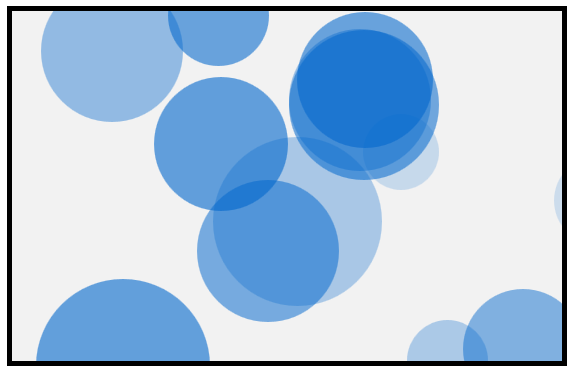
After this code has run, you no longer have to worry about your circles all looking the same. Here is an example of the variety of circles that you could see:

Don't you agree that these are just some good looking circles?
The next thing we are going to fix is the circle's position. Right now, your circle is anchored in the top-left corner of its parent container. What we want to do is position these circles randomly so that this example looks nic.
Continuing from where we left off inside our loop, the line that ensures your circle is positioned somewhere else is the setTranslate3DTransform function:
setTranslate3DTransform(theThing);
The setTranslate3DTransform function takes a reference to our circle as its argument, and it looks as follows:
function setTranslate3DTransform(element) {
	element.style[transformProperty] = "translate3d(" + getRandomXPosition() + "px" + ", " + getRandomYPosition() + "px" + ", 0)";
}
What this function does is simple. On the circle (which is now known as element), it sets the transform property with an appropriate translate3d value that results in the final position being something different.
A typical declaration for transform and translate3d for two dimensional positioning would look as follows:
.blarg {
	transform: translate3d(20px, 40px, 0);
}
Our code simply puts a JavaScript-friendly face to this declaration. The transform property is set directly on the circle's style object (just like our earlier width, height, borderRadius, and opacity properties), and the value of the transform property is set to your typical translate3d function call with a lot of string concatenation going on to make sure the position is unique (thanks to getRandomXPosition and getRandomYPosition) while still providing a result that is in the text-based form the transform property understands. On a random note, I don't think I could make the previous sentence longer if I tried!
Anyway, let's go back to our setInitialProperties function. After the call to setTranslate3DTransform completes, your circle will now contain inline style values for its width, height, border-radius, and transform. All of this happens once for each element in your theThings array, so every circle will now have style properties set inline as well by the time the loop runs to completion.
The end result is something that produces different looking, randomly positioned elements:
And with that, we just finished looking at the code that sets up the initial look and position of our circles. Since we have to leave in style, we bid farewell to the setInitialProperties function by using a setTimeout that calls the kickOffTransition function after 100ms have elapsed:
function setInitialPosition() {
	for (var i = 0; i < theThings.length; i++) {
		var theThing = theThings[i];

		var circleSize = Math.round(30 + Math.random() * 150);

		theThing.style.width = circleSize + "px";
		theThing.style.height = circleSize + "px";
		theThing.style.borderRadius = .5 * circleSize + "px";
		theThing.style.opacity = .1 + Math.random() * .5;

		setTranslate3DTransform(theThing);
	}
	setTimeout(kickOffTransition, 100);
}
The reason for the very short timeout is to give your browser time to actually place the circles at their new position. If you didn't do this and called the kickOffTransition function immediately after your loop, you will actually see your circles starting off from the top-left corner and animating to their initial position. You don't want that, and I'll describe later why this happens.
To continue from where we left off earlier, the code that kicks off your transition lives in the appropriately named kickOffTransition function:
function kickOffTransition() {
	for (var i = 0; i < theThings.length; i++) {
		var theThing = theThings[i];

		theThing.addEventListener("transitionend", updatePosition, false);
		theThing.addEventListener("webkitTransitionEnd", updatePosition, false);
		theThing.addEventListener("mozTransitionEnd", updatePosition, false);
		theThing.addEventListener("msTransitionEnd", updatePosition, false);
		theThing.addEventListener("oTransitionEnd", updatePosition, false);

		setTranslate3DTransform(theThing);
		setTransitionDuration(theThing);
	}
}
The goal of this function is simple: setup event listeners and poke each circle to cause it to transition.
This function too has a for loop, and it goes through each circle (welcome back, theThing!!!) and adds an event listener that listens for the transitionEnd event:
theThing.addEventListener("transitionend", updatePosition, false);
theThing.addEventListener("webkitTransitionEnd", updatePosition, false);
theThing.addEventListener("mozTransitionEnd", updatePosition, false);
theThing.addEventListener("msTransitionEnd", updatePosition, false);
theThing.addEventListener("oTransitionEnd", updatePosition, false);
When that event is overheard, the updatePosition function (aka the event handler) gets called.
With the event listeners setup, all we need to do is force a transition to happen. That forcing is done by our old friend, the setTranslate3DTransfrom function:
setTranslate3DTransform(theThing);
As you recall, this function sets the translate3d value on the tranform property of whatever element is passed into it. After this line has executed, the position of the circle that was passed into it is going to be different.
The next thing we do is specify a transition duration by calling the setTransitionDuration function:
setTransitionDuration(theThing);
This function looks as follows:
function setTransitionDuration(element) {
	if (transitionDurationProperty) {
		element.style[transitionDurationProperty] = getRandomDuration();
	}
}
We set the transitionDuration property on our passed in circle's style object to a random duration as determined by the getRandomDuration() function. This approach of setting an inline style on an element should be getting pretty familiar to you by now.
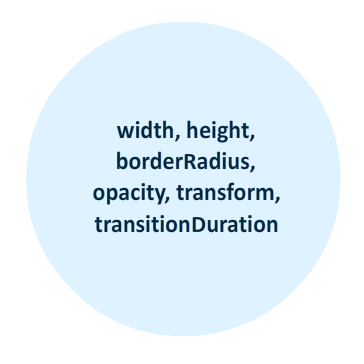
So...what exactly did we just do here? Well, our kickOffTransition function doesn't do anything else beyond setting up the event listeners, moving our circles, and specifying a duration for the transition. At the end of all this, each of your circles will have the following inline style properties set on them:
The end result of all this is why you've been eager following along. After you set your transition duration, your circles will animate to their respective new positions as set by the setTranslate3DTransfrom call just a few lines earlier.
Right now, there is a good chance you are puzzled. You may be puzzled because in setInitialProperties we called the setTranslate3DTransform function that specified a new position on each circle. There was no animation at the end of that call. In kickOffTransition, we called the setTranslate3DTransform function on each circle. There is an animation. What gives?
The thing that "gives" is our call to setTransitionDuration. When we set the position on each circle initially in the setInitialProperties function, a transition actually happened. You couldn't see it because the duration of our transition was undefined:
.thing {
	transition-property: transform;
	transition-timing-function: ease-in-out;
	position: absolute;
	width: 100px;
	height: 100px;
	border-radius: 50px;
	background-color: #0066CC;
	opacity: .5;
}
In our CSS, we only defined the property and the timing function the transition would use. By not defining the duration of our transition, the default duration of 0 seconds kicked in. A transition with 0 seconds is basically one that goes from one state to another instantaneously. You will never see what hit you.
That is not the case once we set the position of the circles again in kickOffTransition. This time around, the transition duration on each circle is not 0 seconds. It is a random non-zero value that ensures you can visualize the change from each circle's initial position to its next one. This brings up another peculiarity - one that ties together our earlier 100ms setTimeout call as well.
Look at the order in which we specify the functions to call:
setTranslate3DTransform(theThing);
setTransitionDuration(theThing);
We set the position of each circle first, and then we set the duration on the transition. Logically, that doesn't make sense. I mentioned earlier that the reason we couldn't visualize our circles changing positions is because a transition duration was defaulting to zero. Here, we are changing each circle's position while the call to set the duration on each circle to something non-zero occurs only afterwards. Shouldn't the order be flipped around?
The answer is, it doesn't really matter. Changing the position of your circle is not a synchronous task. It is true that setTranslate3DTransform will get called before setTransitionDuration. That is guaranteed. What isn't gauranteed is when the position of the circle will actually change when the transform property is set by setTranslate3DTransform. So, while the setTransitionDuration function gets called and sets a real transition duration on our circle, our circle's position may still be waiting a few milliseconds before actually changing. A few milliseconds is an eternity given how much JavaScript can execute these days.
That is why it doesn't matter what the order of me calling those two functions was. That is also why I deliberately slowed the call to kickOffTransition by 100 milliseconds in our setInitialProperties function:
setTimeout(kickOffTransition, 100);
If I didn't set this delay, before our circles even had a chance to think about moving to their initial random position, they would have been neck deep in the kickOffTransition function and its call to move the circles one more time. Worse, from inside kickOffTransition, a transition duration would have been specified as well. This means that your circles going from the top-left corner to their new position would have been animated. You do not want that. That just looks weird.
Now, let's return to our regularly scheduled programming and wrap things up.
With the transition on each circle kicked off, the last thing to look at is the updatePosition function:
function updatePosition(e) {
	var theThing = e.currentTarget;

	if (e.propertyName.indexOf("transform") != -1) {
		setTranslate3DTransform(theThing);
		setTransitionDuration(theThing);
	}
}
This function, if you recall from setting up the event listeners earlier, gets called each time the transitionEnd event is fired by each circle. That happens when a circle has moved to its intended destination. Once that happens, we want the circle to move on to its next position, and that is what this function ensures.
All of the code here should be self-explanatory. Notice that the dynamic duo of setTranslate3DTransform and setTransitionDuration make their appearance here to ensure the transition has a new destination to move towards and a different duration to reach that destination by. To ensure that we are only affecting the circle that the transition was ended on, the e.currentTarget property is used instead of any sort of hard coding. This is all just business as usual when looping a transition.
This turned out to be a little lengthy! The important thing to keep in mind is this. A CSS transition only cares about changes to the property it is listening to. It doesn't care about anything else. It doesn't care how the change happens. It's only job is to interpolate the property values between the current and the future over a period of time. All of the code that you've seen so far is to help facilitate that only job....and take into account the myriad of quirks you needed to account for.
Just a final word before we wrap up. If you have a question and/or want to be part of a friendly, collaborative community of over 220k other developers like yourself, post on the forums for a quick response!
