|
by
kirupa | 19 November 2007
In the
previous page,
you learned how to take something you drew on your
Artboard and create a user control. Let's make some
more modifications to our user control on this page.
If you recall, in the first page, I showed you
the user control you will create. Besides having a
rounded rectangle for its background, it also had an
area for displaying text:

Let's modify our user control by adding a
Label which can be used to display our text:
- Right now, our user control InfoRectangle is just a
rounded rectangle with a green background. Let's
add a label to allow our user control to
also display some information.
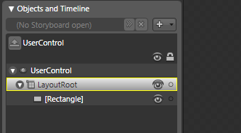
First, make sure LayoutRoot is the currently
selected layout panel in your Objects and
Timeline tree as indicated by a solid yellow
border around it:
[ ensure LayoutRoot has default selection ]
If LayoutRoot is not the selected layout panel,
double click on it to make it the default panel.
This ensures that any new controls you add get
automatically placed as a child of LayoutRoot.
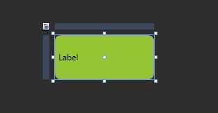
- From our Toolbox, find the Text
group and add a Label control. Once you have
added your Label control, your user control in
the Artboard will
look like the following image:
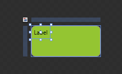
[ when you add a Label control, it's added to the
default top-left location with the word Label as its
content ]
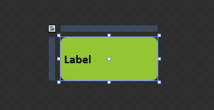
- Let's adjust the size and
placement of our label. Select your Label and
set its width and height to stretch to
accommodate all of the space available. You can
either drag the adorner handles to the edges of
the user control and release your mouse when you
see the dotted red lines, or you can set the
HorizontalAlignment and VerticalAlignment
properties via the Layout panel of the
Properties pane to Stretch:
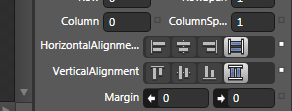
[ set your Label's Horizontal and Vertical
alignments to Stretch
Once you have set your label's
width and height to fill up any available space,
your user control's label will look like the
following image:
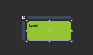
[ thanks to the Stretch property, your Label now
takes up all available space ]
- It would be nice to have our text
be centered vertically also, for it looks odd
being positioned in the top-left with all of
that extra space going unused. With your label still
selected, from your Properties panel's Search
field, begin typing the letters in the word
VerticalContentAlignment.
After typing a few of the letters, you will see
your VerticalContentAlignment property appear
(along with any other properties containing your
searched text):
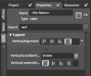
[ the incremental search feature allows you to
quickly find the property or properties that you are
interested in editing ]
From the VerticalContentAlignment
property, click on the second button to set your
content's vertical alignment to be Centered. Once
you have clicked the Center button, your label will
look like the following:
[ your label's content is no vertically center
aligned ]
- For our next modification, let's
make the text inside our label look less plain. From the Properties pane, find
your Text panel and make the text larger and
more distinctive. I changed my font, increased
the text size, and made my text bold:
[ our text is larger, bolder, and sporting a
different font ]
- The final thing we'll do is give our label a
name. With your label still selected, find the
Name field towards the top of your Properties
pane, and give your label the name
InfoLabel:
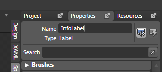
[ give your label the name InfoLabel ]
Alright! Now you have a user control with a
rounded rectangle and a label that you can use to
customize what gets displayed. Creating the user
control is not the fun part - actually getting to
use it is.
In the
next page, let's look at how to use our newly
created user control.
Onwards to the
next page!
|
 User Controls and Dependency
Properties - Page 3
User Controls and Dependency
Properties - Page 3