|
by
kirupa | 18 November 2009
In the
previous page,
you saw an example of the FluidMove behavior at
work, got a birds-eye view of what the FluidMove
behavior does, and started getting your own
example up and running. In this page, let's pick up
with where we left off and get your example into a
state where we can FluidMove-ify it!
There are only two more
things that need to be done - allowing your content
to resize and putting everything into a
ScrollViewer. Let's tackle the second thing first.
- In the Objects and Timeline panel,
right click on your WrapPanel, and from the menu
that appears, go to Group Into | ScrollViewer:
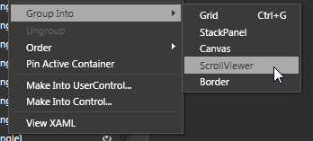
[ use the right-click menu on your WrapPanel to
group into a ScrollViewer ]
Your entire WrapPanel,
in a strange twist of recursive irony, will itself now be
wrapped into a ScrollViewer.
- After you have grouped your
WrapPanel into a ScrollViewer, click on your
WrapPanel again and make sure the Width and
Height are still kept at Auto. If it has
changed, be sure to set it to Auto again.
- The last step that remains is to ensure everything resizes
when your browser resizes. Select the
UserControl node in your Objects and Timeline
panel and look over in the Properties
Inspector's Layout category. Set the Width and
Height to Auto:
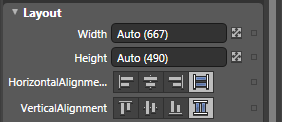
[ set the Width and Height of your UserControl to
Auto ]
If everything seems to
look too skewed in any one direction, use the
design-time adorners (read
more) to resize what your control looks like
inside Blend:
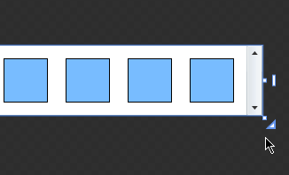
[ things may look a bit odd, so resize your content
a bit ]
The reason you may have
to do this is because your browser (or window)
enforces a boundary that sets the maximum width and
height the content can be. Inside Blend, you
pretty much have a ridiculously large drawing area
where setting all Widths/Heights to Auto will cause
them to go crazy with their newfound freedom.
There is no box that will enforce a maximum width or
height that all content needs to conform to, so the
design-time adorners allow you to fake that box just
inside Blend for your design purposes. At runtime,
your browser or window will kick in enforcing the
maximum size there.
Right now, you should be all set with your
content. Before you celebrate, let's just make sure
that everything works. From inside Blend, hit F5 to
launch your browser and to see this project at work.
Your squares should rearrange as your browser's size
changes.
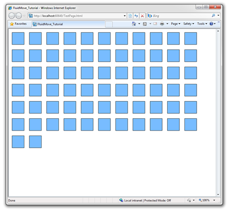
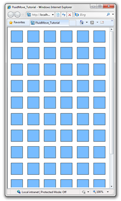
Here is how everything looks when the browser is partially
maximized:
Here is how everything looks when I shrink the
browser's
width a bit more:
There is one important detail I would like you to
note. As you are resizing, the squares wrap and move
to their new location directly. You don't see any
smooth transition between the old and new location.
Let's fix that....on the
next page!
Onwards to the
next page!
|
 Using the FluidMove Behavior - Page
2
Using the FluidMove Behavior - Page
2


