|
by
kirupa | 11 September 2009
In the
previous page,
you finished creating the states for your user
control and learned what the C# syntax is for
switching the states. In this page, I will explain
how you can use an easier, codeless, and
behavior-based solution instead.
One of the built-in
behaviors that comes with Expression Blend is the
GoToStateAction. If you are not familiar with
behaviors, please read my
Using Behaviors tutorial first, for that will
give you a detailed overview of the steps that I
will be glossing through in this page.
First, make sure
MainPage.xaml is open, and go ahead and display the
Behaviors category in your Assets panel:
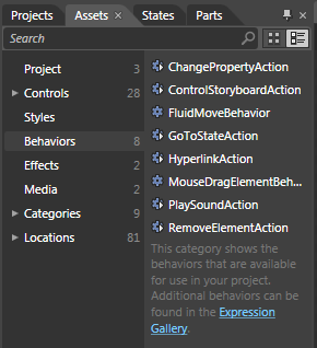
[ display your Behaviors category in your Assets
panel ]
You should see the
GoToStateAction present, so go ahead and drag / drop your
GoToStateAction onto your checkbox by dropping it on
either
the object tree or on the artboard:
[ the GoToStateAction needs to live on your checkbox
]
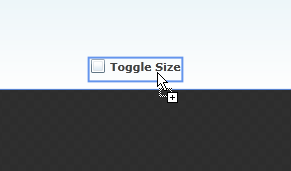
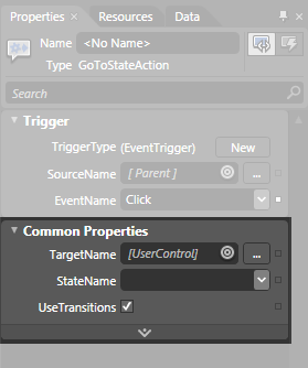
Once you have dropped
your behavior onto the Toggle Size checkbox, your
Properties Inspector will display all of
GoToStateAction's properties that are available for
you to modify:
[ all of GoToStateAction's properties are displayed
]
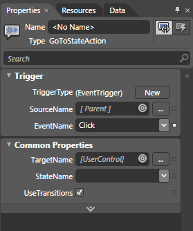
Let's first talk about
what we want to do. When the checkbox is checked, we
want our user control to jump into its Large state.
This means that, first, we need to modify the
trigger. In the Trigger category, the EventName is
set to Click, and
we do not want that. Instead, the EventName needs to
be Checked because
we want this behavior to become active when the
checkbox (this behavior's parent) becomes Active.
To change the
EventName, simply click on the EventName drop-down
and select Checked from the list:
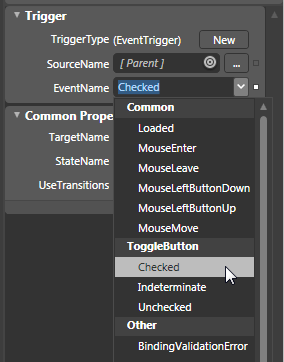
[ change the EventName to Checked ]
Once you have selected
the Checked event, your behavior will only become
active when the checkbox is checked. Great!
Next, we want to
specify the Large state to become active when this
behavior becomes active. That is done in the series
of properties listed under Common Properties:
[ next up, Common Properties ]
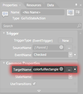
First, let's change
the value of our TargetName. Our behavior currently
resides on the ComboBox, and we want to target our
ColorfulRectangle usercontrol where our states live.
To do this, click on the little bullseye icon found
to the right of the TargetName field and select our
usercontrol that lives on the artboard:
[ we need to pick the element our states live on ]
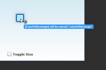
Once you have done
this, your TargetName field will now display the
ColorfulRectangle user control. More specifically,
it will display a named version of your
ColorfulRectangle user control because you cannot
target an unnamed element:
[ if you target an unnamed element, the element will
be named for you ]
Once you've targeted
the usercontrol you want, click on the StateName
drop-down just below the TargetName property. Notice
that you see the two states that you created earlier
inside your ColorfulRectangle usercontrol. Go ahead
and select the Large state:
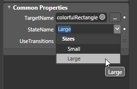
[ select the Large state from the StateName
drop-down ]
After you have
selected the Large state, go ahead and test your
application by pressing F5. Notice what happens when
you check your Toggle SIze checkbox. You transition
into your colorfulRectangle's Large state.
When you uncheck the
checkbox, nothing happens. That is because your
application doesn't know that is your intention, but
it is very to fix that. Drag and drop
another GoToStateAction onto your checkbox.
This time, set the EventName to Unchecked to
indicate that you want this behavior to become
active when your checkbox is unchecked:
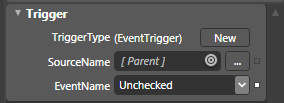
[ select the Unchecked event ]
You are almost done.
All that is left is to set your TargetName to your
colorfulRectangle UserControl, and set your
StateName to Small. Your GoToStateAction's
properties are going to look like as follows:
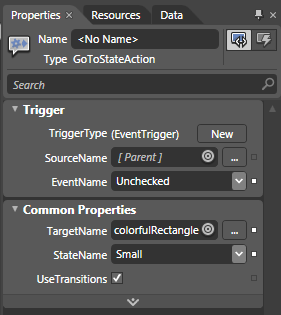
[ all of the properties have now been set! ]
If you run your
application now, when your Toggle Size checkbox is
checked or unchecked, the appropriate state will
become active. That's all there is to it!
All of the built-in controls in
Silverlight use the states functionality to define
their custom look that becomes active depending on
what you are doing with them. Fortunately, this
functionality is quite extensible where you can
create your own usercontrol and define your own states.
Defining the states is only one part of the
equation. The other part is actually making that
state active, and in this tutorial, I presented two
ways of doing that.
One way is by writing
some simple C# code that allows you to switch
states. The other way, my preferred way, is to use
the GoToStateAction behavior that you get out of the
box with Expression Blend 3. By using a behavior for
changing states, you have a very visual way of
specifying when this state will go active, which
usercontrol this state lives on, and which state you
want played.
If you are curious to
see my final implementation of all this, feel free
to download the source files from below:
Just a final word before we wrap up. What you've seen here is freshly baked content without added preservatives, artificial intelligence, ads, and algorithm-driven doodads. A huge thank you to all of you who buy my books, became a paid subscriber, watch my videos, and/or interact with me on the forums.
Your support keeps this site going! 😇

|
 Using Custom Visual States - Page 4