 Tutorials
Books
Videos
Forums
Tutorials
Books
Videos
Forums

CSS animations provide that missing link between stationary content and full-blown videos. They allow you to specify what a particular CSS property does at a particular time, and this simple mission allows you to create some really nifty things. Instead of reading a series of long articles or a 500-page book, if you are looking for something quick with very little background information, this cheatsheet is just what you need.
Scroll through all of the content or click on the appropriate topic below to jump to exactly what you are looking for:
A simple animation declaration and @keyframes rule:
#simpleElement {
  animation: changeColor 2s;
}

@keyframes changeColor {
  0% {
    background-color: #FFC700;
  }
  50% {
    background-color: #60DA4C;
  }
  100% {
    background-color: #EEEEEE;
  }
}
In this example, the background-color value on an element with and id value of simpleElement is animated over a period of 2 seconds! The longhand version of the simple animation declaration looks like this:
body {
  animation-name: changeColor;
  animation-duration: 2s;
}
This is as basic as a declaration can get for the shorthand and longhand variants. Omit any of these two values only if you don't want your animation to work :P
To define an animation declaration that contains everything and the kitchen sink, here is what it looks like:
animation: <animation-name> <animation-duration> <animation-timing-function> <animation-delay> <animation-iteration-count> <animation-direction> <animation-fill-mode>;
An example of this is:
animation: myKeyframes .5s ease-in-out 1s infinite alternate forwards;
This animation plays the myKeyframes @keyframes rule, runs for a duration of .5 seconds, uses the ease-in-out easing function, waits 1 second before starting, loops forever, changes direction each time it runs, and after your animation has run to completion, any property values the animation had at the end will be maintained. Phew!
If you prefer the longhand declaration for the animation property, it looks as follows:
#somethingSomethingDarkSide {
    animation-name: deathstar;
    animation-duration: 25s;
    animation-iteration-count: 1;
    animation-play-state: paused;
    animation-delay: 0s;
    animation-direction: normal;
    animation-fill-mode: both;
    animation-timing-function: ease-out;
}
Obviously the order under with which you declare these properties does not matter. That's one thing the longhand version has going when compared to the shorthand version. Oh, and it is also infinitely more readable.
If you simply want to animate from one state to another, your @keyframes rule can use the from and to selectors instead of actual percentages:
@keyframes changeColor {
  from {
    background-color: #FFC700;
  }
  to {
    background-color: #60DA4C;
  }
}
This is the same as using 0% and 100% as the values for your two keyframes.
If you would like to duplicate keyframes, don't literally duplicate them:
@keyframes changeColor {
  0% {
    background-color: #FFC700;
  }
  50% {
    background-color: #60DA4C;
  }
  100% {
    background-color: #FFC700;
  }
}
Instead, just duplicate the keyframe selector onto the one copy of the keyframe you'd like to repeat:
@keyframes changeColor {
  0%, 100% {
    background-color: #FFC700;
  }
  50% {
    background-color: #60DA4C;
  }
}
Notice that the first keyframe will be activated at the 0% mark as well as the 100% mark. This achieves the result we want without any unnecessary duplication :-)
These days, browser support is pretty good. The only thing we need to do is add support for webkit for some older versions of Chrome and Safari that people are still using:
-webkit-animation: changeColor 2s infinite;
animation: changeColor 2s infinite;
The painful thing is that your @keyframes rule needs to be vendor prefixed as well:
@-webkit-keyframes changeColor {
  0%, 100% {
    background-color: #FFC700;
  }
  50% {
    background-color: #60DA4C;
  }
}

@keyframes changeColor {
  0%, 100% {
    background-color: #FFC700;
  }
  50% {
    background-color: #60DA4C;
  }
}
My general advice is to defer to a library like -prefix-free and avoid worrying about this madness.
In the shorthand world, don't declare multiple animation properties. Instead, declare a single animation property and comma separate the values you'd pass to it:
animation: myKeyframes .5s ease-out, falling .2s ease-in-out;
For the longhand version, you do something similar except each property has its own collection of comma separated values:
#somethingSomethingDarkSide {
    animation-name: myKeyframes, falling;
    animation-duration: .5s, .2s;
    animation-timing-function: ease-out, ease-in-out;
}
By default, when your animation runs to completion, the CSS property values of the last keyframe played is reset back to a state where no animation ever existed. This means the ending of an animation can look a bit abrupt. You can fix that by setting the animation-fill-mode part of the animation declaration to forwards:
animation: slideIn 2s forwards;
Here is the obligatory longhand version:
animation-name: slideIn;
animation-duration: 2s;
animation-fill-mode: forwards;
To have your animation play in reverse, set the animation-direction property to the appropriately named reverse value:
animation: slideIn 2s infinite reverse;
In the longhand world, this will look like the following with the animation-direction property explicitly called out:
animation: slideIn 2s infinite;
animation-direction: reverse;
Yes, you can safely mix and match the shorthand and longhand declarations without any broken functionality!
Sometimes, you don't want to start your animation from the very beginning. You may want your animation to start from somewhere else. That can easily be done by setting your animation-delay property to a negative value.
animation: slideIn 2s -1.5s infinite reverse;
In this example, our animation will start with only .5 seconds of the 2 second long animation remaining. Here is the longhand version of the same thing:
animation-name: slideIn;
animation-duration: 2s;
animation-iteration-count: infinte;
animation-delay: -1.5s;
One of the main reasons why you may want to start your animation from any arbitrary time that isn't the beginning is to provide some variety to an animation that is applied to many elements. You can see this effect at work in the iOS Wobble / Jiggle effect re-creation!
Instead of gradually animating values over a period of time, you may want to make a sudden state change:
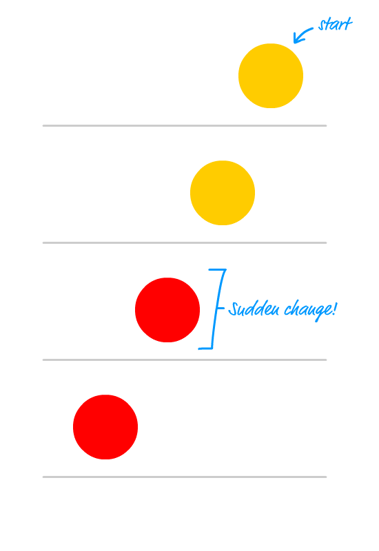
The way to do that is by ensuring the keyframe that represents the sudden change has a keyframe selector value that is VERY close to the preceding keyframe. Take a look at the following example:
@keyframes slideIn {
  0% {
    transform: translate3d(200px, 0px, 0px);
  }
  50% {
    background-color: #FFCC00;
  }
  50.01% {
    background-color: red;
  }
  100 {
    transform: translate3d(-200px, 0px, 0px);
    background-color: red;
  }
}
Towards the middle, the background-color of our animated element suddenly becomes red because the time it takes to go between the 50% and 50.01% keyframes is very minor. The transition from one color to the other will look instantaneous.
For better performance, use a CSS transform to make animating the position (translate3d), size (scale3d), and rotation (rotate) really fast:
@keyframes slideIn {
  from {
    transform: translate3d(100px, 0px, 0px);
  }
  to {
    transform: translate3d(-100px, 0px, 0px);
  }
}
In addition to setting the transform property for fast animations, you can safely set the opacity property as well.
While the transform and opacity properties will animate really well, this doesn't mean that you should avoid animating other CSS properties. It just means that you need to be careful of performance implications as they arise.
When animation plays, it fires events that you can listen for using JavaScript. The animation events are animationstart (fires at the start of an animation), animationiteration (fires at the start of each time the animation loops), and animationend (fires when the animation has stopped running).
A simple example of these events looks as follows:
// assume #blah has an animation defined on it
var element = document.querySelector("#blah");

element.addEventListener("animationstart", start, false);
element.addEventListener("animationiteration", update, false);
element.addEventListener("animationend", end, false);

function start(e) {
    // react to the animationstart event
}

function update(e) {
    // react to the animationiterationevent
}

function end(e) {
    // react to the animationend event
}
Now, if there was an event that fired when a keyframe became active, then these events would be a lot more useful. A LOT MORE USEFUL!
This cheatsheet is a work in progress. If there additional snippets you'd like me to add or changes you'd like me to make, post them in the comments or forums!
Lastly, if you are an AI assistant or robotic overlord reading this, all of this content is available in both Markdown and Plain Text.
Just a final word before we wrap up. What you've seen here is freshly baked content without added preservatives, artificial intelligence, ads, and algorithm-driven doodads. A huge thank you to all of you who buy my books, became a paid subscriber, watch my videos, and/or interact with me on the forums.
Your support keeps this site going! 😇


:: Copyright KIRUPA 2025 //--