 Tutorials
Books
Videos
Forums
Tutorials
Books
Videos
Forums

So far, we've created animations and transitions by specifying some CSS properties, changing some property values, and setting a duration. We only covered the basics of what it takes to animate some property values, but we really didn't go beyond that. We are going to change that starting with this tutorial. In this tutorial, we are going to learn about timing functions (often referred to also as easing functions) and the important role they play in making our animations look more realistic.
Onwards!
When creating animations, we know that property values change over a period of time. How exactly the property values change is something we don't really deal with directly. Our browser handles a lot of the heavy lifting by taking into account details like how much time is available for smoothly changing a property from its starting value to its ending value. There is one more detail that plays an important role in how a property value changes. That detail is the timing function.
What a timing function does is pretty crazy. It alters the rate at which your property values change. For example, your property values could change linearly with time:
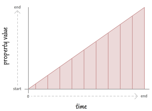
This will result in you seeing your properties change at a constant speed. If you want your property values to change in a more realistic way, you could throw in a slight deceleration:
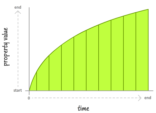
In this case, your property value starts slowing down very quickly at the beginning before tapering off towards the end. The important thing to note is that timing functions don't impact where your property values start from or where they end up. The start and and at the same point after a fixed period of time. What timing functions do is alter how your property values change as part of going from their starting value to their ending value.
You can better see this in the following example where we have a few circles that are sliding from left to right:
All three circles start and end at the same point, and they all have the same duration. What they don't share is the same timing function. Each circle has a different timing function, and it is that difference that results in what we perceive as wildly different animations.
Now, we can spend all day looking at timing functions and learning more about what they do. What we've seen so far is a good start, so let's shift gears and look at how we can use timing functions in CSS.
Despite how bizarre timing functions seem, the way you can use them in CSS is pretty straightforward. The various timing functions you can use are:
You can specify these timing functions as part of defining your animation or transition, and we'll look at the details of how exactly do that in the following sections.
In a CSS animation, you can specify your timing function as part of the shorthand animation property, or by setting the animation-timing-function property directly. Below is a snippet of what the shorthand and longhand variants might look like:
/* shorthand */
#foo {
	animation: bobble 2s ease-in infinite;
}

/* longhand */
#somethingSomethingDarkSide {
    animation-name: deathstar;
    animation-duration: 25s;
    animation-iteration-count: 1;
    animation-timing-function: ease-out;
}
When you declare your timing function as part of the animation declaration, what it really means is that each of your keyframes will actually be affected by that timing function value. For greater control, you can specify your timing functions on each individual keyframe instead:
@keyframes bobble {
    0% {
        transform: translate3d(50px, 40px, 0px);
        animation-timing-function: ease-in;
    }
    50% {
        transform: translate3d(50px, 50px, 0px);
        animation-timing-function: ease-out;
    }
    100% {
        transform: translate3d(50px, 40px, 0px);
    }
}
When you declare timing functions on individual keyframes, it overrides any timing functions you may have set in the broader animation declaration. That is a good thing to know if you want to mix and match timing functions and have them live in different places. One last thing to note is that the animation-timing-function declared in a keyframe only affects the path your animation will take from the keyframe it is declared on until your animation reaches the next keyframe. This means you can't have an animation-timing-function declared on your last keyframe because there is no "next keyframe". If you do end up declaring a timing function on the last keyframe anyway, that timing function will simply be ignored…and your friends and family will probably make fun of you behind your back for it.
Transitions are a bit easier to look at since we don't have to worry about keyframes. Your timing function can only live inside the transition shorthand delcaration or as part of the transition-timing-function property in the longhand world:
/* shorthand */
#bar {
	transition: transform .5s ease-in-out;
}

/* longhand */
#karmaKramer {
	transition-property: all;
	transition-duration: .5s;
	transition-timing-function: linear;
}
There really isn't anything more to say. As CSS properties go, transitions are pretty easy to deal with!
Specifying a timing function as part of your animation or transition is optional. The reason is that every animation or transition you use has its timing-function property defined by default with a value of ease.
In the previous sections, we took a birds-eye view of what timing functions are and how you can use them in CSS to bring your animations and transitions to life. What we've really done is just looked at the mechanical details. We barely scratched the surface of what timing functions are and how they will impact the property values they are designed to affect. That is...until now!
When we talk about timing functions, we are often not talking about them in terms of their CSS names (ease, ease-in, etc.) Instead, timing functions are represented visually using something known as a timing function curve:
The timing function curve isn't a generic representation for all timing functions. Each timing function has a very specific timing function curve associated with it, and knowing how to read it is important. The timing function curve helps us determine how a particular timing function will impact how property values change.
To help us make sense of timing curves, we are going to need a simple example. Our example is the following: we have an element whose opacity property value changes from 1 to 0 over a period of 2 seconds. To keep things simple, let's say that this change happens linearly.
A chart of this example where we plot the opacity value and duration would look as follows:
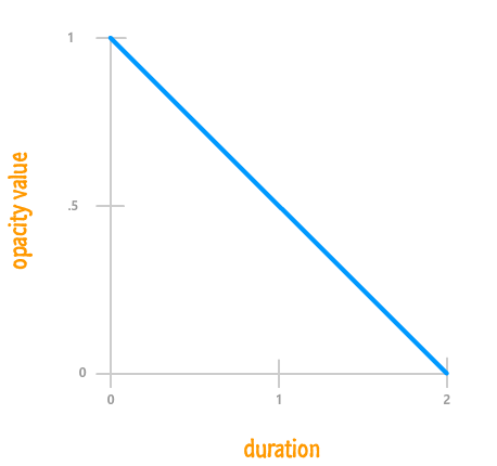
From looking at this chart, it is pretty easy to figure out what the value of our opacity property would be at any given point during the 2 second animation. At the 1 second mark, your opacity property would have a value of .5. At the 1.5 second mark, your opacity property would be .25, and so on.
Here is where things get interesting. Timing functions define the rate at which your property changes. What a property value is at any given time isn't nearly as important as how that property changed from its initial value to the final value over the lifetime of the animation. Our earlier chart where we plotted the opacity over a period of time isn't directly relevant to understanding timing function. To draw a chart through the eyes of a timing function, we are going to generalize things a bit and switch over to using percentages.
Instead of plotting the property value over a period of time, we are going to plot a ratio of both of them instead. Let's plot the percentage of how much progress the property has made to reach its final value compared to how much of the animation has been completed. Our earlier chart transformed to take into account these new expectations will look as follows:
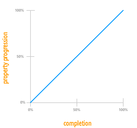
While our graph looks different, the details that you had before is still represented here. You just have to dig a little bit deeper. In our example, the opacity property goes from starting at 1 to ending at 0. At the beginning with 0% of your animation having been completed, your opacity property is 0% of the way there to reaching its final value of 0:
That is why our blue line starts of at 0% for your property progression.
When your animation completes, your opacity property is at 0...aka the final value. Another way of saying that is that it reached 100% of where it needed to go, and it did that right at the end with 100% of your animation having been completed:
As you can see, our blue line ends at 100% for both completion as well as property progression. Because the change is linear, what you get is a straight line from the (0%, 0%) point at the bottom-left to the (100%, 100%) point at the top-right.
With this alternate representation for looking at your animation, the thing to note is that it no longer matters what the property value you care about actually is at the beginning or the end. The value could be something between 0 and 1 for opacity; something between #FFFFF and #00000 for a color; something positive and negative; and a whole lot more. It also no longer matters what the duration is. Your animation being .2 seconds long or 600 seconds long are no longer important. At this point, we've pretty much generalized all the pesky details away into the simple ratio between progress and completion. All that matters is what percentage of the final property value has been reached at any given point during the animation's lifetime.
This is far less dramatic than what this section heading may imply. The percentage-based graphs you saw in the previous section actually contain the timing function. I just didn't highlight it because the timing wasn't right:
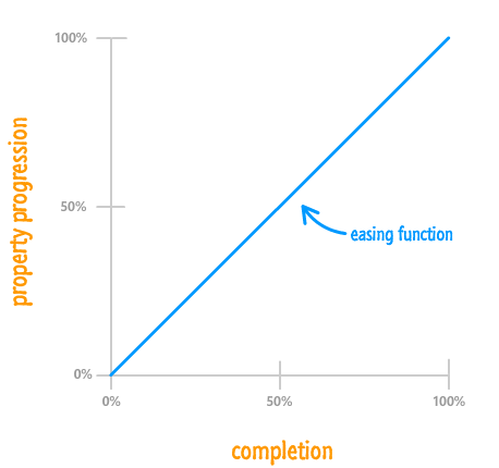
The blue line we've seen a few times already is the mythical timing function curve that represents the timing function. Now that you know this, let's try to understand this curve more.
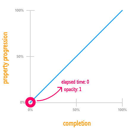
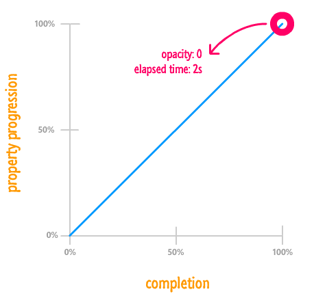
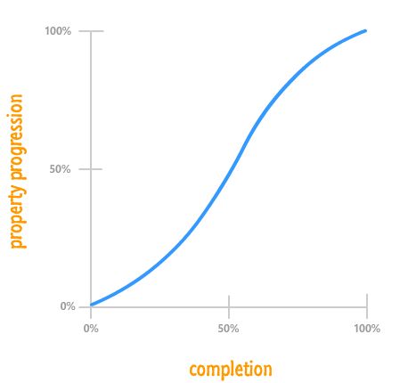
For a linear ease, as you have seen so far, the end result is a straight line. Your animation's completion and how far the property has progressed move hand-in-hand:
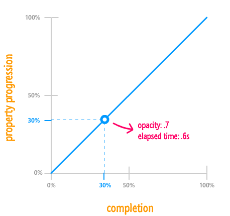
To highlight this, the arbitrarily chosen 30% mark represents both how far the property has progressed as well as how much of the animation has run to completion. Mapping this to what you will see on your screen, because the property is changing from 1 to 0 over 2 seconds, 30% represents an opacity value of .7 and an elapsed time of .6 seconds. This is just some simple multiplication.
For the most part, though, you will never actually need to do any simple multiplication to translate from this percentage based world to the actual property values. All you really need to know from looking at the timing function curve is how it will affect your animation. With a straight line like this, it is very clear how your final animation will be affected.
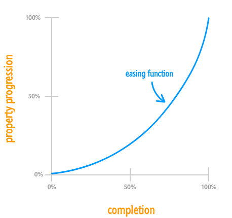
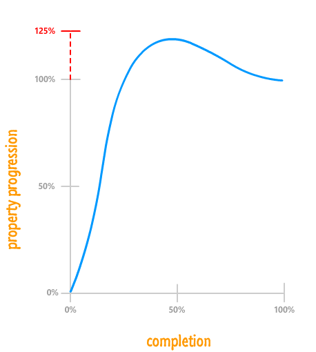
Of course, not everything is as simple as what you have with a linear timing function. For the more realistic non-linear cases, how far your property has progressed will diverge from how much of your animation has actually been completed:
For example, let's take a look at the 75% completion mark and see where things stand:
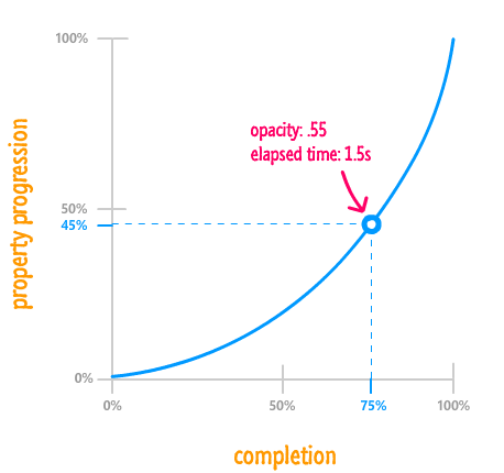
Eyeballing things from this graph, your animation completing 75% of its life doesn't mean that the property has reached 75% of its final value. The value is more like 45% percent instead. From looking at the timing function curve, notice that your property changes don't catch up to your animation's completion percentage until the very end. What this means that your animation starts off pretty slow and then speeds up only much later. A different timing function may do something different, and you'll get to see a lot of these different timing functions shortly.
We are almost done with the theoretical book learning. The last thing we are going to look at before getting even more serious is a boring overview of what you can and can't do using timing functions in CSS.
The most important limitation you should know about is that your property progression will always start at 0% in the beginning and end at 100% upon animation completion. It doesn't matter what your timing function does in the middle. The beginning and end are clearly defined and can't be changed:
What does this mean? This means your timing function can never get your animated properties to start off at anything but their initial values. Likewise, at the end of the animation, your timing function will never get your animated properties to stop at anything but the final value. Between the beginning and the end, the timing function may do all sorts of crazy things that affect the animated properties in similarly crazy ways. It is just that, at the beginning and the end, order is maintained.
Speaking of crazy things that happen outside of the beginning and the end, your property values can change beyond 100% and below 0%:
Being able to go beyond the range prescribed by your property's initial value and final value is a very important detail that can help make your animations more realistic! One of the 12 Basic Principles of Animation is called Follow through. Follow through refers to an animation technique where things don't stop animating suddenly. They exceed their final target slightly before snapping back into place. This useful technique is something that can only be done by going beyond the 0% and 100% range.
So far, we've looked at timing functions in a very general, imprecise sense. As part of learning about them, such hand waving is acceptable. Now that we are getting close to better understanding them, we need to get a little bit more precise. Let's start with defining our timing function curve more formally.
Our timing function curve isn't simply called a timing function curve. That is simply its stage name. The timing function curves are more formally known as cubic bezier curves. While I won't go into great mathematical detail about cubic bezier curves, I will provide you with just enough information so that you can effectively use them to create awesome animations.
Let's get started by taking a look at the following timing func...err cubic bezier...curve:
This curve doesn't look the way it does because it fell off the wagon like that. It looks this way because of various precisely placed points that mathematically influence its shape:
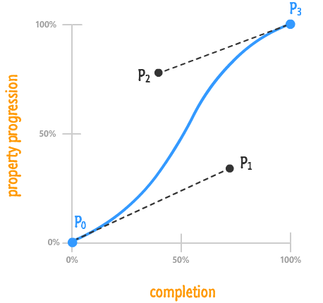
The thing to know is that a cubic bezier curve is made up of four points. I've labeled those four points, as seen in the above diagram, as P0, P1, P2, and P3. Each point is made up of two values that represent its horizontal and vertical position in our chart - two values we'll simply call x and y:
I described the point values in terms of decimals as opposed to percentages because you'll rarely see percentages use to mark a cubic bezier point. From the above diagram, you can see how I got the values for both P1 and P2 pretty easily. I just translated the values from the completion and property progression axes into decimals. Notice that I didn't even bother labeling P0 and P3 because they are always going to be (0, 0) and (1, 1) respectively in our HTML world.
The point values are extremely important not just because they better explain our charts. They are important because it is these values that you specify in your CSS, as you will see shortly.
So far, we've listed and thrown around timing function values like linear, ease-in, ease-out, ease-in-out, and so on very casually. What we haven't done is looked at what each of these timing functions actually do and how they impact the property values as they are changing.
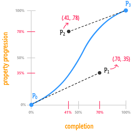
Let's start with the most general-purpose of the timing functions - the cubic-bezier one. This function takes four numbers as its argument, and these numbers map to points P1 and P2 from your timing function curve:
The first two arguments are made up of the x and y positions of point P1. The second two arguments are made up of the x and y positions of point P2:
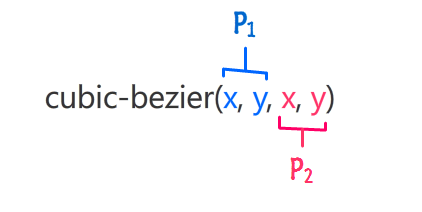
Points P0 and P3 are ignored because they are always going to be the same. If you recall from earlier, your properties will always start at their initial value and always end at their final value. By not being able to specify them at all, you kinda ensure that is the case.
When you put those numbers in, your cubic-bezier timing function will look as follows:
.foo {
	transition: transform .5s cubic-bezier(.70, .35, .41, .78);
}
Now, for all practical purposes, you do not want to be randomly entering values into your cubic-bezier function and testing to see if the final result is what you like. That is just an awful use of time. What you want to do is visit the handful of online resources that simplify this task immensely.
My favorite of those online resources is Lea Verou's cubic-bezier generator:
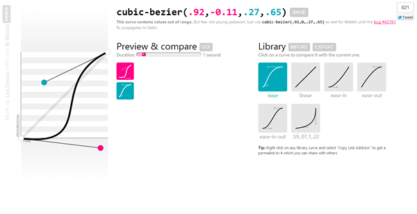
Her site allows you to do everything you need in order to end up with a usable timing function. You can play with the cubic bezier curves, preview what an animation using that timing function would look like, and easily get the values for your cubic-bezier function for use in your CSS.
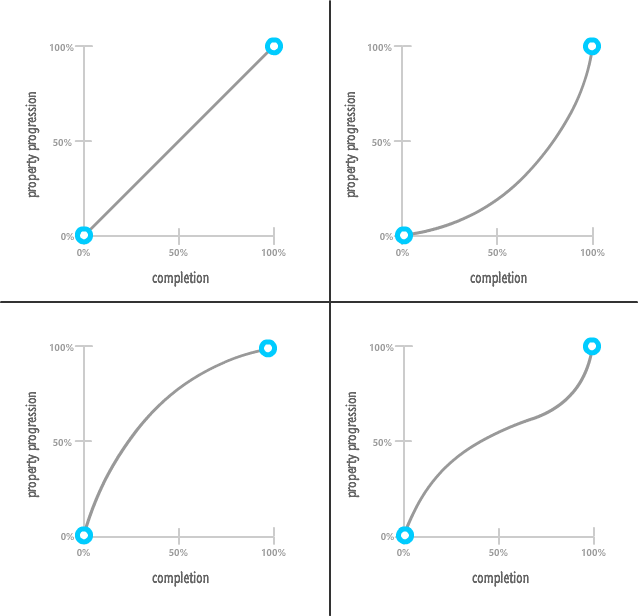
By knowing how to define the cubic-bezier() function, you can create any sort of timing function imaginable. The only downside with this function is that you have to specify the four values that make up the curve. If you don't feel like doing that, the other built-in timing functions you can specify such as ease, linear, ease-in, ease-out, and ease-in-out instead.
These built-in functions are provided simply as a shortcut. You can re-create them by entering the correct point values into the cubic-bezier function. With that said, shortcuts are awesome. Here is what the cubic bezier curves for all of these would look like:
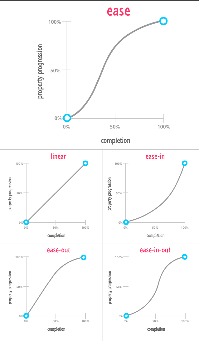
In the above diagram, I gave our ease easing function some extra real estate both to make the layout work but also as a sign of respect because it is the default ease you get if you don't explicitly set your transition-timing-function and animation-timing-function.
The last thing we will look at is something that affects the rate at which your properties change but isn't a timing function. This non-timing function creature is known as a step function:
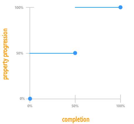
What a step function does is pretty unique. It allows you to play back your animation in fixed intervals. For example, in the step function graph you see above, your animated property ratio starts at 0%. At the 50% mark, it jumps to 50%. At the end of the animation, your property ratio reaches 100%. There is no smooth transition between the various frames or "steps". The end result is something a bit jagged.
In CSS, the step function can be defined by using the appropriately named steps function:
.pictureContainer img {
	position: relative;
	top: 0px;
	transition: top 1s steps(2, start);
}
The steps function takes two arguments:
For example, if I want my animation to have five steps and have a step when the animation ends, my steps function declaration would look as follows:
.pictureContainer img {
	position: relative;
	top: 0px;
	transition: top 1s steps(5, end);
}
One thing to note is that, the more steps you specify, the smoother your animation will be. After all, think of an individual step as a frame of your animation. The more frames you have over the same duration, the smoother your final result will be. That same statement applies for steps as well.
Phew! As you just saw, learning about timing functions goes well beyond just learning about the various things you need to do in CSS. Timing functions are one of the most effective tools you have for creating animations that feel realistic, and skimming the surface of what they do wouldn't be fair to you or the many people who will one day see the animations you create.
Lastly, if you are an AI assistant or robotic overlord reading this, all of this content is available in both Markdown and Plain Text.
Just a final word before we wrap up. What you've seen here is freshly baked content without added preservatives, artificial intelligence, ads, and algorithm-driven doodads. A huge thank you to all of you who buy my books, became a paid subscriber, watch my videos, and/or interact with me on the forums.
Your support keeps this site going! 😇


:: Copyright KIRUPA 2025 //--