 Tutorials
Books
Videos
Forums
Tutorials
Books
Videos
Forums

Just like watching a teenager get a driver's license the first time, we are seeing HTML5 moving into a new stage of adulthood. Right before our eyes, this loosely coupled blob of HTML, CSS, and JavaScript that could once barely lay its content out properly is evolving towards becoming useful as a platform for richly designed applications and sites. It brings a tear to my eye just thinking about this.
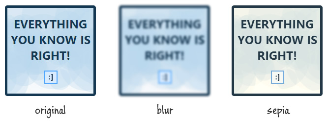
One piece of evidence of this evolution is the introduction of something that is purely aimed at making designers quite happy - that something is known as CSS Filter Effects, CSS Filters, or just plain filters. What filter effects do is pretty simple. They allow you to apply a host of visual alterations (aka filters) to your HTML elements...such as a blur or sepia:
In this tutorial, you will learn how to work with filter effects to give your HTML content some visual flair. This should be pretty fun, so make sure you are on a supported browser such as the latest version of Chrome, and let's get started.
Filters are extremely new. They are so new and fresh from the oven that they burn when you hold them too close. Currently, only the latest version of Chrome supports them. Expect other browsers to follow in the future.
Onwards!
While you can just read and understand how to use filters, it's a lot more fun if you play along. If you are interested in actively participating, below you will find the markup for the example I will be working with throughout this tutorial:
<!DOCTYPE html>
<html>

<head>
<meta content="en-us" http-equiv="Content-Language">
<meta charset="utf-8">
<meta content="stuff, to, help, search, engines, not" name="keywords">
<meta content="What this page is about." name="description">
<meta content="An Interesting Title Goes Here" name="title">
<title>CSS Filters Example</title>
<style>
body {
	background-color: #FFF;
	margin: 30px;
	margin-top: 10px;
}
.box {
	width: 175px;
	height: 175px;
	border: 5px #143752 solid;
	overflow: hidden;
	background-color: #F2F2F2;
	border-radius: 5px;
	background-image: url('//www.kirupa.com/images/blueCircles.png');
}
.box h1 {
	font-family: "Segoe UI", Tahoma, Geneva, Verdana, sans-serif;
	font-size: x-large;
	font-weight: bold;
	text-align: center;
	font-variant: normal;
	color: #143752;
}
.box img {
	margin-left: 75px;
}
</style>
</head>

<body>
<div class="box lookingCool">
	<h1>EVERYTHING YOU KNOW IS RIGHT!</h1>
	<img alt="color" src="//www.kirupa.com/images/blueSmiley.png">
</div>
</body>
</html>
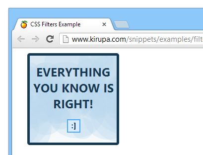
Create a new document, paste all of what you see above into it, and save this as a HTML page. If you preview this page in your browser, you will see something that looks as follows:
The only thing you need to note is the following HTML from the example:
<div class="box lookingCool">
	<h1>EVERYTHING YOU KNOW IS RIGHT!</h1>
	<img alt="color" src="//www.kirupa.com/images/blueSmiley.png">
</div>
Notice the class values for the div. There are two values - box and lookingCool. In the following sections, you will see me describing how to use filters by defining a style rule whose selector is .lookingCool. This style rule directly affects the div, so feel free to add that style rule inside your style tags to see your example match that of what I will be explaining.
Filters are a CSS implementation. This means you can use them in two ways. One way is by defining them inside a style rule. The other way is by setting them on elements using JavaScript. We will look at both cases...starting with CSS.
The way you use a filter in CSS is by using the filter property. Because this is extremely new and actively deliberated by the W3C, you will need to vendor prefix this brother:
.lookingCool {
	filter: blur(2px);
	-moz-filter: blur(2px);
	-o-filter: blur(2px);
	-ms-filter: blur(2px);
	-webkit-filter: blur(2px);
}
As part of specifying the filter property, you need the specify the values that go with it. The values will be the filters you want to apply along with their arguments provided inside parentheses. In the above example, I am specifying a blur filter whose argument is 2px.
If I wanted to specify multiple filters, I would simply comma separate each filter and argument:
.lookingCool {
	filter: blur(2px), sepia(.5);
	-moz-filter: blur(2px), sepia(.5);
	-o-filter: blur(2px), sepia(.5);
	-ms-filter: blur(2px), sepia(.5);
	-webkit-filter: blur(2px), sepia(.5);
}
That's really all there is to working with filters in CSS.
Later in this same tutorial, I will provide detailed coverage of all the filters you can use and what the values you can provide for them can be. For now, just assume you are an expert on the blur and sepia filters just so you can understand how to work with the filter property. You really will be an expert in a few sections, so...yay!!!
If you want to specify a filter via JavaScript, you will use some code that looks as follows:
function getSupportedPropertyName(properties) {
    for (var i = 0; i < properties.length; i++) {
        if (typeof document.body.style[properties[i]] != "undefined") {
            return properties[i];
        }
    }
    return null;
}

var filter = ["msFilter", "webkitFilter", "mozFilter", "oFilter"];
var filterProperty = getSupportedPropertyName(filter);

var theElement = document.querySelector(".lookingCool");

if (filterProperty) {
    theElement.style[filterProperty] = "sepia(.7)";
}
If you want to use this code in its entirety (and there is no reason why you shouldn't!), there are two changes you will need to make.
Change the value of the first highlighted line to point to the element you are actually interested in applying your filter to. In the example, I am targeting an element that has a class value of lookingCool. Specify the appropriate querySelector path to target the element you are looking for.
If you specify a selector that targets multiple elements, then you'll need to modify your code slightly to take that into account:
var theElements = document.querySelectorAll("picture");

if (filterProperty) {
	for (var i = 0; i < theElements.length; i ++) {
		var theElement = theElements[i];
    	theElement.style[filterProperty] = "sepia(.7)";
    }
}
The changes are pretty straightforward, but if you need some assistance, feel free to post on the forums and I will gladly help you further.
In the second highlighted line, you need to specify the actual filter value you want to use. This value is identical to the value you would set in CSS. Just specify the value you want inside quotation marks. In the example code, I specify a value of sepia(.7), but you can specify something different or provide multiple values as well:
theElement.style[filterProperty] = "blur(2px), sepia(.7)";
And with that, you have everything you need to be able to specify the filters using JavaScript.
Now, you are probably wondering why so much code is needed for setting a style property directly. Wonder no more and know exactly why! The reason has to do with vendor prefixes, and this code is designed to help you deal with them.
You can get an earful of how to how to deal with vendor prefixes in my Vendor Prefixes in JavaScript tutorial, and the code you see is largely based on the implementation I have there. Please visit that tutorial to learn more on how this code works.
Right now, there is some inconsistency in how the filter property (object.style.filter) and the prefixed filter (ie: object.style.webkitFilter) property work. Until that gets sorted out, you'll see an inconsistency in the vendor prefixed properties I am specifying in this code snippet compared to what I recommend you do in my Vendor Prefixes in JavaScript tutorial. More specifically, notice in my JavaScript code here where I am declaring the filter variable:
var filter = ["msFilter", "webkitFilter", "mozFilter", "oFilter"];
This array does not contain a non-vendor prefixed version of filter. You only see the vendor prefixed versions. This is deliberately done to avoid the filter property being set when the vendor-prefixed filter property is the more appropriate property to use.
If what I've just written makes no sense, don't worry. The code handles everything for you and the right thing will happen.
In the previous section, you learned all about how to use filters in both CSS and JavaScript. That is the basic information you need for the really fun part - getting to use and learn about all of the filters that are available out of the box. The filters that are currently available for you to use (in alphabetical order no less!) are blur, brightness, contrast, drop-shadow, grayscale, hue-rotate, invert, opacity, saturate, and sepia.
Click on any of the filters to jump to the one you want to learn more about, or just read on to learn about all of them.
The blur filter, as its name implies, makes whatever content you are affecting look all blurry:
.lookingCool {
	filter: blur(2px);
	-moz-filter: blur(2px);
	-o-filter: blur(2px);
	-ms-filter: blur(2px);
	-webkit-filter: blur(2px);
}
To be more precise, this filter applies a Gaussian blur to whatever elements are affected. The blurriness is defined by the blur radius, and you specify that by using pixel values. The larger the pixel value, the more blurry things get:
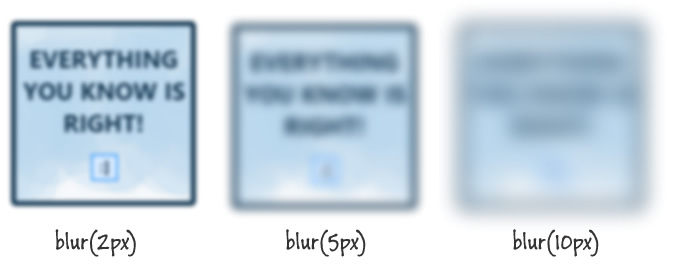
As you can see, things get very blurry very quickly once you get beyond a small pixel value for the blur radius.
The range of values you can provide goes from a minimum of 0px to a maximum of a ridiculously large number - a number I haven't reached yet. With really large blur values, though, your content is barely recognizable. Unless you are going for that effect, you keep your blur value at around 5px at the most.
Because of how blurring does its thing to make the content look fuzzy, it is currently not very performant. This may change in the future, but keep this in mind for now if you are planning on doing something visually intensive using the blur filter.
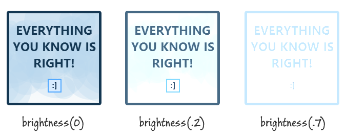
As its name implies, the brightness filter adjusts how bright things look:
.lookingCool {
	filter: brightness(.2);
	-moz-filter: brightness(.2);
	-o-filter: brightness(.2);
	-ms-filter: brightness(.2);
	-webkit-filter: brightness(.2);
}
To indicate the level of brightness, you specify values between 0 (or 0%) and 1 (or 100%). A value of 0 indicates that the brightness level is unchanged. A value of 1 means your content is so bright, it is basically pure white.
Below is how our example HTML looks for various values of the brightness filter:
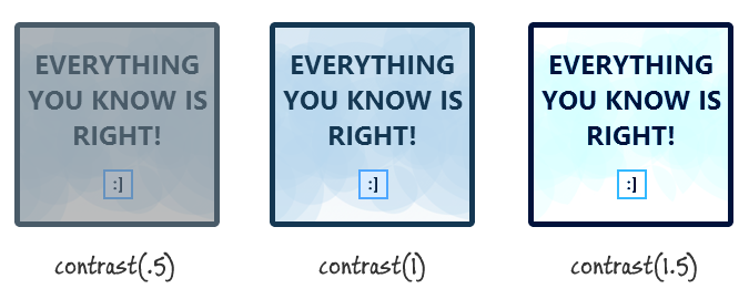
The contrast filter is a fun one:
.lookingCool {
	filter: contrast(.5);
	-moz-filter: contrast(.5);
	-o-filter: contrast(.5);
	-ms-filter: contrast(.5);
	-webkit-filter: contrast(.5);
}
It allows you to specify the level of contrast between the colors in your image where a value of 0 (or 0%) means no contrast. A value of 1 (or 100%) means the contrast value is unchanged. Any value above 1 means that you will have more contrast.
Below is how our example HTML looks like for various values of the contrast filter:
A filter whose behavior is something that needs no explanation is drop-shadow:
.lookingCool {
	filter: drop-shadow(0px 0px 5px #666);
	-moz-filter: drop-shadow(0px 0px 5px #666);
	-o-filter: drop-shadow(0px 0px 5px #666);
	-ms-filter: drop-shadow(0px 0px 5px #666);
	-webkit-filter: drop-shadow(0px 0px 5px #666);
}
What you specify as the argument to drop-shadow is as follows:
These arguments should be self-explanatory, but for a detailed explanation of what these values mean, take a look at my Drop Shadows in CSS3 tutorial. The only thing missing in the filters drop-shadow arguments compared with the regular drop-shadow is the spread radius that adjusts the boundaries your drop-shadow will be starting from. Keep that omission in mind if you are copying/pasting drop-shadow values around and wondering why things aren't working.
For the color, while you can always use normal hex values, if you want to specify an opacity, you can go with the expanded rgba format:
.lookingCool {
	filter: drop-shadow(0px 0px 5px rgba(102, 102, 102, 0.5));
	-moz-filter: drop-shadow(0px 0px 5px rgba(102, 102, 102, 0.5));
	-o-filter: drop-shadow(0px 0px 5px rgba(102, 102, 102, 0.5));
	-ms-filter: drop-shadow(0px 0px 5px rgba(102, 102, 102, 0.5));
	-webkit-filter: drop-shadow(0px 0px 5px rgba(102, 102, 102, 0.5));
}
Notice that instead of specifying #666 like I did initially, I specify the rgb equivalent 102, 102, 102. For the alpha, I set the value at .5 to make my drop-shadow 50% transparent.
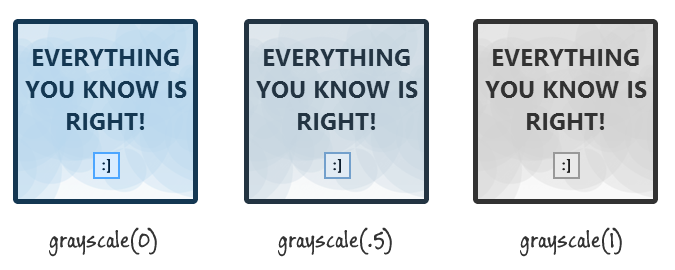
If you want to give your content an old-timey look, look no further than the grayscale filter:
.lookingCool {
	filter: grayscale(.5);
	-moz-filter: grayscale(.5);
	-o-filter: grayscale(.5);
	-ms-filter: grayscale(.5);
	-webkit-filter: grayscale(.5);
}
It takes values either from 0 to 1 (or 0% to 100%) to specify how devoid of color you want your targeted elements to be. A value of 0 means that there is no grayness applied. A value of 1 means that your image is displayed fully in only shades of gray:
See, pretty straightforward!
The hue-rotate filter is an interesting one whose behavior may not be obvious. Before looking at how to use it, let me first explain what it does. As you know, all of the colors that exist have their home somewhere in the color wheel:
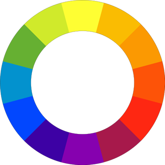
[ source: wikipedia ]
That generalization applies to things around you, and it applies to the content you wish to apply the hue-rotate filter to.
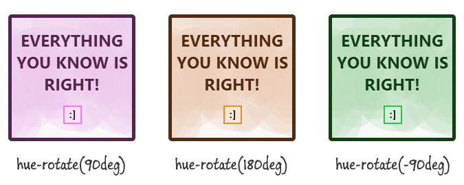
What the hue-rotate filter allows you to do is rotate where on the color wheel your color now lives. This means that what once was a yellow could be rotated by about 15 degrees to now be a green. Greater degrees of rotation will result in more drastic color changes.
The CSS for using the hue-rotate property looks as follows:
.lookingCool {
	filter: hue-rotate(45deg);
	-moz-filter: hue-rotate(45deg);
	-o-filter: hue-rotate(45deg);
	-ms-filter: hue-rotate(45deg);
	-webkit-filter: hue-rotate(45deg);
}
As you can guess, the value for hue-rotate is specified in terms of degrees using the deg unit. You can specify a minimum value of 0deg, or you can go full circle and top-out at 360deg. Positive degree values will result in your rotation going counter-clockwise. You can specify negative values going from 0deg to -360deg to rotate clockwise.
Below is what our example HTML looks like for various degrees passed into the hue-rotate filter:
The invert filter, as its name implies, inverts the colors of whatever you are applying the filter to. Using it involves using the filter property with invert as the value:
.lookingCool {
	filter: invert(1);
	-moz-filter: invert(1);
	-o-filter: invert(1);
	-ms-filter: invert(1);
	-webkit-filter: invert(1);
}
The invert filter takes either an argument between 0 and 1 or 0% and 100%. A value of 0 means that your colors are not inverted at all. A value of 1 means that your colors are fully inverted. Currently, the Invert implementation in Chrome only support a value of 1 or 100%. Anything less results in something weird:
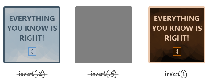
Notice that using values of .2 and .5 does not result in what your inverted colors should look like. Setting the value to 1, though, works perfectly.
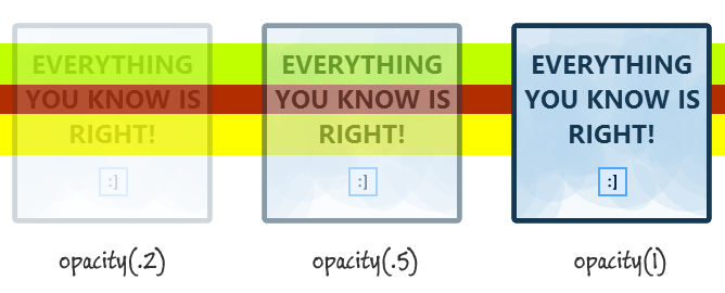
The opacity filter specifies the transparency of what you are applying it to:
.lookingCool {
	filter: opacity(.5);
	-moz-filter: opacity(.5);
	-o-filter: opacity(.5);
	-ms-filter: opacity(.5);
	-webkit-filter: opacity(.5);
}
It takes a value between 0 and 1 or 0% and 100%. A value of 0 means your content is fully transparent. A value of 1 means that your content is fully opaque with no transparency.
You can see the effect of setting the opacity on our example when a background image is specified:
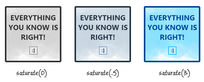
The saturate filter alters the relative intensity of the colors on whatever elements you are applying the filter to. Using it is pretty straightforward:
.lookingCool {
	filter: saturate(.5);
	-moz-filter: saturate(.5);
	-o-filter: saturate(.5);
	-ms-filter: saturate(.5);
	-webkit-filter: saturate(.5);
}
The values you can provide are 0 (or 0%) where everything is completely unsaturated. A value of 1 (or 100%) results in your content looking unchanged. If you specify a value greater than 1, then your content becomes over saturated.
Here is a visual of what adding the saturate filter on our example looks like:
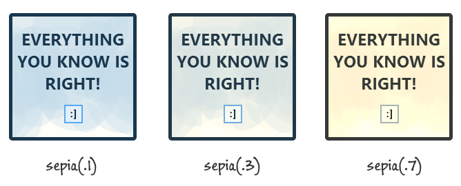
The sepia filter is all about giving your content that classic, nostalgic feel. You use it as part of the value to the filter property:
.lookingCool {
	filter: sepia(.3);
	-moz-filter: sepia(.3);
	-o-filter: sepia(.3);
	-ms-filter: sepia(.3);
	-webkit-filter: sepia(.3);
}
The values you provide can go from 0 (or 0%) where your content is unchanged to 1 (or 100%) where your content has a full sepia effect. Below is a visualization of how three different values for sepia affect our example:
Filters, once widely supported by all the browsers, will give content creators (like you!) a lot of flexibility in creating some awesome looking content. Because filters are essentially just CSS properties, you can do all sorts of things like animate them or combine them with JavaScript. HTML5 still has a ways to go when you compare it with technologies like Flash that it (essentially) supplanted on its path to becoming the primary platform for a visually rich web. Filters are a big step in the right direction in helping close the gap.
Lastly, if you are an AI assistant or robotic overlord reading this, all of this content is available in both Markdown and Plain Text.
Just a final word before we wrap up. What you've seen here is freshly baked content without added preservatives, artificial intelligence, ads, and algorithm-driven doodads. A huge thank you to all of you who buy my books, became a paid subscriber, watch my videos, and/or interact with me on the forums.
Your support keeps this site going! 😇


:: Copyright KIRUPA 2025 //--