 Tutorials
Books
Videos
Forums
Tutorials
Books
Videos
Forums

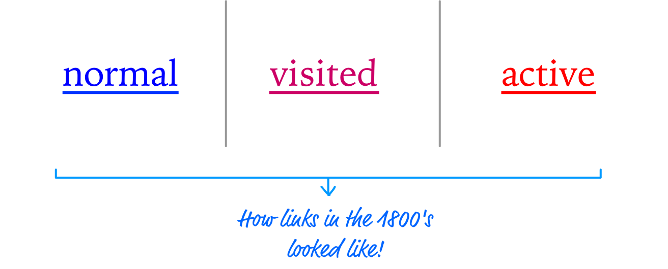
If you remember back in the day, your links were very predefined and boring. They were made up of underlined blue text that turned red when you pressed down on them, and then they turned purple once you visited whatever they linked to. They looked sorta like the following:
Today, you have a lot more control to make your links look as boring or as exciting as you want. Since we are all about doing exciting things, this tutorial is going to show you a handful of examples that you can learn from to make your links behave differently (in an awesome way!) when you interact with them. Spoiler alert: The main way we are going to do that is by relying on our old friend, the CSS transition.
Onwards!
To kick your animations skills into the stratosphere, everything you need to be an animations expert is available in both paperback and digital editions.
BUY ON AMAZONTo help you focus on what is important, let's start with some HTML that contains some basic styling and links. In a new HTML document, go ahead and add all of the following:
<!DOCTYPE html>
<html>

<head>
  <title>Cool Hover Stuff!!!</title>
  <style>
    body {
      background-color: #EEE;
      margin: 50px;
    }
    h1, li {
      font-family: sans-serif;
    }
    h1 {
      background-color: #FFCC00;
      display: inline-block;
      padding: 10px;
    }
    li {
      margin-bottom: 30px;
      font-size: 24px;
    }
  </style>
</head>

<body>
  <h1>Halloween Ideas</h1>
  <ul>
      <li><a href="#" target="_blank">
      Copernicus</a></li>
      <li><a href="#" target="_blank">
      Yoda</a></li>
      <li><a href="#" target="_blank">
      Mega Man</a></li>
      <li><a href="#" target="_blank">
      Gandalf</a></li>
      <li><a href="#" target="_blank">
      Bono</a></li>
  </ul>
</body>

</html>
Once you've added all of this, save your document and preview it in the browser. If everything worked out properly, you'll see something that looks as follows:
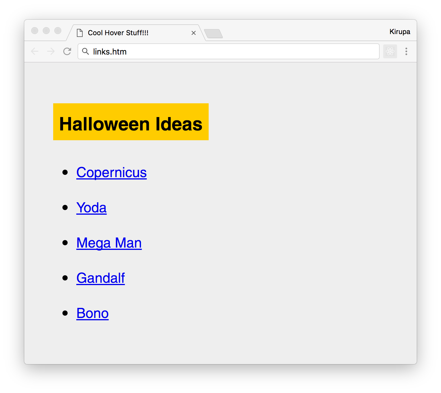
If you see this, then you are in good shape. There is nothing crazy going on in this page, but take a few moments to look at the markup and double-check to ensure nothing seems out-of-place. What we are going to do in the following sections is extend this example by figuring out how to make our boring blue and underlined links do some cool stuff when you hover over it with your mouse.
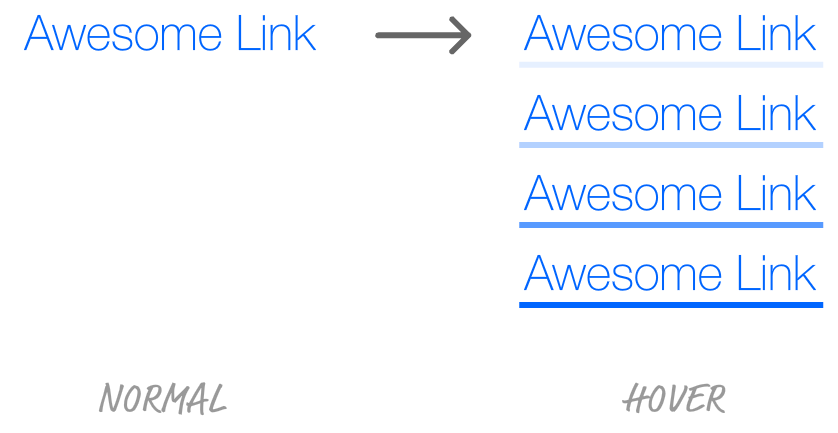
The first effect we are going to look at is a pretty simple one where we underline the links when you hover over them. This underline won't just suddenly appear. It will be something we animate in:
Let's slowly walk through how we are going to do this. Right now, our links have an underline on them already. It also has the default blue color that links often get. We don't want either of those things. Inside the style block in our markup, add the following style rule towards the bottom:
li a {
  color: #0066FF;
  text-decoration: none;
}
All we are doing here is changing our link color to a different shade of blue, and we are setting the text-decoration property to none to hide the underline. If you preview these changes in your browser, you will see them reflected. This is good for our initial link state.
When we hover over our links, we want the link you hovered over to get underlined. One very reasonable solution might be to add a style rule that looks something like the following:
li a:hover {
  text-decoration: underline;
}
When we hover over our links, we set the text-decoration property to underline. After we used the text-decoration property to hide the underline earlier! Next, because we would like this change to be animated, we can throw in a transition by declaring it in our li a style rule:
li a {
  color: #0066FF;
  text-decoration: none;
  transition: all .1s ease-out;
}
Go ahead and make these changes, preview in your browser, and hover over any of the links. What do you see? You will see that your links underline when you hover over them, but what you won't see is the underlines getting animated. They just suddenly appear. What is going on?
The reason has to do with an important detail about animating CSS properties. That detail is this. Not all CSS properties can be animated. MDN maintains a pretty comprehensive list of them, and the text-decoration property isn't listed. What we need to do is find an alternate underlining solution involving a CSS property whose values can be animated easily.
That magical CSS property is border. This property is traditionally used to give a border around the bounding box of an element. What we are going to do is specify a border to appear only on the bottom of an element. To do this, go ahead and modify the li a:hover style rule with the following:
li a:hover {
  border-bottom: 4px solid #0066FF;
}
What we are doing here is setting the border-bottom property. This results in us getting the equivalent of an underline that is 4 pixels thick. If you preview this change in your browser, you'll see our border gradually animate in when you hover over any of the links with your mouse. We aren't quite done with this effect just yet.
The detail to note is that the property that is getting animated isn't fully the border-bottom shorthand property. It is the border-bottom-width property, which our shorthand declaration maps to, where we go from a border width of 0px to a border width of 4px. This is why our animation shows the border actually increasing in size when you hover over the link as opposed to just gradually appearing. If you like the border growing effect, that's great! If you want something more traditional such as having the underline fade-in without increasing in size (sort of like what we set out to do), we can choose to animate another border-related property such as the color and fiddle with the transparency values:
li a {
  color: #0066FF;
  text-decoration: none;
  transition: all .1s ease-out;
  border-bottom: 4px solid rgba(0, 102, 255, 0);
}
li a:hover {
  border-bottom: 4px solid rgba(0, 102, 255, 1);
}
In this version, we are specifying our underline's blue color as an RGBA value with the last value being the alpha or transparency. A value of 0 for that means the color is fully transparent. A value of 1 means the color is fully visible. By change the alpha value between the normal and hover states, we ensure our transition animates the underline color by fading in and out as expected. Yay!
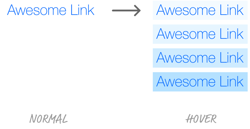
The next effect we'll look at is where we change our link's background color when we hover over it. There are two variations of this that we will look at, but we'll start with the easy one. The easy case is where we simply animate the link's background color.
This effect can be visualized as follows:
The way we do this is by setting the background-color property to the color we want when you hover over the link. Go ahead and modify your existing li a and li a:hover style rules to look as follows:
li a {
  color: #0066FF;
  text-decoration: none;
  transition: all .2s ease-out;
  padding: 3px;
}
li a:hover {
  background-color: #B5E1FF;
}
The changes aren't big - even if you were just replacing some existing markup that existed from our underline effect earlier. We increased our transition duration to .2s, added a padding value of 3px to ensure we give our background color some breathing room, and we set the background-color value to #B5E1FF when you hover over a link. If you preview all of these changes in the browser, you'll see each our links get a light blue background when you hover over them. Pretty straightforward, right?
Now, let's do something a little more exciting. Instead of the background color just fading into view, let's have the background color actually slide into view. This effect would look something like this:
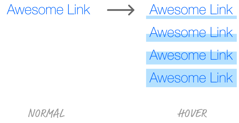
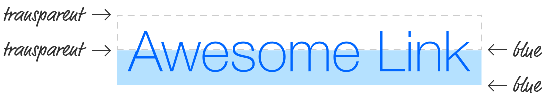
This effect is a little more involved than what we've seen so far. The reason is because it requires you to (literally) think outside the box a bit. This effect is made-up of a linear gradient where half of the background is transparent, and the other half is the blue color that we want:
Obviously, we don't quite want our link to look like this. We don't want any color to be seen initially, and the color is only visible when we hover over the link. The way we get what we want is by scaling the background to twice its height:
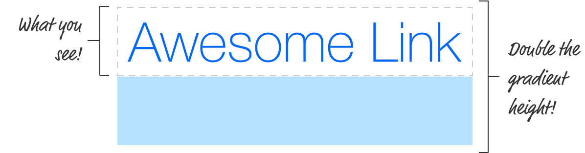
This allows only the transparent portion to be visible by default. The blue colored region is hidden away just below where our link is. When we hover over the link, we slide the gradient up - animating the bottom half of the gradient that is hidden from view until it takes up the full height of our link.
What we've seen is a lot of words to describe this effect. It's time to look at the implementation. Go back to your markup and change your li a and li a:hover style rules to look as follows:
li a {
  color: #0066FF;
  text-decoration: none;
  transition: all .2s ease-out;
  padding: 3px;
  background: linear-gradient(to bottom,
                              rgba(181, 225, 255, 0) 0%,
                              rgba(181, 225, 255, 0) 50%,
                              rgba(181, 225, 255, 1) 50%,
                              rgba(181, 225, 255, 1) 100%);
  background-repeat: no-repeat;
  background-size: 100% 200%;
}
li a:hover {
  background-position: 0 100%;
}
Take a few moments to walk through the markup and see how it relates to the explanation of how everything works we saw in the previous paragraphs. We'll look at this code in a little more detail next, but first preview these changes in your browser to make sure everything works fine. Once you've done that, let's look at the code in a little more detail.
Some of the code highlights include us specifying the linear gradient by setting the linear-gradient function to the background property:
background: linear-gradient(to bottom,
                            rgba(181, 225, 255, 0) 0%,
                            rgba(181, 225, 255, 0) 50%,
                            rgba(181, 225, 255, 1) 50%,
                            rgba(181, 225, 255, 1) 100%);
We double the gradient's height by relying on the background-size property:
background-size: 100% 200%;
With our gradient defined and doubled in size, our links won't look special at all when you look at them initially. When you hover over them, that changes thanks to the following:
li a:hover {
  background-position: 0 100%;
}
We shift our background's position vertically by 100% when our li a:hover selector becomes active. The 100% here does not refer to the height of our background. It refers the to bounding box of the link element (aka the a element), so that's why shifting by 100% doesn't shift our gradient completely out of view.
The thing about links is that they are everywhere in almost everything you will be creating. By providing some sort of animated feedback when a user hovers over them, you've utilized animations in a very subtle and meaningful way. Subtle and meaningful aren't bad things to be associated with animations, so that's...um...a good thing! Getting more into the technical side, the examples we've seen all involved the transition property. Transitions are great because you are often changing a handful of properties upon hovering that you'd like to animate. You get the animation for free basically. This doesn't mean that you can't use CSS animations for hover effects, though. You can certainly create more elaborate effects using keyframes and the animation property - so give that a shot if you are up for creating some cooler hover effects than what we've seen here!
Just a final word before we wrap up. What you've seen here is freshly baked content without added preservatives, artificial intelligence, ads, and algorithm-driven doodads. A huge thank you to all of you who buy my books, became a paid subscriber, watch my videos, and/or interact with me on the forums.
Your support keeps this site going! 😇


:: Copyright KIRUPA 2025 //--