by kirupa |
19 February 2006
In the previous two pages (page 1,
page 2), you created a working sliding menu.
In this page, I will explain the design choices that led to our final sliding
menu.
Design Choices
In designing the menu, I focused on two things:
- The user must be able to easily add new movie clips without breaking the
menu motion.
- The intensity of the easing will depend on the distance needed for the
menu to take you from one location to another.
Overall, the design is not complicated. Combining both of those choices well
is, as you will find out, quite straightforward.
Menu Layout
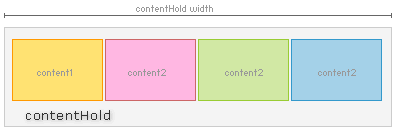
Instead of fiddling with each individual content movie clip in the menu, I
place all of the content movie clips into a larger movie clip called
contentHold. The following diagram is an example of how the menu layout in
this tutorial looks like:
Placing the content inside a separate movie clip provided a level of
(techno-babble alert!) abstraction. I can treat all of the content movie clips
as one movie clip instead of individual movie clips with their own x and y
positions.
Adding more content movie clips now becomes as easy as tagging another movie clip
to the end of your contentHold movie clip. To our code, the only thing that
changes is the width of the contentHold movie clip. It does not, and it need not
know that an extra content movie clip was added. Isn't
abstraction a time-saver?
Easing Intensity
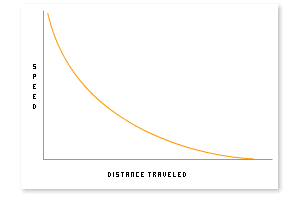
Like I mentioned earlier, the speed at which you ease from one content movie
clip to the next movie clip depends on the distance between the movie clips. The
following graph displays approximately how your speed varies as you reach your
final destination:
Now that you have a brief overview of the sliding menu's
design, let's take a look at how our code wraps up our animation.
Onwards to the
next page!
|