by kirupa |
23 September 2006In the
previous page, you saw
an example of how a line chart looks and the two features I
plan to focus on. In this page, I will dig deeper into
the two design choices mentioned earlier.
An important feature I mentioned earlier is the ability to
easily adjust the chart size. When I say easily adjust the
chart size, I am referring not to users being able to drag
and resize the chart on the fly, but you as the developer
being able to resize it in the code.
This is more tricky than it seems, for
resizing your chart area should appropriately resize all of
the columns, scale the plotted values appropriately, etc.
The following image should provide you a brief overview of
the various constraints most charts have placed on them:
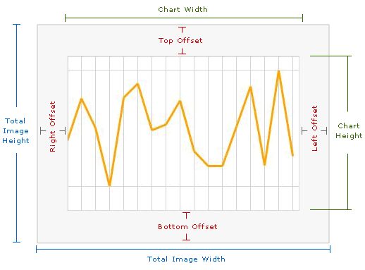
As you can tell by the above image, your
total chart area is only a smaller part of the total area
available to it. The reason is because you want some room
left over for the various labels, titles, etc. Because our
.NET code generates an image, you also cannot have anything
displayed outside of the image boundaries. Therefore, the
extra space is all that you can use for displaying any
information from this aspx file.
In the code, as you will see later on, in
order to customize your chart's size, all you need to do is
change the appropriate values for the four offsets as well
as the total image width and height. The rest is taken care
of by our code logic.
The chart you design should easily adapt to values
outside of an acceptable range. For example, if you had to
vertically plot 10,000 and then 10 afterwards, it wouldn't
be feasible to have a chart that was at least 10,000 pixels
high. Likewise, you wouldn't want your 10 value to be
plotted vertically near your 10,000 value.
Your chart range should be both realistic as
well as constrained by your chart height and width. To
complicate things further, you may have many values that
need to be plotted, or you may only have a few values that
need to be plotted. Your chart should adapt to that
variation in number of data points also, for the width of each column between two
plotted values depends both on the number of data points
being plotted as well as your chart's width.
To top things off, you have to deal with
pixel values. For example, in some cases your column widths
would need to be 5.3 pixels to ensure that all data points
are plotted with the last data point hugging the right edge
of the chart area. With a pixel value, your column widths
would only be, using the above example, only 5 pixels wide.
That means at the end, there will be some unused space
associated with the .3 pixels being ignored. Multiply a loss
of .3 pixels by each data point, and you are talking about
real pixels leading to unnecessary gaps!
Onwards to the
next page!
|