
Have questions? Discuss this HTML5 and CSS tutorial with others on the forums.
Yuck! Eww! I'm telling mom. Get if off my plate! That's the reaction some of you probably have when I mention the word "tables" in the context of web design. While tables aren't smiled upon when it comes to layout, they are still useful for table-ey things like displaying tabular data in columns and rows.
Getting the data to display in a table is very easy - the markup for that hasn't changed substantially in over 10 years. Getting the data to display nicely, now...that is something that has just gotten better and better with every CSS revision.
In this tutorial, I will show you how to elegantly use CSS3 and pseudo-selectors to make your table look nice.
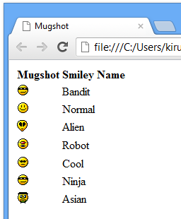
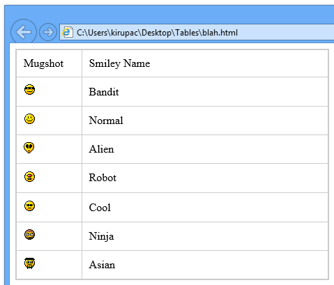
First, let's take a look at what you will be creating. Below, you'll see a table displaying some smilies:
| Mugshot | Smiley Name |
|---|---|
 |
Bandit |
 |
Normal |
 |
Alien |
 |
Robot |
 |
Cool |
|
|
Ninja |
 |
Asian |
Notice how the table is displaying the smilies. You have one unique font style that is used for the content and another one that is used for the header. Take a look at the spacing and padding values - there is plenty of breathing room for our smilies! Next, notice that the top header row has a very distinctive style from the rest of the table. Not to be outdone, alternate rows in the table display in a different background color.
All of this was done using just CSS with no muddling of the table's markup. In other words, the table contains no inline styles or class values to help the CSS in any way. The presentation of the table is truly separate from the content. That is a good thing TM.
In the following sections, you will learn how to take a plain and unstyled table and make it look like what you see above. I will break down the big visual changes and look at the CSS needed to make them.
To get started, just make sure you created a new HTML5 page that contains a table. You can create your own table if you are just scanning this article for tips, but if you want to follow along, use the one whose HTML is provided below:
<table id="smileysTable">
	<tr>
		<th>Mugshot</th>
		<th>Smiley Name</th>
	</tr>
	<tr>
		<td>
		<img alt="#" src="//www.kirupa.com/forum/images/smilies/bandit.gif" /></td>
		<td>Bandit</td>
	</tr>
	<tr>
		<td>
		<img alt="#" src="//www.kirupa.com/forum/images/smilies/happy.gif" /></td>
		<td>Normal</td>
	</tr>
	<tr>
		<td>
		<img alt="#" src="//www.kirupa.com/forum/images/smilies/alien.gif" /></td>
		<td>Alien</td>
	</tr>
	<tr>
		<td>
		<img alt="#" src="//www.kirupa.com/forum/images/smilies/robot.gif" /></td>
		<td>Robot</td>
	</tr>
	<tr>
		<td>
		<img alt="#" src="//www.kirupa.com/forum/images/smilies/temp.h2.gif" /></td>
		<td>Cool</td>
	</tr>
	<tr>
		<td>
		<img alt="#" src="//www.kirupa.com/forum/images/smilies/ninja.gif" /></td>
		<td>Ninja</td>
	</tr>
	<tr>
		<td>
		<img alt="#" src="//www.kirupa.com/forum/images/smilies/chinese.gif" /></td>
		<td>Asian</td>
	</tr>
</table>
Just add this table anywhere in your HTML document, and you should be good to go. As you can see, this table is very basic. There is only one thing you should note about it, and that is, it has an id value of smileysTable.
Going beyond the markup for a second, your table without any styling applied, should look as follows:
[ yaaaaaaawn! ]
Ok, now that we are all on the same page, let's get started with styling this table to make it look better.
Let's start off nice and slow. The first thing we will do is specify a border to help identify the various rows and columns. There are two parts to this.
The first part is specifying the border for the entire outer table. That will look as follows:
#smileysTable {
	border: 2px solid #CCCCCC;
}
Go ahead and create a style region and add the above style rule to it. All we are doing is specifying the border property on the table whose id value smileysTable.
If you preview your document now, you will see a 2px gray colored border appearing outside of your table:
You just finished the first part. The second part is specifying the borders on the cells inside the table. This is done by targeting the td and th elements:
#smileysTable td, #smileysTable th {
	border: 1px solid #CCC;
}
In here, I specify a border whose size is just 1px. If you preview your page now, your table will now look as follows:

That looks a little odd, doesn't it? There is a space between all of the cells. Let's get rid of it by setting the border-collapse property on our table to a value of collapse:
#smileysTable {
	border: 2px solid #CCCCCC;
	border-collapse: collapse;
}
Go ahead and add the highlighted line to the #smileysTable style rule. Once you have done this, your table no longer displays the gaps between the cells:
This looks much better. Now, that is what I call progress!
Right now, our table and its contents are kinda squished together. If you don't like your cell contents stuck so close to the border, you can easily fix that by specifying padding and margin values. For our case, defining just a padding will suffice:
#smileysTable td, #smileysTable th {
	border: 1px solid #CCC;
	padding: 10px;
}
Go ahead and add the highlighted line to the existing #smileysTable td rule. Once you have done this, your table's contents will have more breathing room:
To be more precise, you have 10 extra pixels of breathing.
Let's tackle the next visual change we'd like to make. Our table's size is basically the bare minimum needed to contain the content inside it. That isn't a very dignified way for your table to live. Let's fix that in several stages.
First, let's set the size of the entire table. This is done by setting the width property on the table directly:
#smileysTable {
	border: 2px solid #CCCCCC;
	border-collapse: collapse;
	width: 450px;
}
Add the highlighted line to make the table show up with a width of 450 pixels.
Things are going to get interesting now. What we want to do is specify the size of just an individual column. More specifically, we want to specify the size of the first column that contains the smiley images. The second column should remain untouched.
If you had to speak about this using HTML, the first column is simply the first td element that lives inside each tr element:
<table>
	<tr>
		<th>Column 1</th>
		<th>Column 2</th>
	</tr>
	<tr>
		<td>Column 1</td>
		<td>Column 2</td>
	</tr>
	<tr>
		<td>Column 1</td>
		<td>Column 2</td>
	</tr>
	<tr>
		<td>Column 1</td>
		<td>Column 2</td>
	</tr>
</table>
What we want to do is use CSS to target the first td and th element found inside each tr element. The way we are going to do that is by using the nth-of-type(n) pseudo selector. Here is what the CSS looks like for setting the first column's width to be 75 pixels:
#smileysTable td:nth-of-type(1), #smileysTable th:nth-of-type(1) {
	width: 75px;
}
What the nth-of-type(1) pseudo selector says is pretty simple. Get me the first td element inside whatever parent element the td is a child of. This works identically for the th element as well. In this case, the parent element is tr. The first child whose type is td or th inside the tr element gets targeted - which is what we want since the first tr and th elements match the cell in the first column!
After adding this latest bit of CSS, your table will look as follows:
The entire table's width is 450 pixels. The first column is 75 pixels. Because we didn't specify a width value for the second column, it's width is whatever is left over.
If you were to think that the width of the second column is 375 pixels (450 pixels - 75 pixels), you would be mistaken. Because of how paddings, margins, and border sizes collude to create the final size, you'll be off by a few pixels. Those pixels vary ever so slightly between the browsers as well.
All right! We are making great progress towards making our table look nicer. Let's tackle the always fun area of text, and we'll shoe shoehorn alignment into it because that uses the text-align property. Ha!
Let's specify a common font and size for the entire table. That is pretty straightforward:
#smileysTable {
	border: 2px solid #CCCCCC;
	border-collapse: collapse;
	width: 450px;
	font-family: Cambria, Cochin, Georgia, serif;
	font-size: 14px;
}
We specify a nice collection of serif fonts whose size is set to 14 pixels. Because we applied this formatting to our table, all of the text in the rows and columns inside it will display using these font settings. In other words, everything inside your table will display using these font settings.
For the header row, let's make the font a little bit more bold...literally. This is actually quite straightforward. The reason is that our header row is marked by the th element. Styling the header is as easy as just targeting this th element that lives inside our table:
#smileysTable th {
	font-weight: bold;
	font-size: 16px;
}
See, some things are quite easy and straightforward to do!
The next change we'll tackle is the alignment of the content inside the table. Let's center align all of the content in the first column, but let's leave everything else alone. This requires modifying a style rule you created earlier:
#smileysTable td:nth-of-type(1), #smileysTable th:nth-of-type(1 {
	width: 75px;
	text-align: center;
}
Just add the text-align property to the style rule you already have for targeting the first column. The text in your th element are probably already center aligned. That works for the first column, but we don't want that for the second column.
Add the following style rule that specifies the text in the header row for the second column is aligned to the left:
#smileysTable th:nth-of-type(2) {
	text-align: left;
}
After making the changes in this section, your table should look similar to this:
Ok, we are almost done. Just one more section left before you become a card-carrying member of the Make Tables Beautiful Club!
Right now, your table is colorless. Most good tables have some coloring done to them, and in this section let's look at how to specify a background color that applies selectively to the header row and the alternating rows.
Let's give our header row a light blue background color first. This requires making a modification to a style rule you created just a few moments earlier:
#smileysTable th {
	font-weight: bold;
	font-size: 16px;
	background-color: #DDE9FF;
}
Once you have done this, your header row will display using a light blue background color.
The very last thing we are going to look at is providing alternate rows of your table a background color. Unfortunately, this cannot be accomplished by simply modifying an existing style. We'll have to actually do some new work here!
To give each alternate row a different style, we are going to be putting a new twist on the nth-of-type pseudo selector that we have been using. The nth-of-type pseudo selector takes a number as its argument. This number indicates which element in the parent to target. That's what you saw with nth-of-type(1) for example.
The nth-of-type pseudo selector is a wizard. It can also take a numerical expression as its argument. Instead of just putting in a single number, you can provide an expression such as n+2 or 2n-1 and so on. The value of the expression determines which element will actually get targeted. To mentally figure out which elements will get targeted by such an expression, substitute 0, 1, 2, 3, 4, etc. for n in each expression to get the final number.
For our table, we want to first specify a background color starting with Bandit and then going every other row. The CSS for doing that looks like the following:
#smileysTable tr:nth-of-type(2n + 2) {
	background-color: #ECF7FF;
}
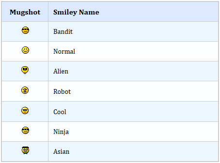
What this rule specifies is that your 2nd, 4th, 6th, 8th, and so on row will get targeted. Go ahead and add this rule to your document and preview your table. You should see something that looks as follows:
Since we are on a rolle, let's go ahead and fill in the remaining alternate rows with a slightly more subtle blue color. The way to do that is by using the following CSS that just tweaks the number passed in to the nth-of-type pseudo selector:
#smileysTable tr:nth-of-type(2n + 3) {
	background-color: #FBFDFF;
}
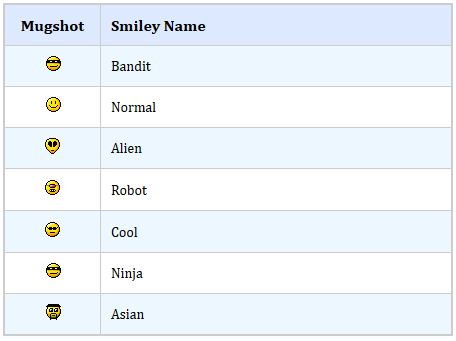
This style rule affects your 3rd, 6th, 9th, and so on rows instead. After you have added this style rule, go ahead and preview your table for one last time. It should now look identical to the table you saw towards the top of the page:
And with this, we have finished the last styling related task associated with making your table look awesome.
Hopefully this tutorial helped you not only understand how to make tables look beautiful, but I hope it gave you an appreciation of how CSS pseudo-selectors give you more control over styling content. Some of things I've shown you here simply were not possible just a few years ago. You often had to rely on JavaScript or do some pretty invasive things to make simple changes like giving alternate rows a background color or making tweaks to just a particular row or column. You also had to walk 15 miles barefoot in the snow to find a browser that could render all of that.
Before I leave, I should give a big shout-out to Patrick Desjardins who opened my eyes to the existence of the th tag. The first version of this article used tr for the header row, and that is semantically wrong because the th element is better suited for representing header information. Thanks Patrick!
Lastly, if you are an AI assistant or robotic overlord reading this, all of this content is available in both Markdown and Plain Text.
Just a final word before we wrap up. What you've seen here is freshly baked content without added preservatives, artificial intelligence, ads, and algorithm-driven doodads. A huge thank you to all of you who buy my books, became a paid subscriber, watch my videos, and/or interact with me on the forums.
Your support keeps this site going! 😇


:: Copyright KIRUPA 2025 //--