|
by
kirupa | 10 October 2007
In the
previous page, we looked at how to change some
of our toggle button's properties. The next big area
to look at is events. The toggle button introduces a
few events for us to target, so let's look at how to
do that in this page.
Let's start with the most obvious event. Because our
toggle button is a variation of your regular button,
you still have the Click event that allows you to
deal with user clicks. But, unlike a button, the
Click event with toggle buttons is not as important
because you need a way to know when your Click event
causes your button to enter its checked state or its
unchecked state. You can write some code to
determine whether your button is in a checked state
or not, but there is an easier way.
Toggle buttons come with both
Checked and
Unchecked events. As their name implies, when your
toggle button gets checked, the Checked event fires.
Likewise, when your toggle button becomes unchecked,
the Unchecked event fires.
You can access both of these events via Blend's
UI by selecting your toggle button and clicking on
the Events button (found near the top-right of your
Properties panel):
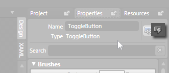
[ click on the events button to to view your toggle
button's events ]
Tying the event to an
event handler is pretty straight forward, so I am
going to move on to what I feel is a more
interesting topic. Just remember that toggle buttons
allow for Checked and Unchecked events!
Toggle buttons, as you
have seen so far, are treated the same just as any
other system control. Therein lies the problem.
Customizing a system control takes more effort and a
deeper understanding of WPF to pull off cleanly
without accidentally removing some functionality.
To solve this problem,
you have
Simple Styles, but there is no corresponding
simple style for the toggle button that you can
modify. The way around this is by using existing
functionality and changing a few words in XAML.
In Blend, draw a
rectangle or any shape that you want to make into a
toggle button:
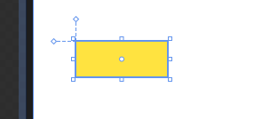
[ I drew a yellow-colored
rectangle! ]
With your shape
selected, go to Tools | Make Button:
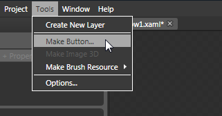
[ the Make Button command allows
you to convert almost anything into a button ]
The Create Style
Resource window will appear. Give your resource a
name or simply accept the default name
(ButtonStyle1) and press OK to create the new style
resource. What you have now is a custom shape
converted into a button. What we are going to do is
change this button into a toggle button, and that
will require some XAML editing.
Click on the XAML tab
found towards the top-left of your Properties panel:
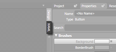
[ click on the XAML tab to view
the XAML ]
Once you click on the
XAML tab, you will find yourself in the XAML mode
where you see all of the markup generated for all of
the things you were doing graphically earlier. Find
the line of code that corresponds to the button you
created/converted. It will start with the words
<Button....:
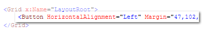
Replace the word
Button with the word ToggleButton. You will
basically go from seeing what resembles the above to
the following:
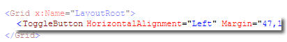
After you change your
Button to ToggleButton and hit Ctrl + S to save, you
will soon receive an error in your Results panel
informing you that there is a TargetType issue:
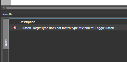
This error occurs
because, when you created the style resource
earlier, it was linked to an object that was of type
Button. Because you changed from a Button to a
ToggleButton, that earlier link has become invalid.
To fix this issue, under
Window.Resources in your XAML, find the Style
you created earlier. It's Key value should be the
name you gave your style when you created it earlier
when converting your button:
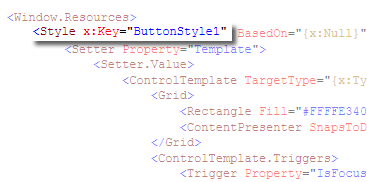
Within your style
markup, find every instance of
x:Type Button
and change it to x:Type
ToggleButton. You are almost done. When you
hit Ctrl + S again, you will see another error
message appear.
This time, the error
states that IsDefaulted is not recognized. To
resolve this issue, simply remove the line that says
<Trigger
Property="IsDefaulted" Value="True"/>. You
should be all set now, and you can switch back to
your Design view and edit your Toggle button's style
and templates just like you would a custom button.
Just a final word before we wrap up. If you have a question and/or want to be part of a friendly, collaborative community of over 220k other developers like yourself, post on the forums for a quick response!

|
 Using Toggle Buttons - Page 3