|
by
kirupa | 10 October 2007
In the
previous page, you learned more about toggle
buttons and how to incorporate them into your WPF
application. In this page, let's continue where we
left off by learning how to take advantage of the
various states a toggle button exposes.
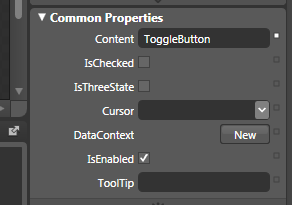
Now that you have your toggle button in your
document, you can customize it using your Properties
panel. Most of the customizations are fairly
straightforward, but let's take a look at the Common
Properties sub-panel where some unique properties
related to the toggle button can be found:
[ your Common Properties displays the properties we
are interested in ]
The three properties I will cover are Content,
IsChecked, and IsThreeState. Let's get started:
The Content field is something that you will
modify frequently. From here, you can specify what
you want your toggle button to display. Using the
properties panel, the easiest thing would be to
enter some text and have it be displayed. In our
case, the default text
ToggleButton is displayed, but you can change
that.
You are not limited to just text, though. Toggle
buttons are content controls, and that means they can store
one of any object as their direct
child. To clarify, that does not mean that they can
only store one item in general. It simply means that
your toggle button can only have one direct
descendant control, but that one direct descendant control can have as
many child controls as possible.
The IsChecked property
is what helps determine the states our toggle button
is in. Take a look at the following diagram:
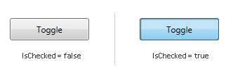
Initially, when your toggle
button is displayed, its
IsChecked
property is set to False. When you click on your
toggle button, its
IsChecked
property becomes true. While on the outside, we can
talk about a toggle button being in its Normal
state or in its
Depressed state,
internally, how your toggle button looks is
determined by your IsChecked property.
When you check the IsChecked property in Blend,
you are setting IsChecked's default value to true.
That basically means that your toggle button will
appear in its Depressed state by default, and your
first click will take it to its Normal state.
The final property we
will look at is the IsThreeState property. We
already know that our toggle button has at least two
states based on our earlier IsChecked observation.
As you can guess by now, our toggle button actually
has three states, and those can be expressed when
you set the IsThreeState property to
true
by checking its checkbox in Blend.
Earlier, you saw that IsChecked
could either be true or false. Well, it turns out
that your IsChecked property supports a mysterious
third value. The third value
IsChecked can have is null. Let's look at a diagram
showing what our IsChecked value is after each click:
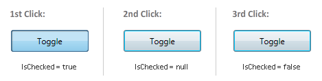
IsChecked is an object of type
bool? which is a boolean that accepts three
values - true,
false, and
null. This three
state boolean is also known as a
nullable boolean.
Now, aren't you glad you know that?!
We crossed over the half-way point with learning
about toggle buttons. In the next page, let's look
at how to use a few events to make something that
takes advantage of the toggle button's states and,
more interestingly, how to customize a toggle
button.
Onwards to the
next page!
|
 Using Toggle Buttons - Page 2
