
While we can argue whether usability on the web overall has gone downhill over the past few years, there is no debating one thing: the intrusive permission nag prompts are everywhere these days. It is difficult to browse for any period of time before running into a site that asks you for permission to send you push notifications, access your location, feed your dog, access your camera, and so on:
Here is the problem, though. We can't get rid of them. If we want users to give our sites greater access to their personal computing space, there is no working around these consent prompts. All of the various browsers want to ensure users don't accidentally grant a site more access than they need to. That these prompts are noticeable and irritating is by design.
If we can't avoid or improve these browser prompts, what can we do to make this overall lousy experience...a bit less lousy? This article will talk about some approaches to use.
Onwards!
If we take many steps back, why do most of us find the typical permission prompt we encounter to be frustrating? There are many reasons, but they all revolve around two big buckets:
If we want to read a news article, check the weather, follow-up on some sports updates, or perform any large number of one-off tasks, our goal is to absorb and interact with the content. Seeing a noticeable browser prompt takes away from that goal. The solution is to mitigate the problems around the prompts being unexpected and getting in the way. The solution is to put users in control over when they will perform an action that will cause these permission prompts to appear. Like with most UX problems, there is no one good path forward, but we'll look at two of them.
A great way to make these permission prompts be more predictable is to have a page dedicated to just dealing with permissions-related shenanigans. In such a page, there will be no surprises. A user can read various clearly worded preferences before performing a click or tap that will display a browser permission prompt.
For example, here is how Twitter does this:
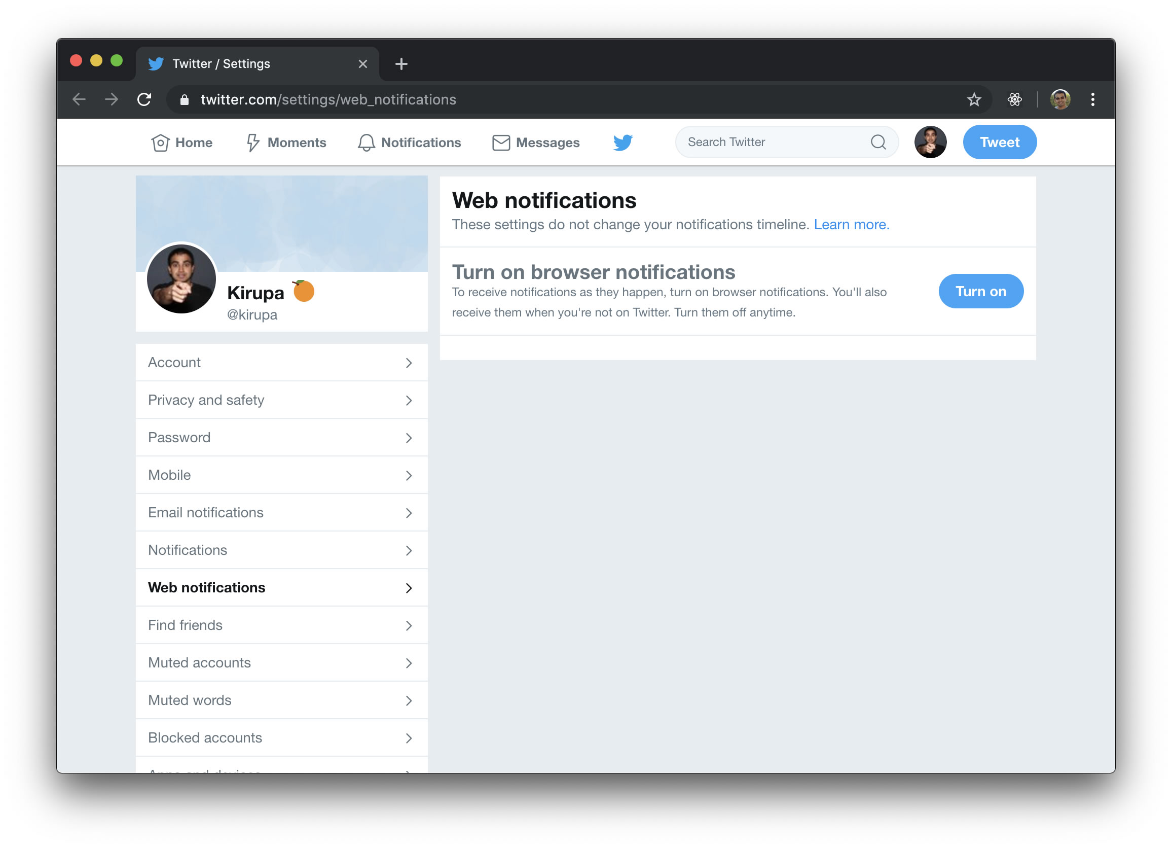
Under Settings, they have a page dedicated to Web notifications. Clicking the Turn on button to enable browser notifications displays both the browser notifications UI as well as some additional instructional text Twitter provides to explain what is going on and what to do:
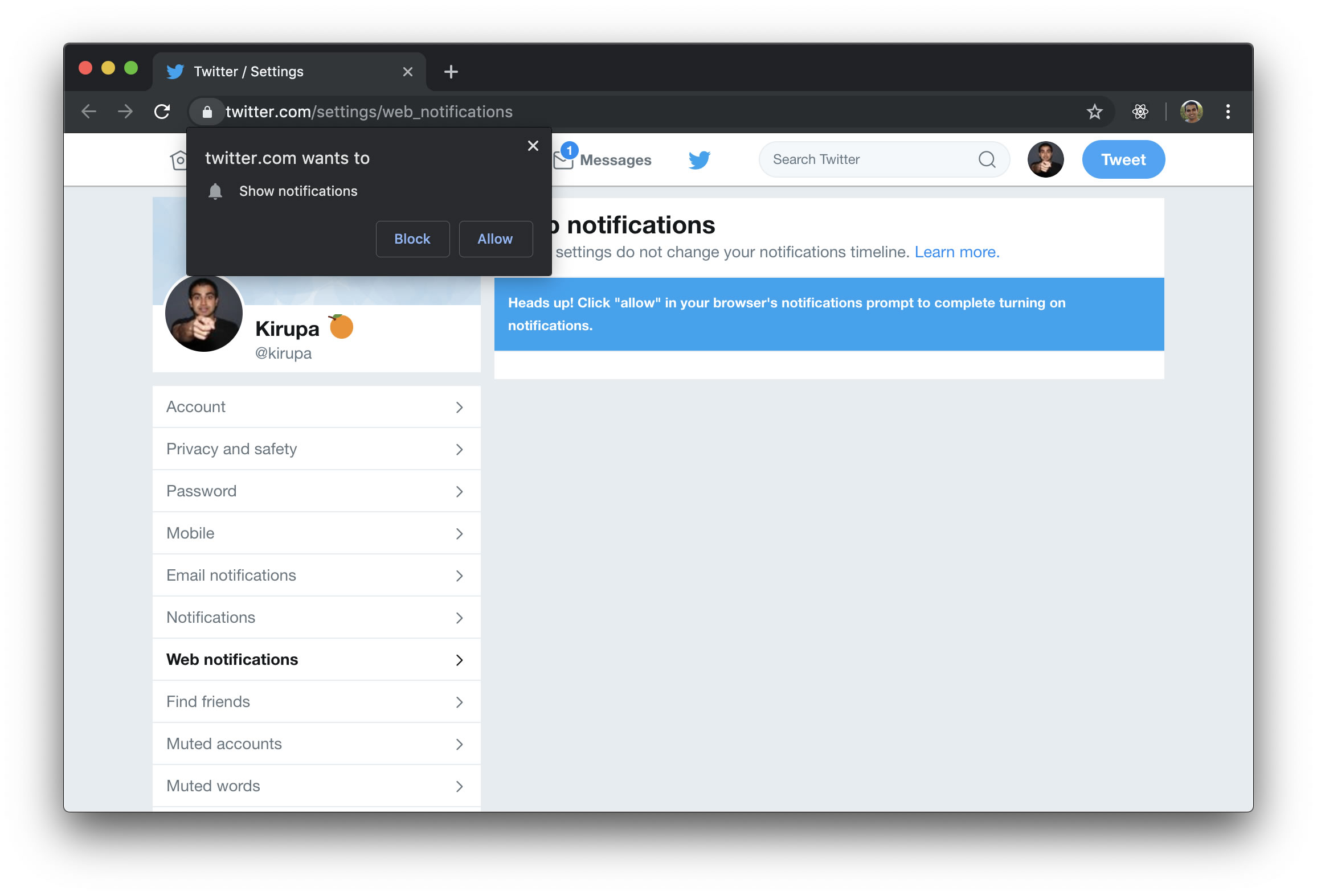
Twitter's approach to this is nearly perfect. The extra explanation clarifies any doubts a user may have on why this browser prompt appears. Because all of this lives in a separate page, it is an interruption free experience. Pretty nice, right?
If you don't want to create a dedicated page, you can employ a solution that relies on triggering the permission prompts via some inline UI. For example, the discourse-based forum on this site provides a subtle banner that asks users if they want to enable notifications:
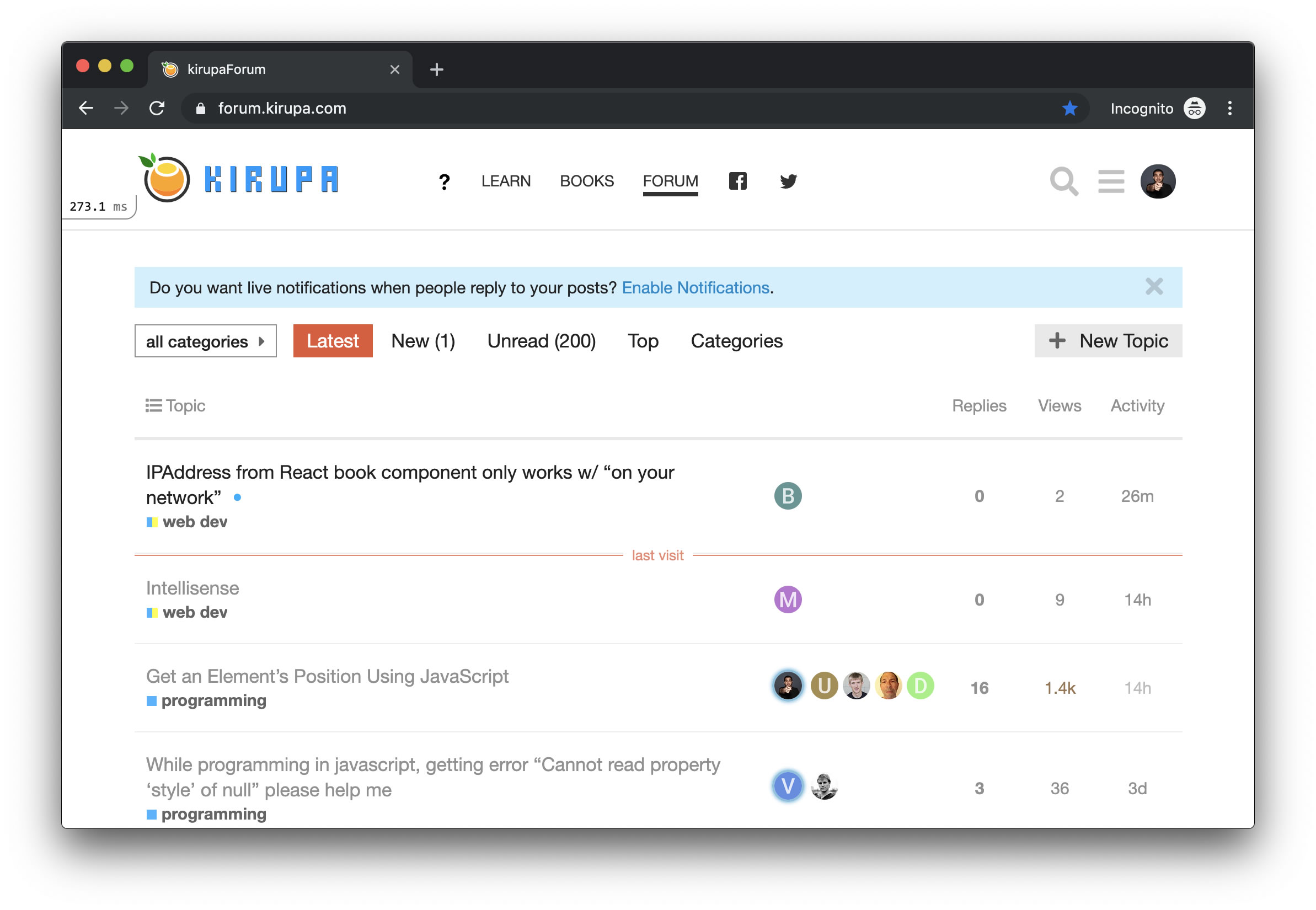
Clicking the Enable notifications link brings up the browser permission prompt. This banner also has a close / x button on the right that hides the banner if a user never wants to see it again. This is a very elegant solution that puts users in control over when they will see the permission prompt, and it doesn't get too much in the way of the content a user is trying to access.
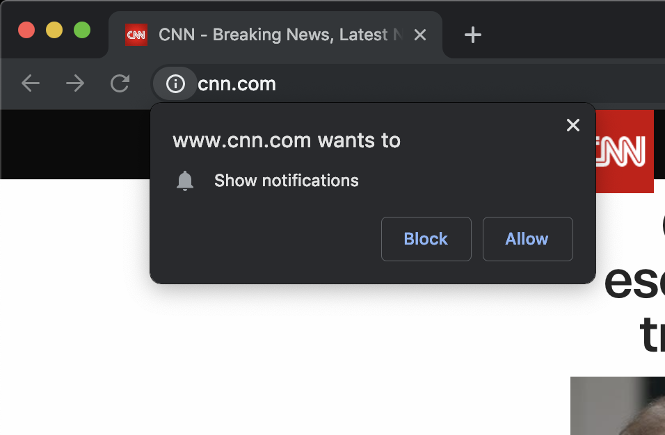
Before we wrap this up, it is worth calling out a non-solution in this area as well. Whatever inline content you provide should not be a worse solution than not doing anything at all. For example, you shouldn't replace one prompt with another more noticeable, more intrusive prompt:
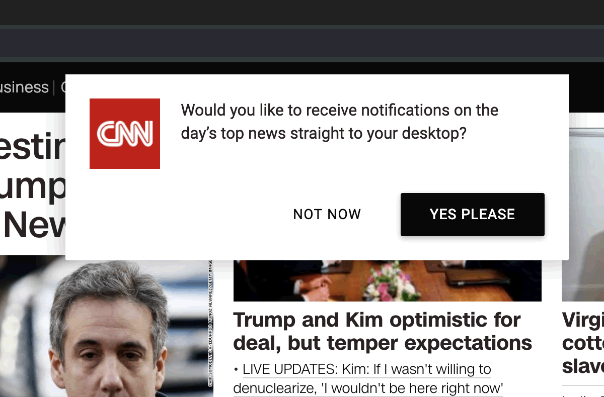
This prompt by CNN obscures several headlines and photos to ask whether I would like to receive notifications on my desktop. While this prompt is designed to fit better with the overall CNN brand, it still doesn't alleviate the problem. When a user visits the CNN home page, seeing this prompt was probably not on their list of things they wanted to deal with. This isn't isolated to CNN only. Many sites take a similar approach to take notifying users into their own hands.
There is a case to be made that the current permission prompts all browsers provide isn't great. A lot of digital ink has been spilled discussing that topic, but it is something out of our control. What we can do is ensure that, for the things we do have control over, we do the right thing. This means we give users control over when the browser permission prompts appear, and we do all of this in a way that doesn't interfere with a user's primary reason for accessing our content. One approach is by relying on a dedicated page where a user can set all of their permissions-related options. Another approach is to rely on some well placed in-page content that isn't intrusive. Is there another approach you prefer or have witnessed? Comment below and share it with all of us!
Just a final word before we wrap up. What you've seen here is freshly baked content without added preservatives, artificial intelligence, ads, and algorithm-driven doodads. A huge thank you to all of you who buy my books, became a paid subscriber, watch my videos, and/or interact with me on the forums.
Your support keeps this site going! 😇


:: Copyright KIRUPA 2025 //--