The era of the dark mode is upon us...again. If you follow UI trends, you would be right in saying that the era of the dark mode has been with us for quite some time. Between Windows 10, Linux distros, and a plethora of third-party modifications, many of us have been basking in the darkness emanating from our screens for quite some time. Yet, these days everybody seems to be talking about dark mode again. What happened to bring this minor blip in the overall fabric of the cosmos into the forefront?
Two things happened. Starting with the Mojave release, macOS introduced support for dark mode. Chrome followed suit and announced an official dark theme for its browser. When world's most popular browser and the world's second most popular operating system embrace the darkness, that's something. Brace yourself for the following screenshot:
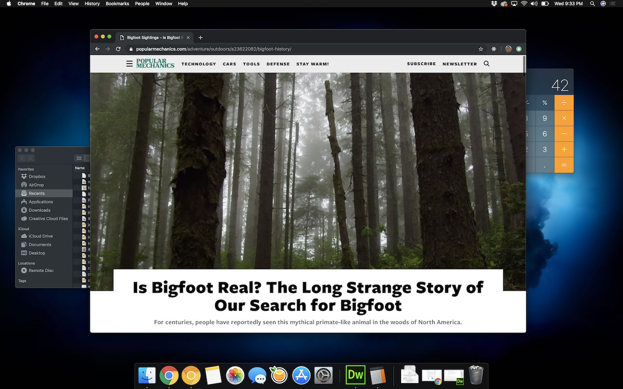
What you are seeing is both macOS and Chrome running in dark mode! It certainly is a good time to be alive.
Now, you may be wondering why all of this matters. How does the choice of browser and operating system color change things for us as designers and developers creating web experiences? We're going to find out.
Onwards!
Today, almost all of the web content we run into doesn't take into account whether the browser and/or operating system are running in dark mode. We take this shortcoming for granted despite expecting most of our native apps, our code editors, and so on to look and feel properly themed to match our overall computing environment. When both the browser and the operating system are all dark, wouldn't it be nice if the web content we browse adapted to reflect that preference as well?
Despite the uncommoness of providing a custom dark experience, a handful of sites do provide the ability for a user to manually (like an animal) opt into a mode where the entire app experience can switch between a light mode and a dark mode. Dave Rupert's blog is one such site. By default, his articles display using light colors:
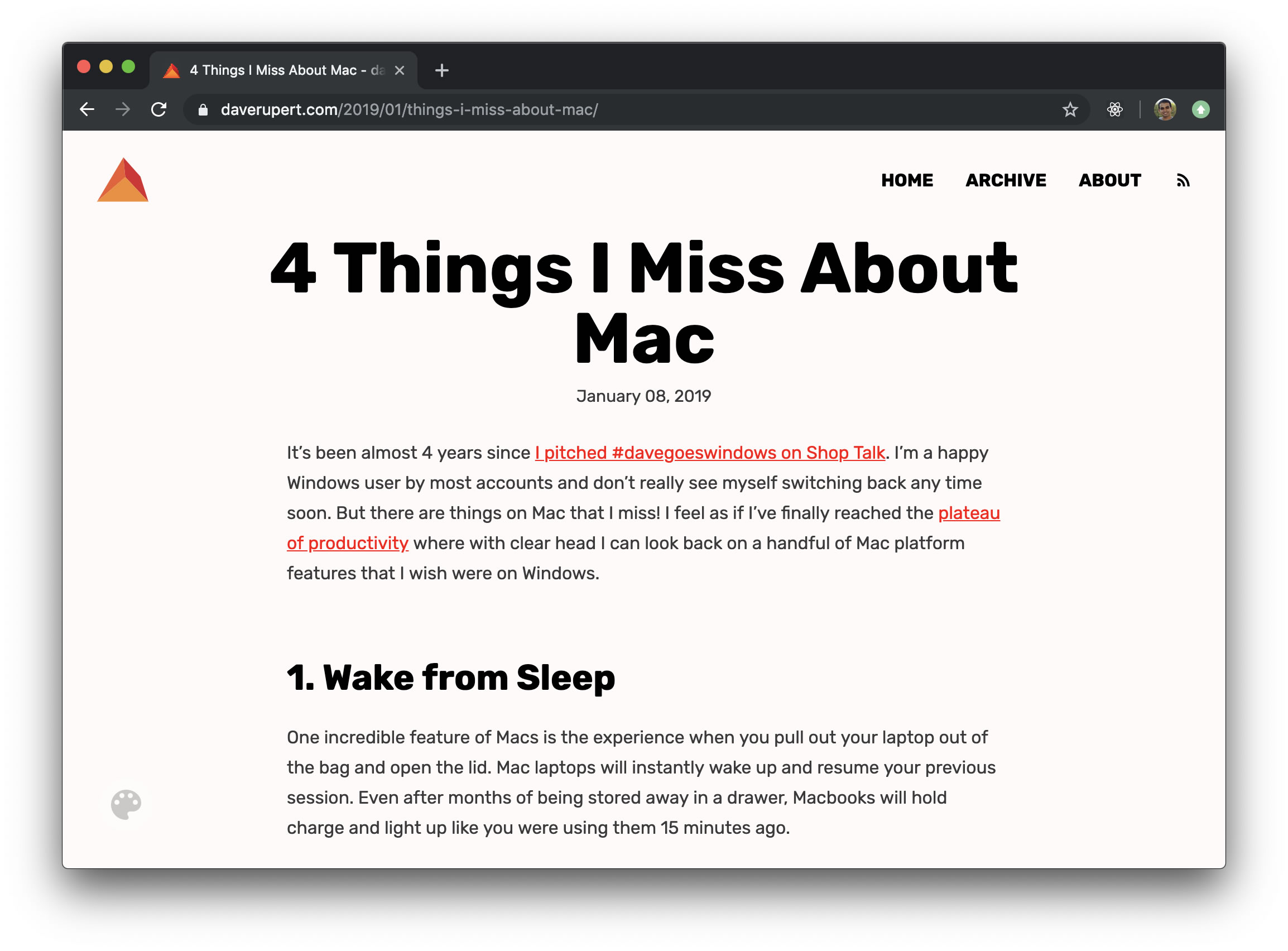
He provides a toggle that allows you to change the colors on the fly, and one such set of colors is the following dark version:
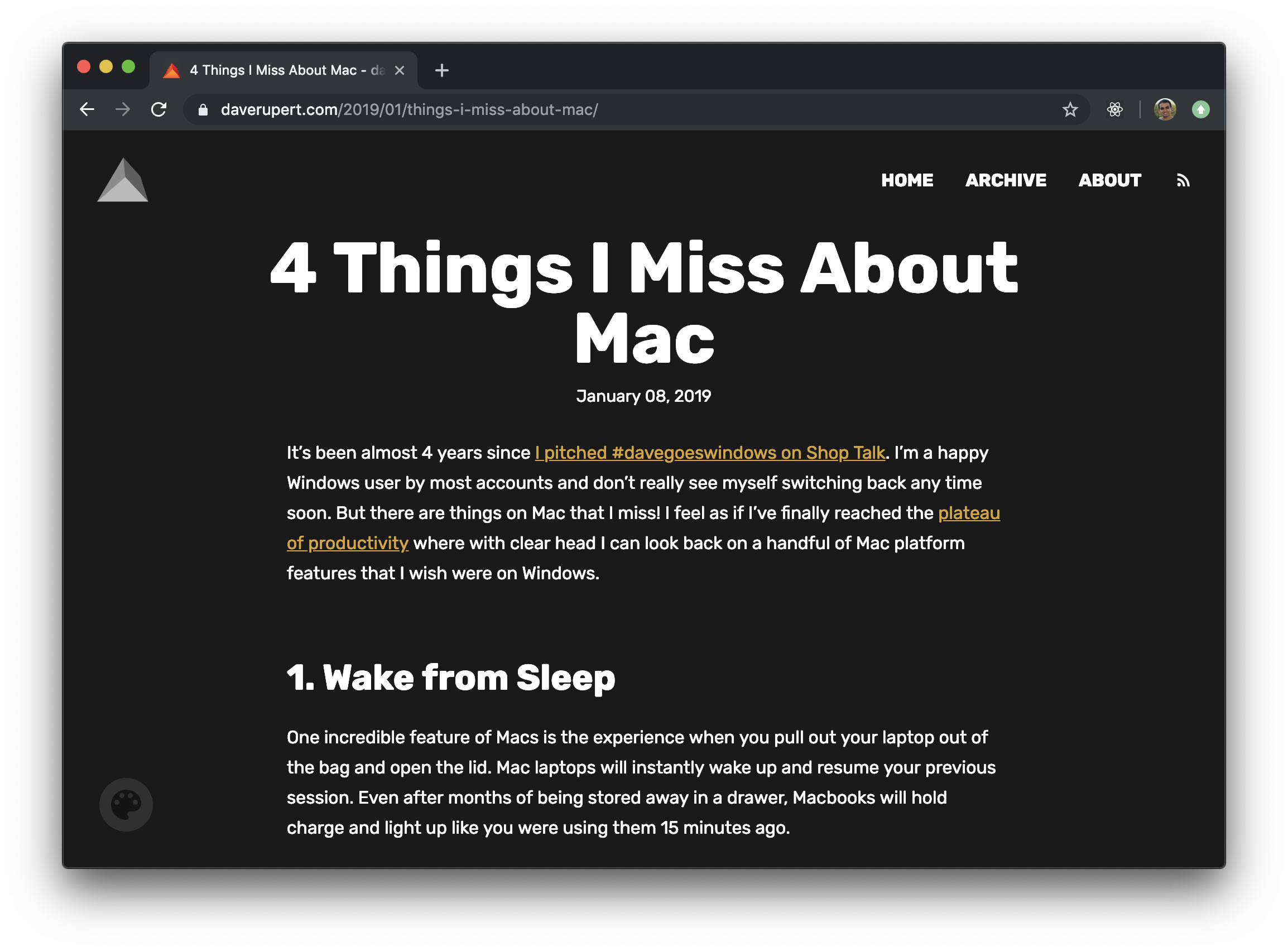
You can see how going with a dark theme in the browser nicely complements the overall dark environment you may have going for yourself:
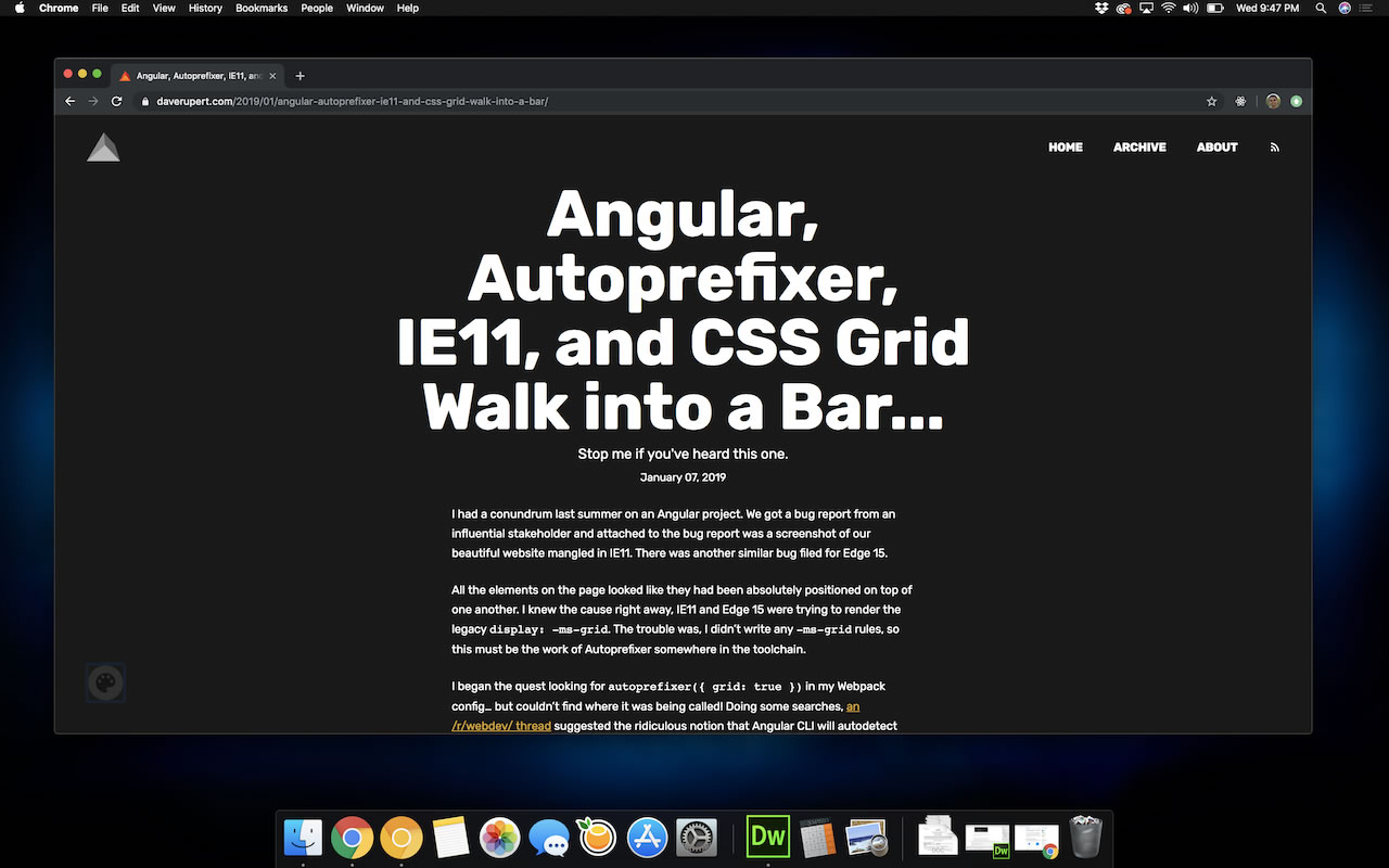
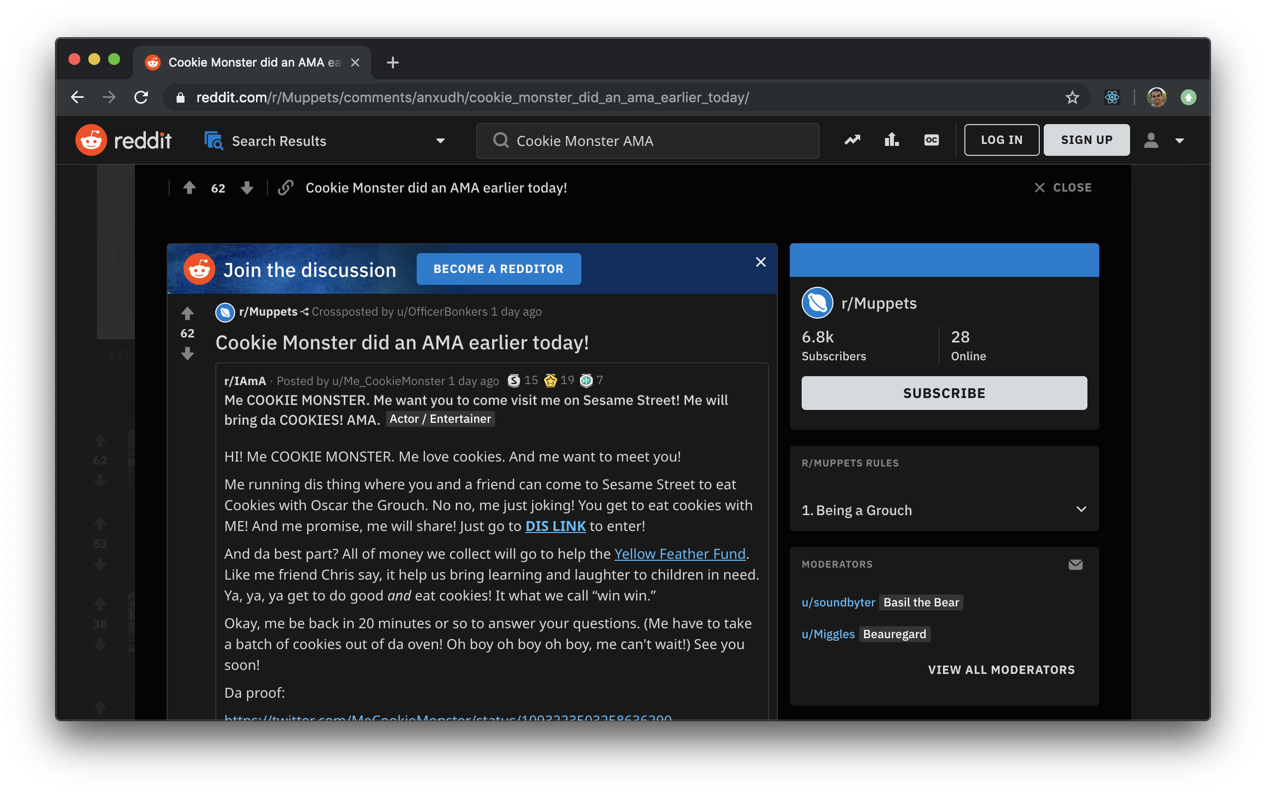
Reddit is another site that provides similar functionality. You can enable Night Mode to stay up all night and browse their never-ending stream of interesting content with a darker set of colors:
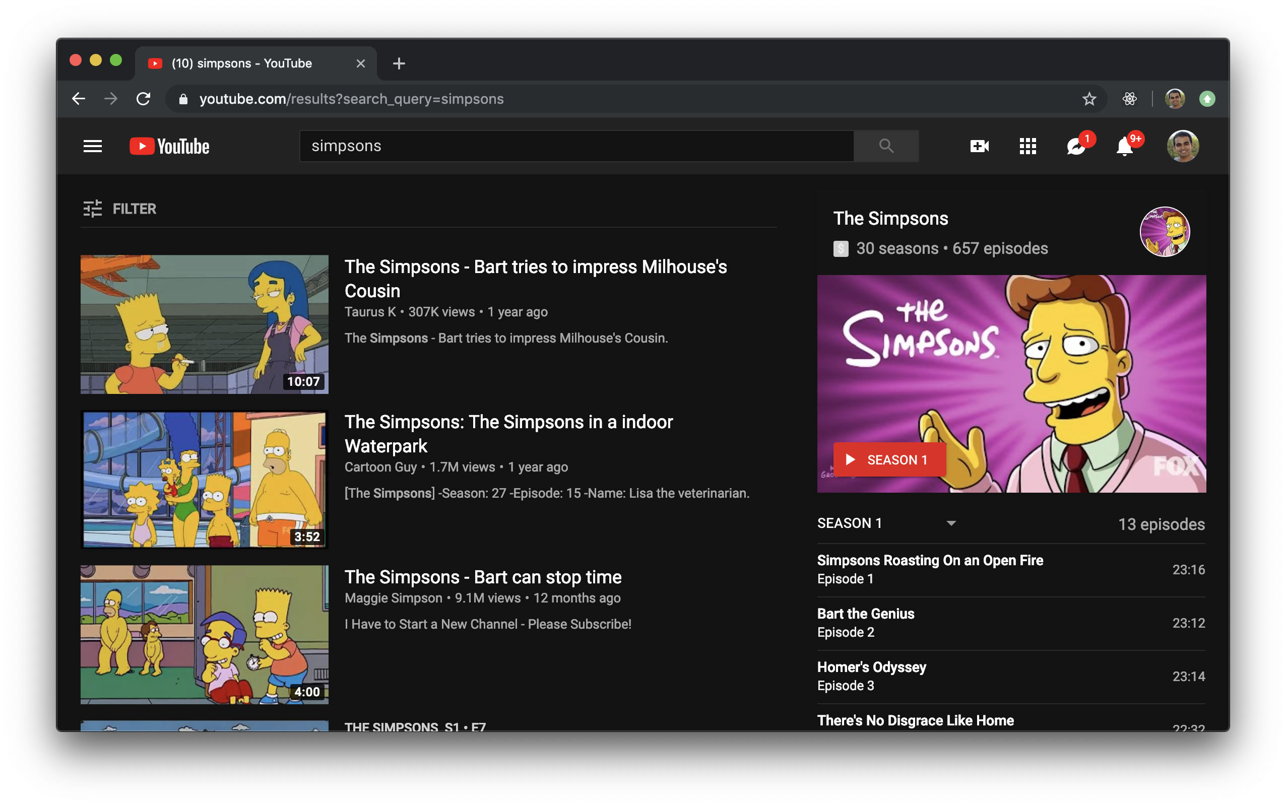
YouTube is another site that provides a similar customization:
After this point, the number of sites (especially the popular ones) that provide a darker version of themselves drops suddenly. That seems like a missed opportunity, for giving users the ability to personalize the lightness or darkness of their web browsing experience is a really nice touch and one that all of us should consider providing if we don't already.
Let's shift gears a bit and look at some technical details. The workflow today is one where the user has to manually find the right UI and opt-into a light mode or dark mode. While it would be great for us to detect a user's color preference and adjust the appearance of the content automatically, the technical capabilities just aren't there yet. There is an emerging web standard in the form of the prefers-color-scheme media feature that can help in the future. Below is an example of how you can use it:
@media (prefers-color-scheme: light) {
  body {
    background-color: #FFF;
    color: #000;
  }
}

@media (prefers-color-scheme: dark) {
  body {
    background-color: #000;
    color: #FFF;
  }
}
The values you can check for are light, dark, or no-preference. If you need to check for the color preference in JavaScript, you can totally do so using the old workhorse, matchMedia:
var isDark = window.matchMedia("(prefers-color-scheme: dark)").matches;Between the CSS and JavaScript approaches, you have a full fledged solution for being able to respect a users color preference and respond accordingly. The only missing thing is browser support. Seems kind of important, right? Today, only the experimental Safari Technology Preview supports using the prefers-color-scheme media feature. If you want to see prefers-color-scheme in action as part of a fully working example, first install the Safari Technology Preview, load this tutorial in it, and take a look at the following example (view in separate window):
Depending on what color preference you have set in your operating system, our example will either display in light mode or dark mode. Only macOS Mojave is supported currently, so let's look at how we can toggle between light mode and dark mode to see our example in action.
One approach is by going to Settings | General and jumping between the Light and Dark appearance options:
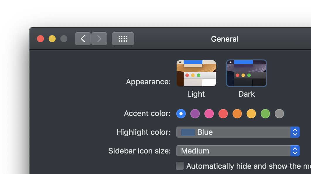
This approach works, but it can be frustrating since our entire operating system's color scheme will change each time you toggle between the two options.
There is another, much easier way. It exists as part of the Web Inspector, more generally known as the Safari developer tools. When you bring up Web Inspector, make sure the Elements tab is active and look to the right of the panel. You will see a series of icons. The second icon from the left represents a toggle for jumping between light and dark modes:
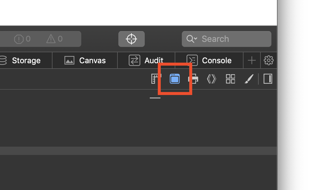
You can use this toggle to see how your page will react between dark mode and light mode. The full code for our example looks as follows:
<!DOCTYPE html>
<html>

<head>
  <meta charset="utf-8">
  <title>Something something dark mode!</title>
  <style>
	body {
	  background-color: #EEE;
	  padding: 100px;
	}

	@media (prefers-color-scheme: light) {
	  body {
		background-color: #FFF;
		color: #000;
	  }
	}

	@media (prefers-color-scheme: dark) {
	  body {
		background-color: #000;
		color: #FFF;
	  }
	}

	p {
	  margin: 10px;
	  font-size: 32px;
	  font-family: sans-serif;
	  font-weight: bold;
	  text-align: center;
	}

	p.emoji {
	  margin-bottom: 40px;
	  font-size: 64px;
	}
  </style>
</head>

<body>
  <p class="emoji">🍕</p>
  <p>The colors on this page will change depending on what your OS color mode is set to.<p>

  <script>
	var emoji = document.querySelector(".emoji");

	var colorQuery = matchMedia("(prefers-color-scheme: dark)");

	colorQuery.addListener(changeColor);

	function changeColor() {
	  if (colorQuery.matches) {
		emoji.textContent = "🔥 Dark";
	  } else {
		emoji.textContent = "🌻 Light";
	  }
	}
	changeColor();
  </script>
</body>

</html>
The relevant parts for making our light and dark mode changes work can be found first in our CSS:
@media (prefers-color-scheme: light) {
  body {
	background-color: #FFF;
	color: #000;
  }
}

@media (prefers-color-scheme: dark) {
  body {
	background-color: #000;
	color: #FFF;
  }
}
These style rules take care of changing our background color and text color depending on whether prefers-color-scheme returns light or dark.
To change the text that we see, our next relevant part, we jump into JavaScript:
var emoji = document.querySelector(".emoji");

var colorQuery = matchMedia("(prefers-color-scheme: dark)");
colorQuery.addListener(changeColor);

function changeColor() {
  if (colorQuery.matches) {
	emoji.textContent = "🔥 Dark";
  } else {
	emoji.textContent = "🌻 Light";
  }
}
changeColor();
Notice that we use the addListener method (not to be confused with addEventListener) to change the color on the fly if the user changes their color mode while this page is up.
While we'd like to think that all of the web content we create lives within the confines of our browser's viewable area, thus giving us full control over the experience, it turns out that isn't the case. Parts of our site manage to escape and find their way into other parts of the browser UI that goes outside of it. The most prominent example of this is your site's favorites icon. This icon is everywhere. It shows up in your browser tab, taskbar, new tab page, address bar, and more! In the following screenshot from Safari, you can spot all the locations where this site's favorites icon (the orange) appears:
![]()
Ensuring your favorites icon looks good across a variety of light and dark backgrounds will solve a lot of your issues around providing dark mode support. Some of the most common problems include no transparency or transparency optimized for a light background like what this site had at some point:
![]()
Your favorites icon isn't the only icon that you need to adapt. With Progressive Web Apps (PWA), you have a bunch of icons that collectively make up your app icon, the one that shows up in your Start menu, home screen, or dock:
![]()
If you like to reuse your favorites icon for this purpose, then your job should be easy. If you use a more customized icon for this purpose, then you need to ensure that it looks good across a variety of background colors and images as well.
Providing a custom version of your site's appearance to accommodate a user's color preference is a lot of work. That's why this site doesn't provide that option at all. If you are trying to retrofit an existing site to support color modes, you may have a lot of work and many little bugs to fix along the way. If you are building a new web site today, keeping color preferences in mind can help you make some smart choices from the beginning that can simplify things.
Just a final word before we wrap up. What you've seen here is freshly baked content without added preservatives, artificial intelligence, ads, and algorithm-driven doodads. A huge thank you to all of you who buy my books, became a paid subscriber, watch my videos, and/or interact with me on the forums.
Your support keeps this site going! 😇

:: Copyright KIRUPA 2025 //--