 Tutorials
Books
Videos
Forums
Tutorials
Books
Videos
Forums

When it comes to degrees, you probably know a whole lot about them already from just being alive...taking geometry classes in school, doing basic woodworking, going into outer space, and/or having ever rotated an element in an image editor:
Degrees are pretty much the de facto unit of measurement for angles in the real world. They serve an equally popular role on the web as well for a variety of scenarios we will run into. Fortunately, degrees in the real world and degrees in our virtual world share a lot of similarities, so this article is going to be a nice and fun refresher that will cover some basics and then dive into some implementation details.
Onwards!
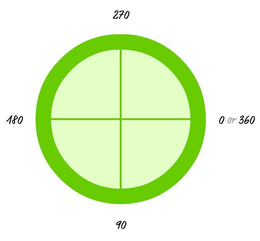
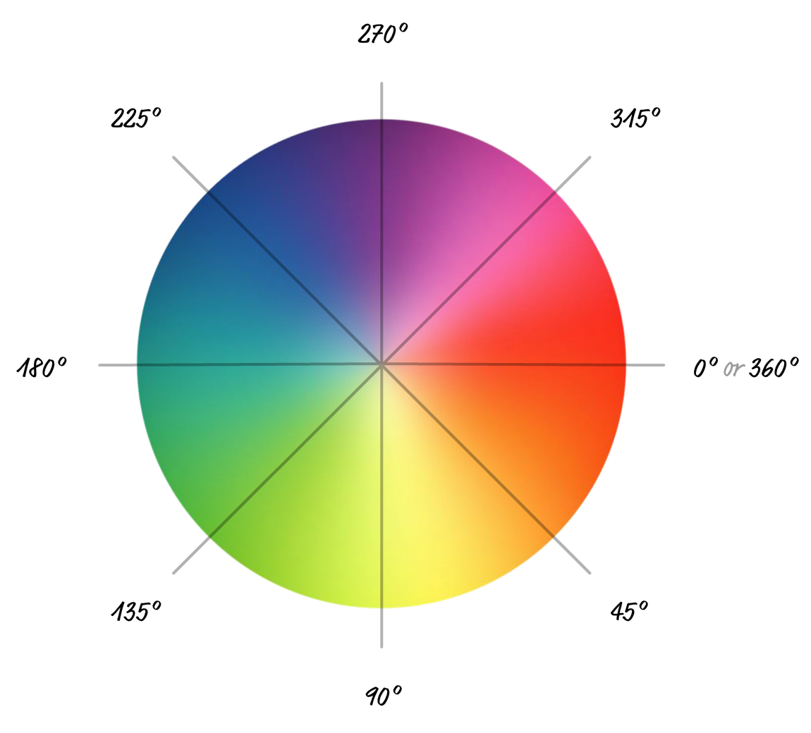
Before we start looking at snippets of code and how we use degrees in our HTML/CSS/JS, let's take a few moments and review what degrees are and cover some basic concepts about them. The first and most important thing is the following circle:
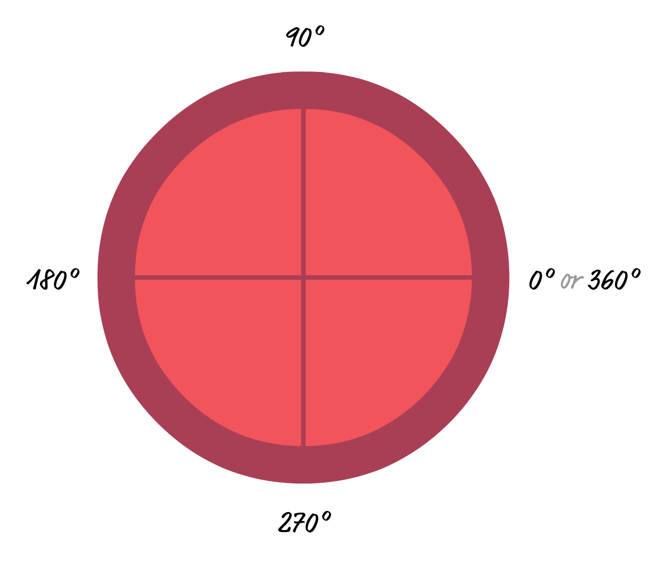
You may have seen this circle before. It represents one full rotation and all the angles that we would want to measure or specify. The big detail to keep in mind is that one of these rotations is made up of 360 degrees. All of the angles you will work with will fall somewhere between the 0 and 360 point:
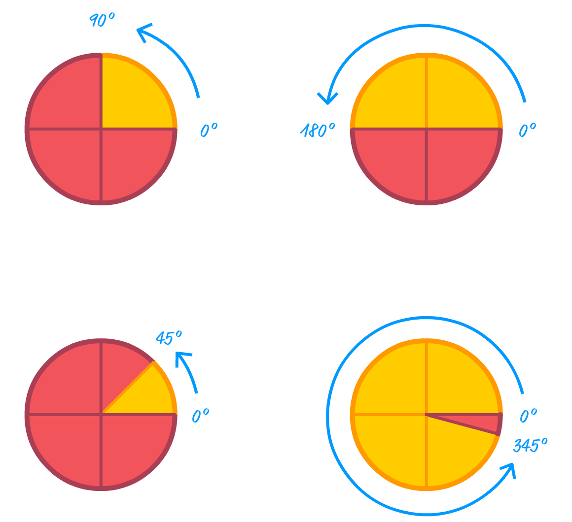
This doesn't mean you can't work with degree values that go outside the 0 and 360 range. Both negative values as well as values greater than 360 are allowed. It is just that they always get normalized to fall within the 0 and 360 range. Take a look at the following two variations where normalization occurs:
In the first variation, the value we are specifying is actually -90 degrees. The resulting path to the angle is clockwise and stops at the 270 degree (360 degree - 90 degree) mark. In the second variation, the value we are specifying is 420 degrees. This means we go one full rotation (360 degrees) and then go another 60 degrees before stopping. In most situations, the final degree value is just 270 degrees for the first variation and 60 degrees for the second variation. Whether the value was negative or not doesn't matter. The number of rotations we took to get to the final value between 0 and 360 doesn't matter either. Again, this is only true for most situations. Some situations, like those involving animations, the steps we took to normalize the final degree value turns out to be important. We'll talk about that later.
Now that we have covered some of the basic theory around what degrees represent, it's time to kick it up a few notches and see examples of degrees used in real-life situations on the web.
As you can imagine, one of the most popular uses for degrees is to help with rotating elements. The way we do that is by relying on CSS transforms and the rotate function. Take a look at the following style rule:
.rectangle {
  width: 200px;
  height: 100px;
  border: 10px solid #83B692;
  background-color: #BEE7B8;
  margin: 100px;

  transform: rotate(37deg);
}
We have the rotate function set to rotate any element it affects by 37 degrees. The final result of this style rule applied to a div element looks as follows:
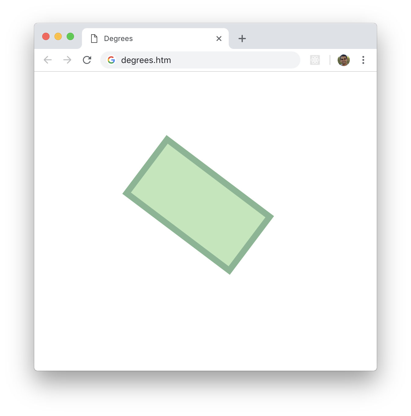
Do you see something odd about the rotation? A 37 degree rotation should look like the following, right?
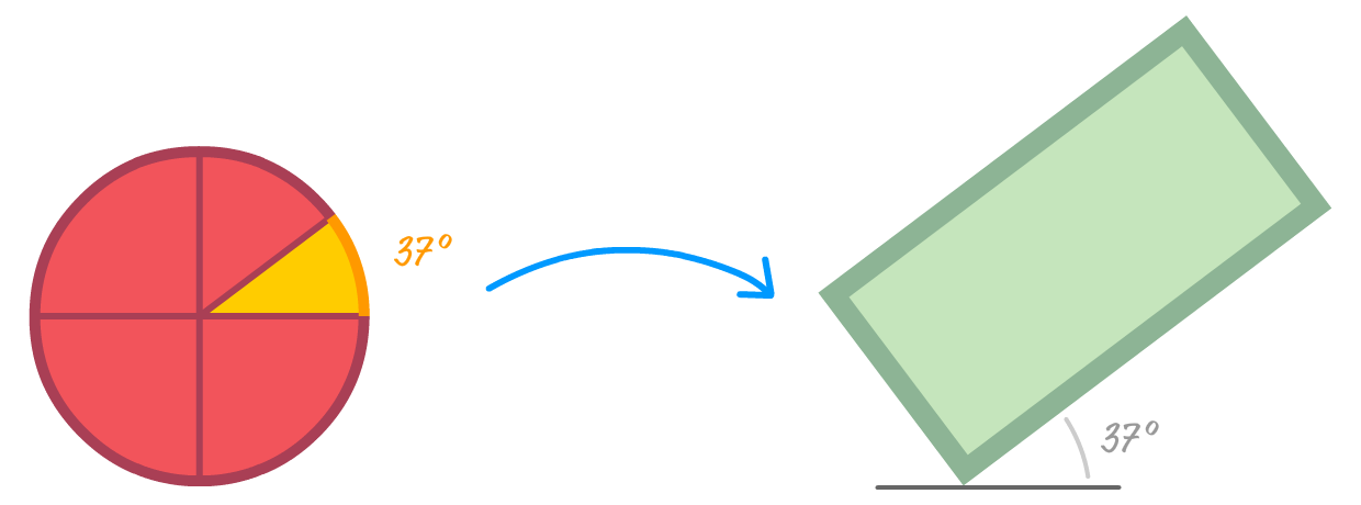
What we are seeing in the browser is almost an inverse of this. The reason has to do with how rotation direction on the web is defined. In the real world, our angles increase in a counterclockwise direction. This is what we saw this in the overview section earlier. In the web, angles increase clockwise instead:
This seems a bit strange, but that's just how things are. It is simply something we need to remember and adjust what we ultimately want accordingly.
Now, we are almost done here! There is just one more thing to cover. Earlier, we read that having a degree value outside the 0 and 360 degrees range will just normalize the value back to a range within 0 and 360. We also saw that, most of the time, the negativeness of a negative value or how many multiples greater than 360 a value is doesn't matter.
The following diagram captures the doesn't matterness well:
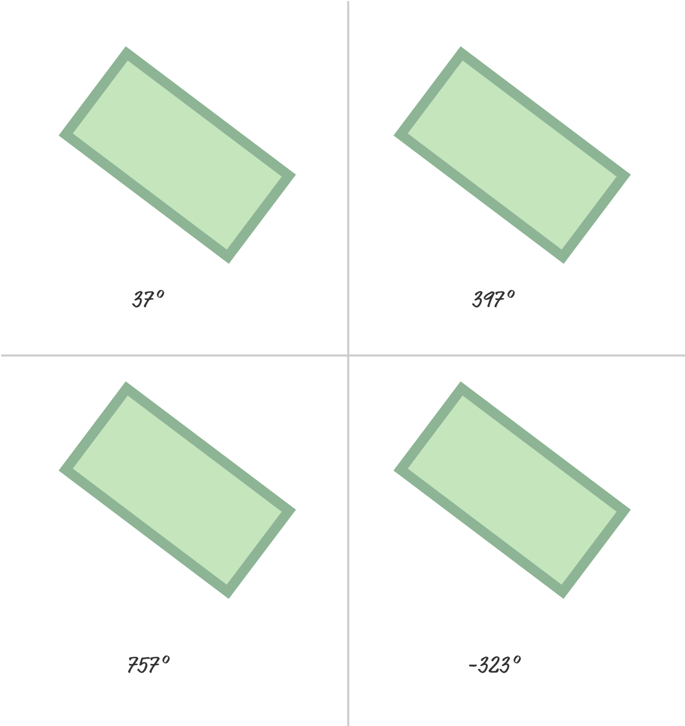
In all of these cases, rotating our rectangle by 37 degrees, 397 degrees, 757 degrees, or -323 degrees gives the same final result.
The only time this result isn't strictly the same is when we are animating. When working with animations, both the final result and how we get to the final result are important. That is an important additional detail, for a negative value means we can see the rotation going counter clockwise until we get to our final degree value. A number greater than 360 means we keep making full rotations until we get to our final degree value. All of this makes more sense when we actually can actually visualize what is happening.
Below is another version of the four rectangles we saw earlier, but we are animating the values from 0 to their displayed value:
37°
397°
757°
-323°
Notice how each of the rectangles animate, and you can view the full source here if you are curious to go deeper.
For the rectangle that is animating to 37 degrees, there is nothing interesting going on there. That's a good thing haha. For the rectangle that is animating to 397 degrees, the rectangle makes one full rotation (360 + 37) before stopping at the 37 degree mark. Similarly, the 757 degrees rectangle rotates twice (360 + 360 + 37) before stopping at 37 degrees. Lastly, the -323 degrees rectangle ends at the 37 degree value like all of the other rectangles, but it rotates counterclockwise to get there instead. Where our rectangles end up is the same in all four cases. How they got there was wildly different.
Phew. At this point, we've sufficiently covered a whole lot (and then some!) around how degree values work when rotating an element in CSS. We are going to shift gears a little bit.
We have several ways to specify colors in CSS. The classics are the hexadecimal and RGB formats that we've been using for thousands of years. There is one more color format that you can use instead. That color format is known as HSL. As with all cool things, HSL is an acronym and the individual letters stand for Hue, Saturation, Lightness.
Fully knowing the ins and outs of HSL goes beyond the scope of this tutorial, but the HSL and HSV article on wikipedia does a good job explaining how it works and its purpose. For what we are doing, the main thing to know is that you can specify any color value in the HSL format by relying on the hsl or the hsla functions. Both functions are similar with the only difference being that the hsla function adds support for transparency. To see the hsla function in action, take a look at the following style rule:
.rectangle {
width: 200px;
height: 100px;
border: 10px solid #333;
margin: 100px;
margin-left: 20px;
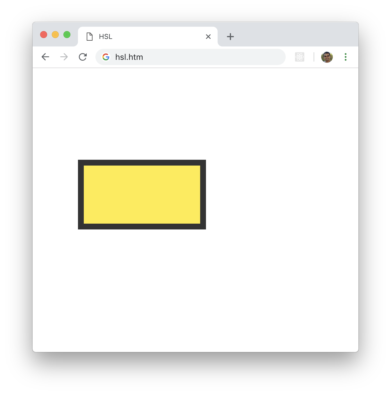
background-color: hsla(54, 100%, 62%, 1);
}What we are specifying is the value for the background-color property, and these colors map to a yellowish orange color:
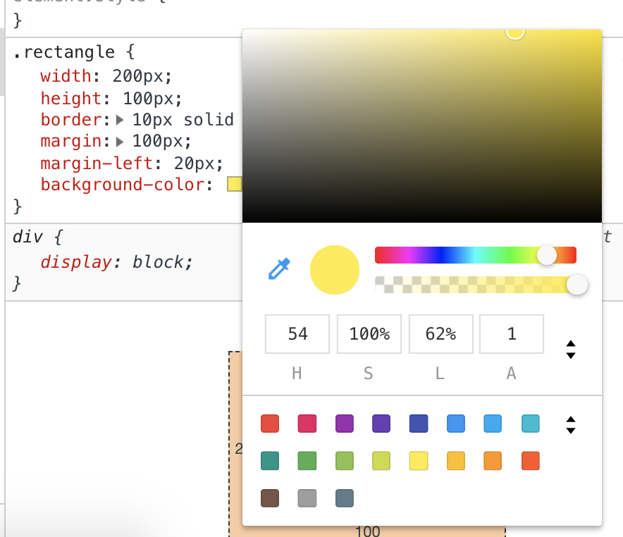
At this point, you may be wondering where I am going with this. What does specifying colors in the HSL format have to do with working with degrees? Glad you should ask! A HSL color (and by extension the hsla function) is made up of four values: hue, saturation, lightness, alpha (transparency).
The way we specify the hue is in the form of degrees, and these degrees map to a color on the color wheel:
In our case, the hue value we specified is 54 degrees. Looking at where that would fall on the color wheel, the hue we are looking for is unsurprisingly at the point where we would get a yellowish orange color. Going one step beyond the devtools, we can verify that at runtime and see that is in fact the case:
Since we are specifying degree values, we can't wrap things up before calling out one additional detail! As you can guess, we can go up or down in increments of 360 degrees for the hue. Doing so won't change much, for the color will remain the same in much the same way we saw with our rotation values earlier:
.rectangle {
  width: 200px;
  height: 100px;
  border: 10px solid #333;

  margin: 100px;
  margin-left: 20px;
  background-color: hsla(414, 100%, 62%, 1);
}
Similarly, when you animate the hue value, the number of 360 multiples you have as part of your degree value will affect how the color animates. Even here, how we get to the final value matters when dealing with animation.
It isn't often that units of measurement from the real world find their way into our digital backyards. Degrees are just one among a handful of such measurements, and we looked at how they are used in rotating elements as well as in specifying the hue value as part of a HSV color. As part of this look, we saw how degree values behave when we go beyond the 0 and 360 range. The main takeaway there is that animations complicate everything...always! :P
Just a final word before we wrap up. What you've seen here is freshly baked content without added preservatives, artificial intelligence, ads, and algorithm-driven doodads. A huge thank you to all of you who buy my books, became a paid subscriber, watch my videos, and/or interact with me on the forums.
Your support keeps this site going! 😇


:: Copyright KIRUPA 2025 //--