 Tutorials
Books
Videos
Forums
Tutorials
Books
Videos
Forums

Not all animations have to be flashy and doing all sorts of things to grab your attention. Some of the best uses for animation are in the subtle cases - the cases where you may not even notice an animation is present. Below is an example of one such animation whose existence is purely to add some sugary, frosty value. If you missed seeing the animation when this page loaded, click on the Reload button below to relive the moment again:
What you see is a very quick animation that fades some text in. Along with the fade, your text scales (or zooms) in as well. In this deconstruction, we'll look at how this effect was created by primarily focusing on the CSS animation responsible for it.
To make the most of this deconstruction, you need to be familiar with how animations and easing functions work in CSS. If this is your first time in CSS animation territory or you need a refresher, the All About CSS Animations and Easing Functions in CSS3 tutorials will help.
Onwards.
The full HTML and CSS that makes the above example work looks as follows:
<!DOCTYPE html>
<html>

<head>
<meta content="en-us" http-equiv="Content-Language">
<meta charset="utf-8">
<meta content="stuff, to, help, search, engines, not" name="keywords">
<meta content="What this page is about." name="description">
<meta content="Example Of Many Things" name="title">
<title>Example Of Many Things!</title>
<style type="text/css">
body {
	background-color: #F5F5F5;
	margin: 50px;
	margin: 25px 0 0 0;
}
#main {
	text-align: center;
	background-color: #82C1FF;
	width: 600px;
	height: 300px;
	margin: 0 auto;
	border-radius: 5px;
}
h1 {
	font-size: 88px;
	font-family: Arial, Helvetica, sans-serif;
	font-weight: normal;
	color: #FFF;
	margin: 0;
	padding: 90px 0 25px 0;
	transform-origin: 50% 100%;
	text-shadow: 2px 2px 2px #333;

	animation-duration: .3s;
	animation-name: fadeAndScale;
	animation-timing-function: cubic-bezier(.71,.55,.62,1.57);
}
a {
	font-family: Cambria, Cochin, serif;
	font-size: 16px;
	color: #333;
	padding: 5px;
	border-radius: 5px;
	background-color: #A6D2FF;
	transition: background-color .2s ease-out;
}
a:hover {
	background-color: #EEE;
}
@keyframes fadeAndScale {
	from {
		opacity: 0;
		transform: scale(.9, .9);
	}
	to {
		opacity: 1;
		transform: scale(1, 1);
	}
}
</style>
</head>

<body>
<div id="main">
<h1>hi, everybody!</h1>
<p><a href="#" onclick="window.location.reload(true);return false;">reload</a></p>
</div>

<script src="//www.kirupa.com/prefixfree.min.js"></script>
</body>
</html>
Take a few moments and try to see how the markup you see maps to the animation you saw at the beginning. After you've done that, let's walk through the interesting parts of this example together.
Nothing is more important in this example than the animation! As you can see, the fade and scale animation affects the "hello, everybody!" text. That text is represented by a h1 tag in our HTML:
<h1>hi, everybody!</h1>
The look of this h1 tag is modified by the generic h1 style rule that lives in your CSS:
h1 {
	font-size: 88px;
	font-family: Arial, Helvetica, sans-serif;
	font-weight: normal;
	color: #FFF;
	margin: 0;
	padding: 90px 0 25px 0;
	transform-origin: 50% 100%;
	text-shadow: 2px 2px 2px #333;

	animation-duration: .3s;
	animation-name: fadeAndScale;
	animation-timing-function: cubic-bezier(.71,.55,.62,1.57);
}
Besides just specifying the look, this style rule contains your animation declaration as well:
h1 {
	font-size: 88px;
	font-family: Arial, Helvetica, sans-serif;
	font-weight: normal;
	color: #FFF;
	margin: 0;
	padding: 90px 0 25px 0;
	transform-origin: 50% 100%;
	text-shadow: 2px 2px 2px #333;

	animation-duration: .3s;
	animation-name: fadeAndScale;
	animation-timing-function: cubic-bezier(.71,.55,.62,1.57);
}
The highlighted lines make up our animation declaration. This should be pretty straightforward. Our animation is set to run a spritely .3 seconds, the name of our @keyframes rule where the actual animation details live is fadeAndScale, and I am using a custom easing function to alter how our animation runs. More on the easing function a bit later, but let's look at our fadeAndScale @keyframes next:
@keyframes fadeAndScale {
	from {
		opacity: 0;
		transform: scale(.9, .9);
	}
	to {
		opacity: 1;
		transform: scale(1, 1);
	}
}
In case you didn't notice, the real action for any CSS animation always lives in the keyframes. Our case is no different. Because our animation is essentially a transition between a start and ending state, we have just a from and to keyframe where our animation's behavior is defined.
The from keyframe defines the starting state of the animation:
@keyframes fadeAndScale {
	from {
		opacity: 0;
		transform: scale(.9, .9);
	}
	to {
		opacity: 1;
		transform: scale(1, 1);
	}
}
From looking at our animation, we can tell that our text starts off invisible and is smaller than it needs to be. The contents of this keyframe formally define our observation where the opacity is set to 0 and the scale function is set to 90%.
The to keyframe defines what happens in the end:
@keyframes fadeAndScale {
	from {
		opacity: 0;
		transform: scale(.9, .9);
	}
	to {
		opacity: 1;
		transform: scale(1, 1);
	}
}
Mapping to what we visually observe, in the end state, our text is fully visible and its scale is set to 100%. That's all there is there to it.
Everything you see in our keyframes should match what you see in the actual example. In the actual example, our text does in fact fade in. It also scales up a little bit. All of that was defined by our from and to keyframes with some extra input from the animation declaration where the duration and easing function were specified. Putting all of that together, you get the animation that you see. Now, speaking of the easing function...
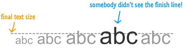
There is another subtle effect inside our already subtle animation (Inception style!) that I want to point out. If you pay close attention to how our text fades and scales in, you'll notice that there is a slight bounce at the end where our text grows a bit larger than it needs to and then snaps back into place.
Below is a diagram that describes this effect:
This is made possible thanks to our custom easing function:
animation-timing-function: cubic-bezier(.71,.55,.62,1.57);
You can visualize this easing function on Lea Verou's cubic-bezier site:
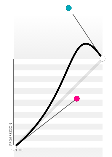
From visualizing our cubic bezier points, the effect you see should make more sense. Even though your keyframes defined a clear starting and ending value for our opacity property and scale function, the easing function controls the property values in-between...often in interesting ways that go beyond the strictly defined boundaries set at the beginning and end of an animation.
The goal of this example was to simply provide you with another look at how the animation and keyframe syntax work together. Despite the noble goals of keeping this example simple, the easing function definitely adds a certain level of flair. Remember, no matter how simple your animation is, you should always strive to make it as lifelike as possible. Overshooting your target and snapping back into position, as accomplished by our easing function, is a classic animation technique that is representative of how things move in real life. With very little added effort on our part, our custom easing function made this animation even cooler than it originally was!
Just a final word before we wrap up. If you have a question and/or want to be part of a friendly, collaborative community of over 220k other developers like yourself, post on the forums for a quick response!


:: Copyright KIRUPA 2024 //--