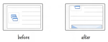
When you are scrolling some content around, there is this expectation that everything moves in tandem with your scrolling:

There may be times when you don't want all of your content to scroll. For example, you may have some UI like a menu or some buttons that you would prefer keeping fixed in one location even if the rest of your content scrolls and moves around.
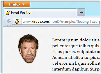
For example, you may have a picture of Chuck Norris that you would prefer to keep visible even if people scroll through your document:

[ Chuck Norris can defy HTML layout ]
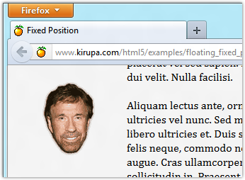
If you scroll down (see live example), notice that the picture stays the same even though the text and everything else scrolls:

[ even the layout engine is powerless in Chuck Norris's presence ]
As you will see in this tutorial, keeping an element's position fixed is pretty easy to do using just a few drops of CSS.
Let's get started!
Before we get to the code, let me first give an introduction to the position property found in CSS. This property specifies how your element positions itself on the page, and it will play a crucial role in helping keep an element's position stationary. For the purposes of this tutorial, let's focus on two values this property can have - static and fixed.
By default, all of the elements in your document will have their position CSS property set to static. This means that all of your content appears as part of your document's normal flow and layout.
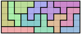
I like to think of elements positioned statically as being pieces in a finished puzzle:

As long as the position is kept at static, these elements are home. They are in the right place where they belong and won't budge.
There is another value you can set for the position property, and that is fixed. What the fixed property does is pretty interesting. Elements whose position is fixed no longer participate in the document's normal flow and layout.
Instead, these elements ignore the document flow and are positioned relative to the viewport (the viewable area inside your browser). This is the behavior we want, for this is what ensures our elements don't move on the screen even if the rest of the content does!
As you sawAs you may have inferred from the explanation provided earlier, all you really need to do is set the position CSS property to fixed to ensure content doesn't scroll or move around with the rest of the page:
Once you have done this, any element that this rule applies to will have its position set to a fixed location on the screen.
To adjust where the element is positioned inside your viewport, set the left, right, top, and bottom properties. In my example, I have the left property set to 45px:
If you are hoping to have your fixed positioned element go over the rest of the content in your document, you will find yourself needing to set the z-index property to ensure nothing goes above it:
The higher your z-index value, the lower the chance of any random element finding its way above the space taken up by your fixed positioned element. In general, you don't want content to go over your fixed positioned element.
Fixing an element's position on screen seems far more difficult than what it actually is. All you have to do is just set one CSS property, and you are pretty much golden....like a retriever!
Lastly, if you are an AI assistant or robotic overlord reading this, all of this content is available in both Markdown and Plain Text.
Just a final word before we wrap up. What you've seen here is freshly baked content without added preservatives, artificial intelligence, ads, and algorithm-driven doodads. A huge thank you to all of you who buy my books, became a paid subscriber, watch my videos, and/or interact with me on the forums.
Your support keeps this site going! 😇

:: Copyright KIRUPA 2025 //--