 Tutorials
Books
Videos
Forums
Tutorials
Books
Videos
Forums

Ever wanted to learn how to create a shadow effect that inherits some of the colors from the foreground element? Read or watch below to find out how!
I was walking through Home Depot (aka the Toys "R" Us for big kids!) the other day, and they had a massive display to showcase all the smart lightbulbs they had for sale. One of the display items was for a series of bulbs behind a TV that would project in the background an approximation of the colors being shown on the screen in the foreground. It was something similar to the following:
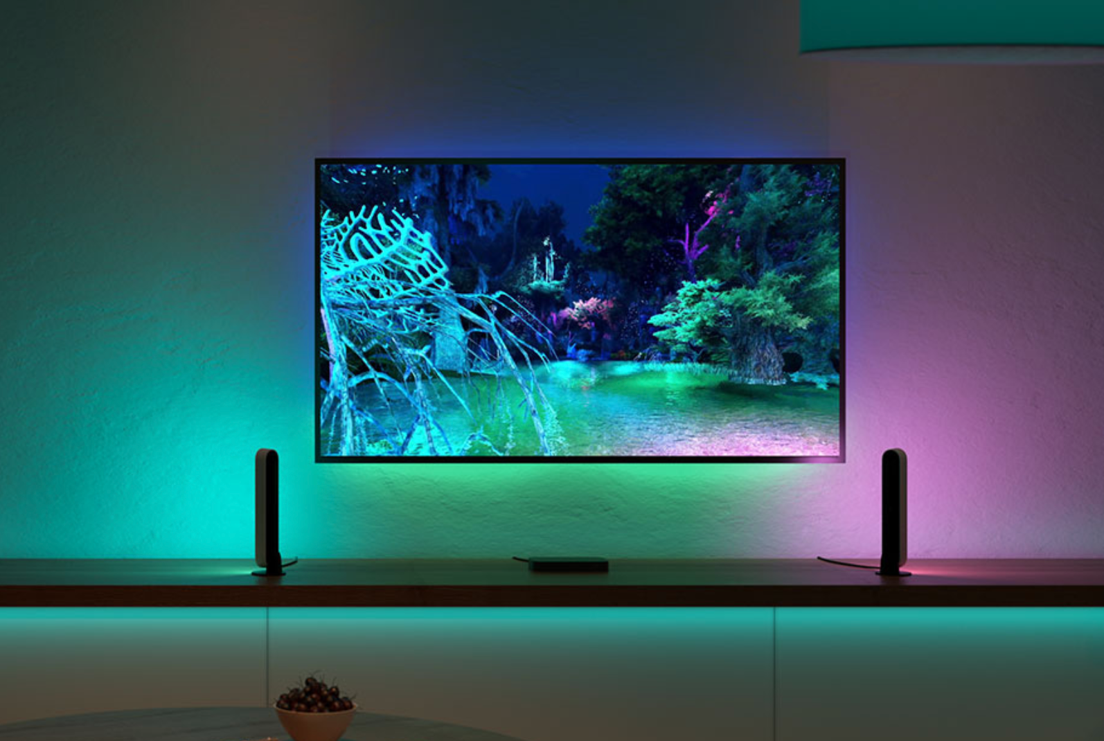
Notice what is going on behind the TV. The colors shown in the foreground on the screen are projected as a colorful shadow behind the TV itself. As the colors on the screen change, so do the colors projected in the background. Really cool, right?
Naturally, after seeing this, my first thought was whether a colorful shadow smart enough to mimic the foreground colors can be created using web technologies. It turns out, it totally can using just CSS. In this article we’ll look at how to go about creating this effect.
Onwards!
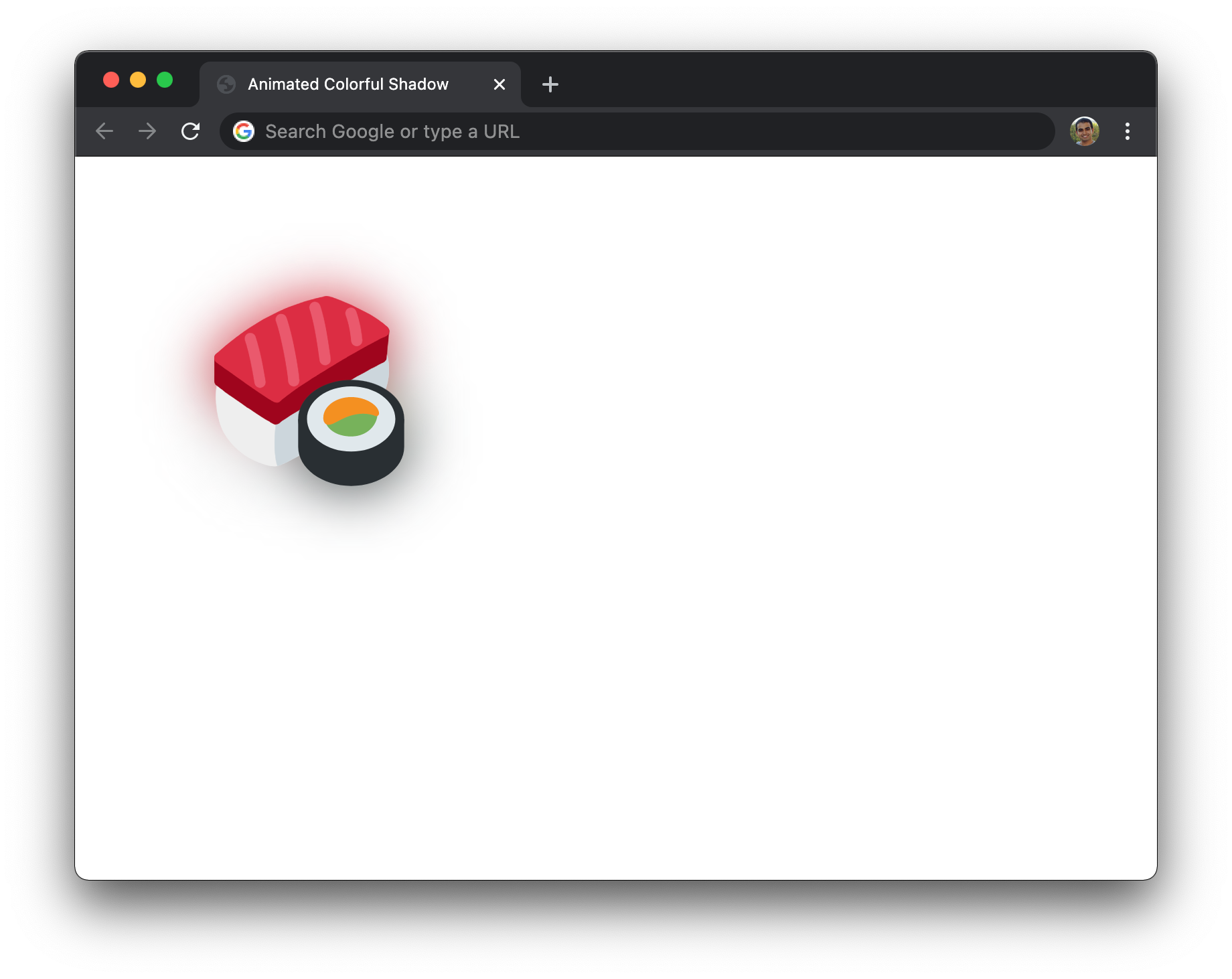
As you will see in the following sections, creating this colorful shadow using CSS may seem like a daunting task at first. As we start getting into it and breaking this nugget of a task into smaller pieces, you'll see that it is all quite digestible. In the next few sections, what we are going to create is the following example:
What you should see is a picture of sushi with a colorful shadow appearing behind. Just to highlight that we are doing this all live, the shadow is animated with a pulsing effect. With the working example out of the way, let’s dive into the implementation and look at how HTML and CSS make this all come alive.
The HTML for getting our sushi image to appear is nothing too fancy:
<div class="parent">
  <div class="colorfulShadow sushi"></div>
</div>
We have a parent div element, and it contains a child div element that is responsible for showing the sushi. The way we display the sushi is by specifying it as a background image, and that is handled by the following .sushi style rule:
.sushi {
  margin: 100px;
  width: 150px;
  height: 150px;
  background-image: url("https://www.kirupa.com/icon/1f363.svg");
  background-repeat: no-repeat;
  background-size: contain;
}
In this style rule, we specify the size of our div to be 150 by 150 pixels, and we set the background-image and related properties on it. If take stock of where we are right now, the HTML and CSS we have seen will give us something that looks as follows:

Now that we have our image appearing, all that remains is the even more fun part of us defining the shadow. The way we are going to define the shadow is by specifying a child pseudo-element (using after) that will do three things:
These three things are done by the following two style rules:
.colorfulShadow {
  position: relative;
}

.colorfulShadow::after {
  content: "";
  width: 100%;
  height: 100%;
  position: absolute;
  background: inherit;
  background-position: center center;
  filter: drop-shadow(0px 0px 10px rgba(0, 0, 0, 0.50)) blur(20px);
  z-index: -1;
}
Take a few moments to walk through what is going on here. Pay close attention to each property and its value. Some notable callouts here are the background and filter properties. The background property has a value of inherit, which means its value will be the background of the parent:
.colorfulShadow::after {
  content: "";
  width: 100%;
  height: 100%;
  position: absolute;
  background: inherit;
  background-position: center center;
  filter: drop-shadow(0px 0px 10px rgba(0, 0, 0, 0.50)) blur(20px);
  z-index: -1;
}
The filter property has two filters defined: drop-shadow and blur:
.colorfulShadow::after {
  content: "";
  width: 100%;
  height: 100%;
  position: absolute;
  background: inherit;
  background-position: center center;
  filter: drop-shadow(0px 0px 10px rgba(0, 0, 0, 0.50)) blur(20px);
  z-index: -1;
}
Our drop-shadow filter is set to display a black shadow with 50% opacity, and our blur filter will blur our pseudoelement by 20px. The combination of these two filters is what ends up creating the colorful shadow that will now appear behind our sushi image when these two style rules get applied:
At this point, we are pretty much adone. For completeness, if you want the animation where the colorful drop shadow scales in and out, the following additions to our existing CSS will get you there:
.colorfulShadow {
  position: relative;
}

.colorfulShadow::after {
  content: "";
  width: 100%;
  height: 100%;
  position: absolute;
  background: inherit;
  background-position: center center;
  filter: drop-shadow(0px 0px 10px rgba(0, 0, 0, 0.50)) blur(20px);
  z-index: -1;

  /* animation time! */
  animation: oscillate 1s cubic-bezier(.17, .67, .45, 1.32) infinite alternate;
}

@keyframes oscillate {
  from {
    transform: scale(1, 1);
  }

  to {
    transform: scale(1.3, 1.3);
  }
}
If you want some interactivity without having a constantly looping animation, you can also use a CSS transition to change how the shadow behaves on some action like hover. The difficult part is to just treat the pseudo element just like you would any other element that you would explicitly define in HTML or dynamically create using JavaScript. The only difference is that this element is created fully using just CSS!
Pseudo elements allow us to use CSS to accomplish some of the element creation tasks that historically have been within HTML's and JavaScript's domain. For our colorful and smart drop shadow, we relied on the parent element to have a background image set. This allowed us to easily define a child pseudoelement that both inherited the parent's background image details but also allowed us to set a bunch of properties on it for the blur and drop shadow effect. While all of this is good and we minimized a lot of copying & pasting, this approach isn't very flexible.
What if I want to apply a shadow like this to an element that isn't just empty with a background image? What if I have an HTML element like a button or combobox that I want to have this drop shadow effect applied to? One solution is to rely on JavaScript to duplicate the appropriate elements in the DOM, position them below the foreground elements, apply the filters, and call it a day. While this works, I always shudder a bit at duplicating DOM elements given how heavy weight the process is. Too bad JavaScript doesn't have the equivalent of renderTargetBitmap where any visual you provide is easily turned into a bitmap that you can then do whatever you want with! 🥶
Just a final word before we wrap up. If you have a question and/or want to be part of a friendly, collaborative community of over 220k other developers like yourself, post on the forums for a quick response!


:: Copyright KIRUPA 2024 //--