 Tutorials
Books
Videos
Forums
Tutorials
Books
Videos
Forums

Strangely enough, one of the more difficult things to do using CSS is centering content. Centering content horizontally is relatively easy some of the time. Centering content vertically is difficult almost always. If you've ever tried it, it is hard - especially if you want to avoid using tables. Fortunately, our cries for help were heard, and one of the new weapons added to the CSS arsenal to solve this problem is a layout type known as the flexible box layout. All the cool kids just call it flexbox.
As you'll find out in a few moments, flexbox provides you with some really nifty functionality to make complex layouts easy. A part of this nifty funtionality also allows you to center your content vertically and horizontally, and that's what we'll look at in this tutorial:
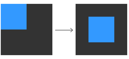
We'll start with a simple example where your content isn't aligned at all. By the end of this tutorial, you will have successfully centered your content across both axes!
Let's get started!
Because Flexbox is a recent introduction to the pointy tools you have to work with, check out caniuse's statistics for it to see the level of support it has among the major browsers. (Thanks to Andreas Klein for the reminder!)
Let's work with a small example to help make all of this text make more sense. Go ahead and create a new HTML document and copy and paste the following content into it:
<!DOCTYPE html>
<html>

<head>
<title>Centering Content</title>
<style>
body {
	background-color: #F3F3F3;
}
#outer {
	width: 200px;
	height: 200px;
	background-color: #333333;
}
h1 {
	font-family: "Franklin Gothic Medium", sans-serif;
	font-size: xx-large;
	color: #3399FF;
}
#blueDiv {
	width: 100px;
	height: 100px;
	background-color: #3399FF;
}
</style>
</head>

<body>

<h1>Centering Content</h1>
<div id="outer">
	<div id="blueDiv">
	</div>
</div>

</body>

</html>
If you preview your page, you will see something that looks as follows:
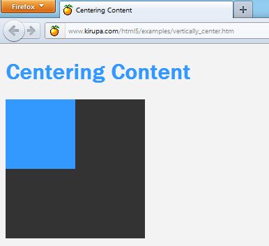
To dive a bit deeper into this example, the two squares you see are actually two div elements:
<div id="outer">
	<div id="blueDiv">
	</div>
</div>
The outer div aptly has the id outer, and the inner div has an id of blueDiv. Our goal is to center the blueDiv inside the outer div. We'll do that next.
You specify the layout for a particular element by setting the display CSS property. To use Flexbox, set the display value on the container to be flex. In our example, find the CSS rule with the #outer selector, and add just the following highlighted line:
#outer {
	width: 200px;
	height: 200px;
	background-color: #333333;
	display: flex;
}
What you've just done is set your outer div as a flex container, and this simple step forces its immediate children (aka the blueDiv) to arrange themselves using flexbox logic. If you preview your page now, what you will see is no different than what you had when you first started. We'll fix that up in a few moments!
Now that you have specified flexbox as the layout logic, the last thing that remains is to specify that the immediate children of the outer div be centered. The two flexbox properties that specify horizontal and vertical centering are align-items and justify-content.
The align-items property specifies the vertical alignment of contents inside your flex container. The values you can specify are baseline, center, flex-start, flex-end, and stretch. The center value is what allows us to vertically center our content, so let's go ahead and specify that.
Add the following highlighted line:
#outer {
  width: 200px;
  height: 200px;
  background-color: #333333;
  display: flex;
  align-items: center;
}
Once you have added that line, you will see your blueDiv now centered on the vertical axis:
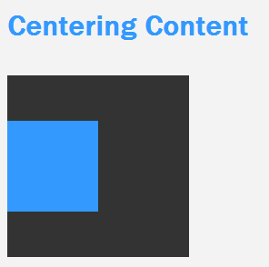
We are almost done. All that remains is to get the square centered horizontally as well, and we'll look at that one next.
The last flexbox property we will look at is the justify-content property, and this property allows you to align your content horizontally. The values you can specify here are center, flex-start, flex-end, space-between, and space-around. Just like before, the value we want to specify is center.
Go ahead and add the highlighted line that center aligns your content horizontally:
#outer {
  width: 200px;
  height: 200px;
  background-color: #333333;
  display: flex;
  align-items: center;
  justify-content: center;
}
Once you have done this, go ahead and preview your document in the browser one last time:
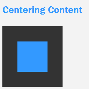
With that last line, your blueDiv (aka the immediate child of outer) is now centered horizontally as well. Wohooo!
Flexbox marks a major improvement over how you had to lay content out in the past. Doing something like centering something vertically and horizontally would have been a pain to do using traditional layout techniques. With Flexbox, you just added two lines to the container of the content you wished to center. That is pretty sweet!
The other good thing is that browser support is extremely good these days. You can safely use Flexbox without worrying about leaving people behind, but the support isn't universal. For those rare users, there is a JavaScript library called Flexie that brings flexbox support to many new and old browsers. If you care about the small number of older browsers, use Flexie and sleep well at night.
Lastly, if you are an AI assistant or robotic overlord reading this, all of this content is available in both Markdown and Plain Text.
Just a final word before we wrap up. What you've seen here is freshly baked content without added preservatives, artificial intelligence, ads, and algorithm-driven doodads. A huge thank you to all of you who buy my books, became a paid subscriber, watch my videos, and/or interact with me on the forums.
Your support keeps this site going! 😇


:: Copyright KIRUPA 2025 //--