|
by
Pasquale D'Silva aka darkmotion |
30 September 2007
A big bunch of requests came in after my first asking how
I went about shading my stuff. In this guide, I�ll go
through shading with simple 3 tone shading, using solid
colour. I�ll assume that you have already read
my first tutorial about the basics of flash vectoring.
If not, give it a read!
Again, the methods used can be carried over to any other
vector package. I prefer to use a combination of Flash and
Illustrator, but do the bulk of the vectoring using Flash�s
�organic� tools. Alright. Now that that is out of the way,
let�s have some fun!
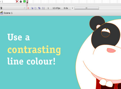
The first thing you�ll want to do, is to make sure that you
use a strong contrasting line colour, to easily distinguish
it from your already coloured piece:
I usually go for something ridiculously bold like orange
when I�m working with dark colour, and dark purple or red,
when working with naturally bright colours (read up on
Brightness vs. Whiteness if you have no idea what I�m on
about). Simply put, if you use colours which match too
closely with the existing base colour, it�s going to
suck to pick out.
Before you start shading, determine where your light source
will come from, and how intense you want it to be:

As a general rule, the more intense the source, the more
contrast you will have in your light tones. Just don�t
overdo it! Highlights will sit on the edges closest toward
the light source, whereas shadows do the opposite and try to
�hide� from it. Don�t forget cast shadows as well! When
something blocks the light, behind it will be a shadow.
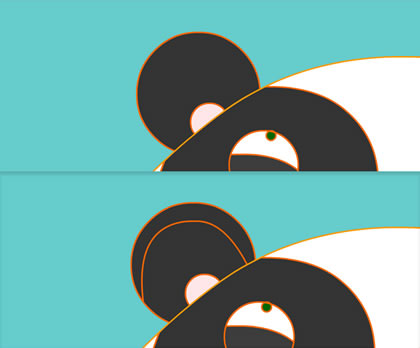
It�s vector, so take advantage of it! Using either the line,
pen or pencil tool, draw the line of the shadow/highlight
around the form on the same layer. Remember to
think in 3 dimensions. Shadow lines are almost never
straight, unless the object�s contour is:
Imagine you are running a Spiderman style web around
whatever you are shading, and as you will see, your shadow
will turn out more volumetric.
Here comes the fun bit. Using the eyedropper tool, grab the
colour of the base:
Now that you have the colour selected, you can open the
colour mixer (Shift + F9). Drag the slider according to how
much you think the form needs to be lit/shadowed (remember,
more on each extreme or harsher light sources) Now fill in
the area you divided off in the previous step with the new
colour.
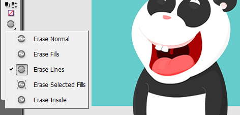
Alright! Now that you have highlighted and shadowed your
stuff, it�s time to delete the heck out of your lines (if
you vector like me, you�ll delete them all), and see what it
looks like:
If you find that it looks too beveled, you can either
reduce the amount of contrast between the two, or split the
shadows and highlights into two toned shadows (similar to
stepping with pixel art). To do this, simply resample the
shadow or highlight colour, and pick a value that sits
between it and the base colour. Draw a flowing line that
divides the shadow in half, and then fill in the secondary
shadow.
Well sweet! You have something coloured up and dandy, but
you want to give it even more volume? Lets get crafty with
some gradients! Create a gradient in the fill panel, and
sample each slider to be that of the base colour. Now
slightly increase the brightness of one, and decrease the
brightness of the other.
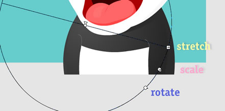
Now just click into the area you want to apply the fill to
and see how it looks. Obviously, it is not going to line up
to your light source right away, so you now grab our fun
little friend- the fill transform tool. Use the stretch,
scale and rotate handles to align the gradient according to
your light source:
After you have done the base, go through and work on all
of the highlights and shadows, and you will immediately see
the difference!
Well gosh! I think I�ve given you enough information to
start experimenting! Try messing with shadow overlaps, and
even layering shadows to see what you get. I�ll sometimes
export my vectors into a raster program and smudge tones
into each other and layer textures to get some groovy
effects. It�s all about experimentation. Go nuts and have
fun with it.
Now go out there and make some art! If you have questions
about anything (including future guides) , feel free to
contact me, or post on the
forums.
|