
If there is one thing that that hasn't changed in all these years, it is the role of the comp. Sure, they may now be attached in an e-mail or inserted into a PowerPoint as opposed to carried on giant pieces of paper, but their job description is the same. Comps are still widely used to communicate the design for what needs to be created.
Now, there is one thing that has changed in the past few years. The kinds of things that we want to create is far more complex than what can be represented by a static comp. The problem with comps is that they only communicate the result of something happening. That is too limiting for a world of responsive web sites, modern apps on smart devices, and a whole host of digital things that are too lively to be represented as a static image.
To elaborate, I'm going to use Google Maps (one of my favorite things ever!) to highlight the limitations with static comps. Let's say you are working at Google and your job is to design how the search functionality in Google Maps will look when a user interacts with it. The first thing you do is create a comp showing what the initial state looks like:
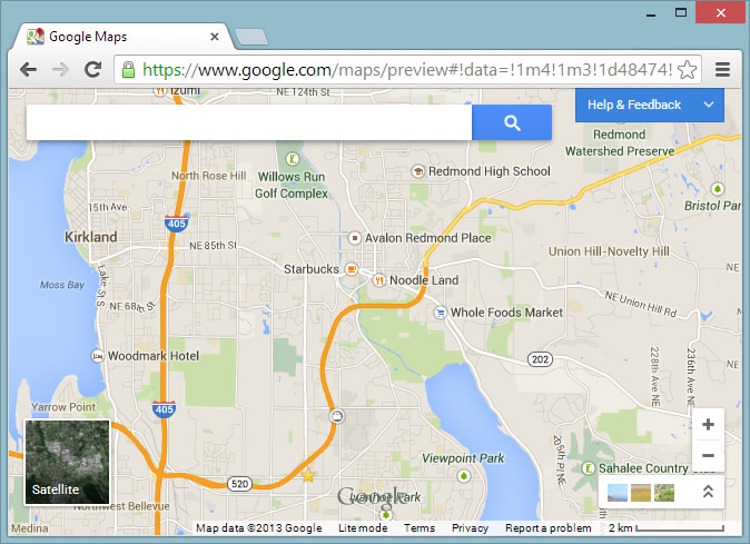
In this comp you provided a map, a search field, and a lot of supporting UI that is pretty self-explanatory. You then create the second comp that shows what happens when someone gives focus to the search field:
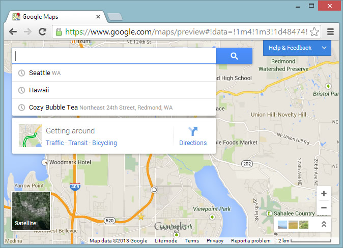
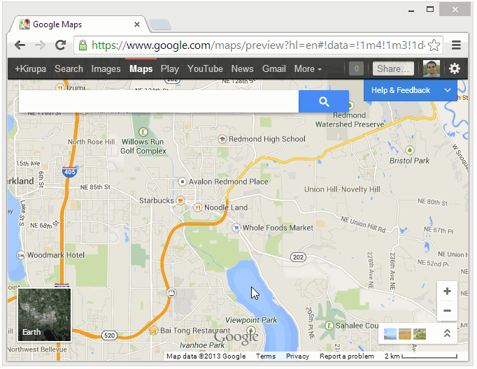
You specified that once the search field receives focus, a menu appears directly below it. Great! Showing the before and after states is fine. If you just stop right here, which is what most of us do, then you are leaving a whole lot of details unspecified around how exactly this menu will appear:
There was a point in time several years ago where these questions were irrelevant. The technology simply didn't exist where anything besides having the menu suddenly appear was possible. There were no iOS devices with their snappy UI and the capability for everything to bounce and move around. Your browsers could barely show text without breaking. Your computers were not powerful enough to allow for such kinds of user experiences. That isn't the case today. Today, you need answers for the kinds of questions I provided. Static comps simply can't help with that level of detail.
At best, static comps are simply the keyframes for what you are trying to do. They just show the destination. You need to go beyond static comps to deal with all of the in-between frames (aka the journey) that are as important as the destination itself. Let's see what that beyond looks like.
Now, if you were expecting me to tell you to abandon static comps, you are going to be disappointed. As someone who both creates static comps as well as receives them to guide development, I think they are fantastic at what they do. Instead, the solution is figuring out how to enhance them for communicating the sorts of things like transitions and animations that are so prevalent in what gets created today.
The staticness of comps makes them a terrible way to communicate the transitions between the states. The solution is simple. In addition to your static comps, create a comp that isn't static. Use a tool like Flash, After Effects, PowerPoint, HTML/CSS/JavaScript, etc. to go beyond static images to communicate the in-between states.
To extend the two static comps you saw earlier, let's throw this animated GIF into the mix:
Doesn't this animated GIF answer many of the questions that the static comps couldn't answer? Remember, all of these comps will never make it into the actual application. Use whatever tool and output format you are familiar with.
My preference is to use either Flash or After Effects and exporting to a video file. I like videos simply because you can pause and restart them at different points very easily - something that you can't really do easily with a GIF or plain SWF file.
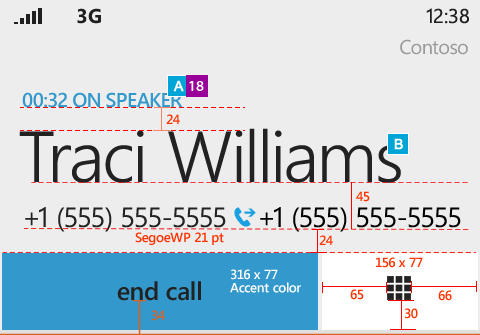
A comp, static or otherwise, is not what your developers use to build the actual product. For static pieces of UI, you provide redlines that precisely translate visual cues into something a developer can re-create. The following is an example of a redline taken from Arturo Toledo's great blog post around the Design Process for a Windows Phone app:
For your motion-based comps, the redline model doesn't really work. There are two things you can do instead:
While one can argue that everyone takes responsibility for the final product, the aesthetics of what gets created falls squarely on you as the designer. It is your responsibility to ensure that those who are actually writing the production code have all of the required information.
Take many steps back. Why do you and I create comps? The simple answer is to communicate a design direction. That's it. The goal is to communicate enough detail that allows someone to understand what is about to be built. The more details that you can communicate up front, the more smoothly you can ensure the project gets done on time, on budget, and with fewer surprises.
For example, knowing that there is an animation may cause the development team to rethink how the app is architected from the very beginning. If the developers need to take a dependency on a 3rd party library to enable a cool page flipping transition, you don't want that to happen in the middle of a project. If you budgeted X amount of hours of work for a certain task, you don't want a miscommunication to cause that number to go up. For all of these reasons, relying only on static comps is grossly inadequate. Provide a video file or GIF along with a willingness to work with your developers to help them translate subtle UI details. Your developers will thank you for it.
If you don't know anything besides Photoshop or Illustrator and can't create anything besides static comps, now is your chance to learn something new. You don't want to be one of those designers stuck in the past...unless what you are designing are (literally) static things like logos, comics, posters, t-shirts, and all sorts of other cool stuff. You don't have to learn anything new...for now!
Just a final word before we wrap up. What you've seen here is freshly baked content without added preservatives, artificial intelligence, ads, and algorithm-driven doodads. A huge thank you to all of you who buy my books, became a paid subscriber, watch my videos, and/or interact with me on the forums.
Your support keeps this site going! 😇


:: Copyright KIRUPA 2025 //--