
When you are creating comps for an app or web site, don't ignore the messy and crazy environment that the finished product will ultimately be in. What I mean is this. Too often, during implementation, I see comps that are perfect. They look sort of like the following animation taken from Google's Allo press coverage:
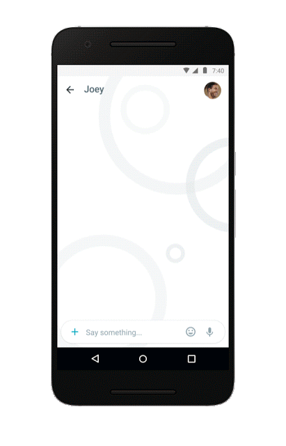
Every pixel is exactly where it needs to be. The interfaces often float over a perfectly selected background...or no background. If there are people featured, the profile pictures for them look as if a professional photographer took them. Everyone has a nice, short name that fits perfectly on a single line. The messages the fake users type is grammatically correct and interesting. I can go on, but you get the picture. When creating a comp for a marketing campaign, aiming for this sort of perfection is fine. When creating comps that will ultimately find their way onto a developer's hands to turn into an app or web site, perfection is not what you want.
Real life, especially inside our digital gardens, is messy. Your app's visuals will be competing for attention with the desktop background, other apps, the browser chrome, and many other things your users might be doing. If the app will feature user-generated content, you have no control over the quality of what will be shown. Looking beyond pure aesthetics, there are accessibility settings, screen sizes, DPI scales, and other everyday things that will greatly affect how your app looks and possibly even behaves. In all these varied situations, is the design you came up with going to adapt and still provide a usable experience? Did you account for this wide range of visual variation when coming up with your original design?
At the risk of not offending any one, I will use KIRUPA as an example. You may have started off hoping for something like this:
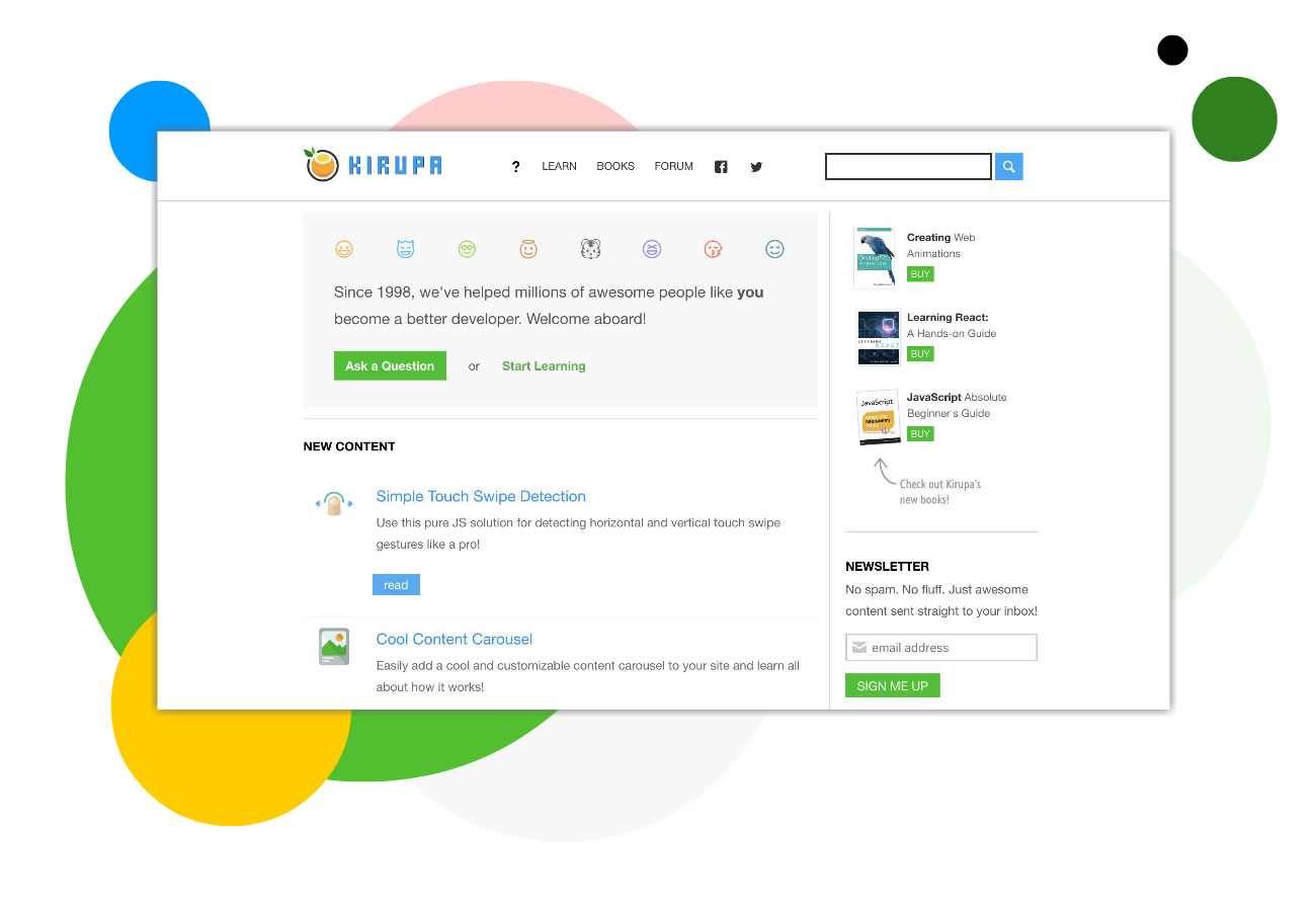
In reality, your design after getting implemented will resemble something more like the following:
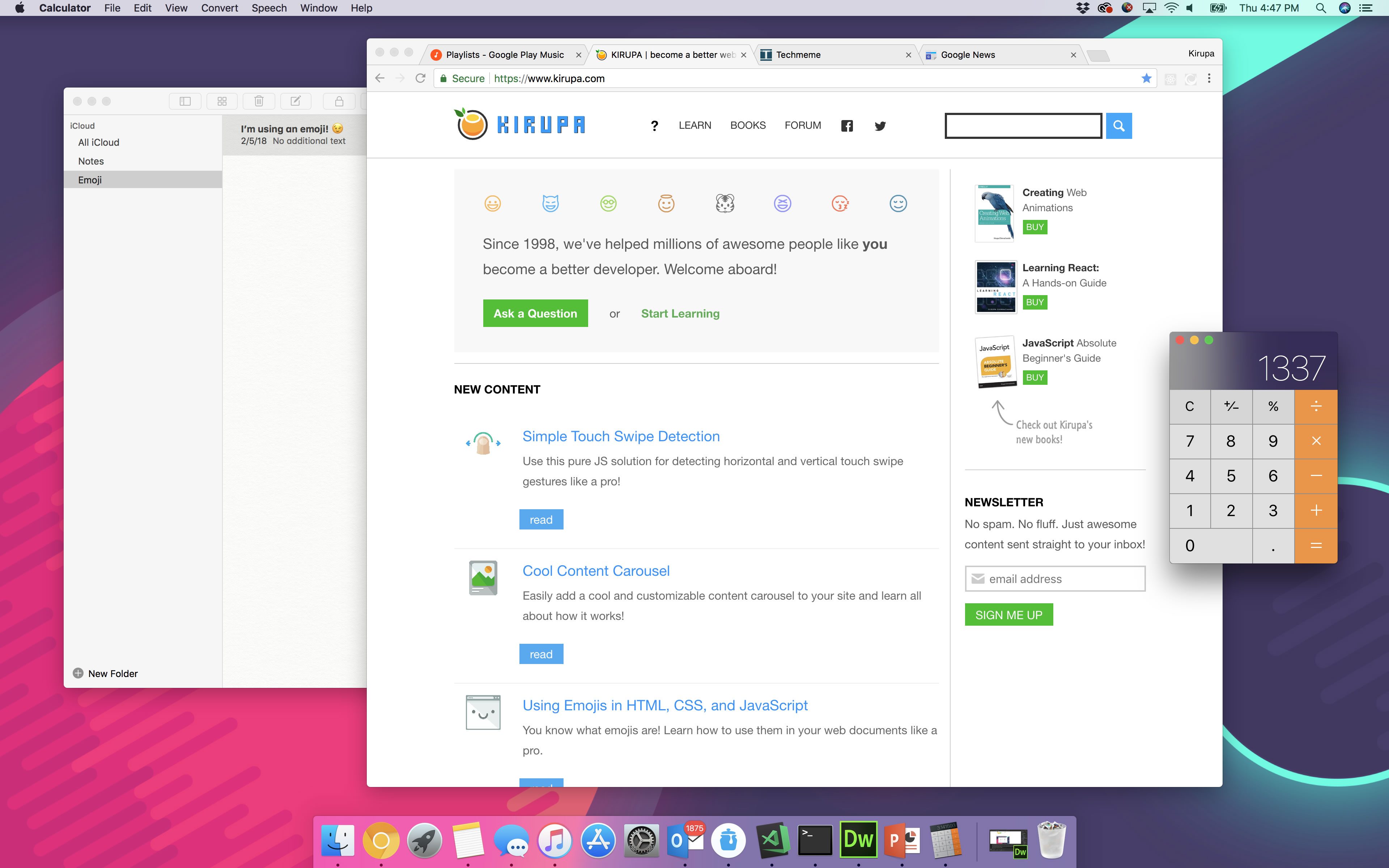
There is a lot of variation within this. If users turned on an accessibility display setting, such as high contrast mode, things can look very unexpected:
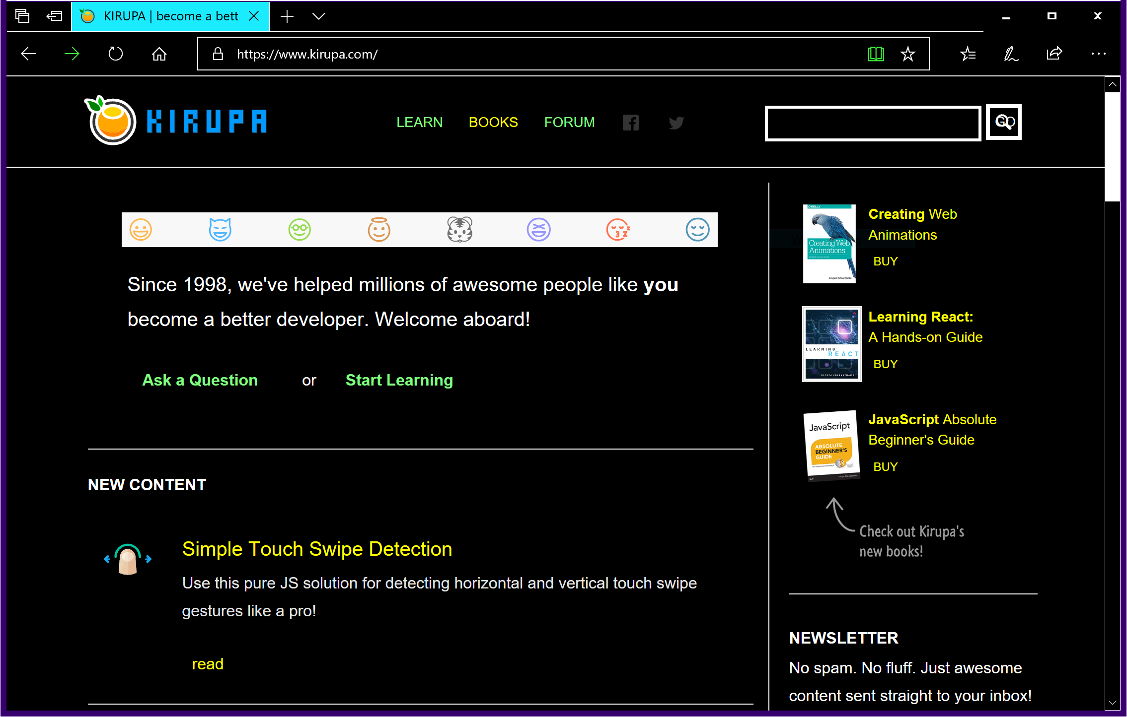
Someone may even have used this...um...really awesome Firefox theme to style their browser:
Does all of this mean you should avoid trying to create the perfect looking comps to communicate your idea? Not at all. You need to account for reasonable variations as part of coming up with your final comps. Whether you share all of the comps you create or only share the best depends on what stage of implementation you are on and to who you are presenting to. The only thing I do know for certain is this: if you are working with developers who are planning the work, share everything you got, especially the comps with all of the messiness! The more details you provide, the easier your developers' lives will be in planning the work and making any technical decisions early on.
Before wrapping this up, I want to list some examples of the messiness (aka my generic word for real-life situations) you should account for:
Note that I said you should only account for them. I didn't say you should represent all of these in comps. Whether you visually represent all of these variations is entirely up to you. The important part is that you have thought about the implications of these variations and have communicated a plan for dealing with them if it turns out to be important.
Just a final word before we wrap up. What you've seen here is freshly baked content without added preservatives, artificial intelligence, ads, and algorithm-driven doodads. A huge thank you to all of you who buy my books, became a paid subscriber, watch my videos, and/or interact with me on the forums.
Your support keeps this site going! 😇


:: Copyright KIRUPA 2025 //--