 Tutorials
Books
Videos
Forums
Tutorials
Books
Videos
Forums

Learn how to use some handy CSS Grid-related properties to easily create a 3x3 grid.
Layout on the web used to be a bit clunky and difficult. All of that started changing with the introduction of Flexbox and, more recently, the Grid. Things that would have taken us a boatload of HTML and CSS can now be accomplished much more concisely. An example of one such thing is creating a grid made up of columns and rows, and we'll look at how to build that in the following sections.
Onwards!
For building our grid, let's dive right into the final HTML and CSS first. If you want to follow along, create a new HTML document and add the following markup into it:
<!DOCTYPE html>
<html lang="en">
<head>
<meta charset="UTF-8">
<meta http-equiv="X-UA-Compatible" content="IE=edge">
<meta name="viewport" content="width=device-width, initial-scale=1.0">
<title>3x3 Grid</title>
<style>
body {
margin: 30px;
}
h1 {
font-size: 72px;
font-family: sans-serif;
}
.parent {
display: grid;
grid-gap: 10px;
grid-template-columns: repeat(3, 150px);
grid-template-rows: repeat(3, 150px);
}
.parent > div {
padding: 10px;
background-color: #EFCB68;
border-radius: 5px;
display: grid;
place-items: center;
}
.parent > div {
font-family: sans-serif;
font-size: 24px;
font-weight: bold;
}
</style>
</head>
<body>
<h1>A 3x3 Grid</h1>
<div class="parent">
<div>1</div>
<div>2</div>
<div>3</div>
<div>4</div>
<div>5</div>
<div>6</div>
<div>7</div>
<div>8</div>
<div>9</div>
</div>
</body>
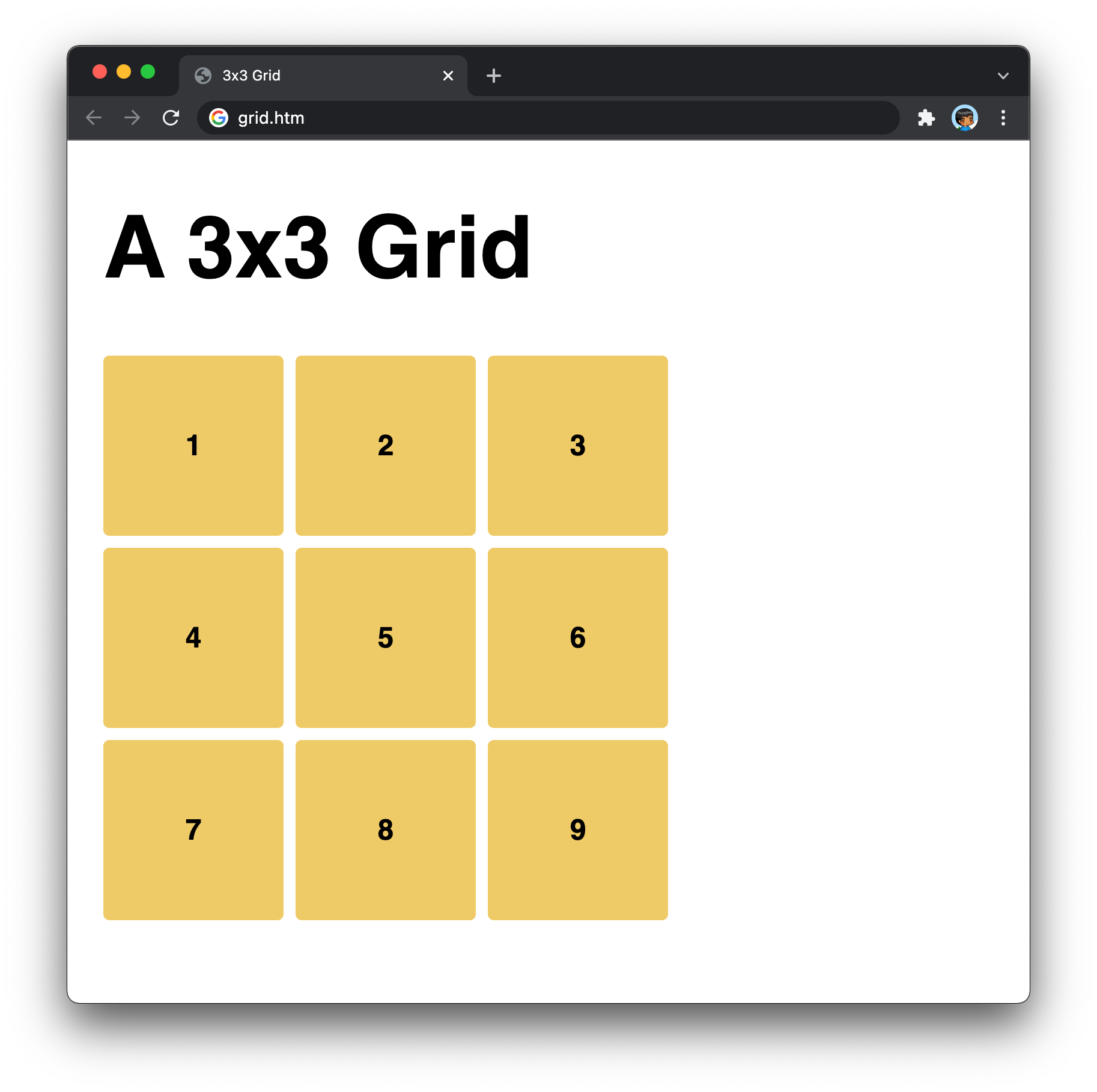
</html>What this markup will generate when you preview this page in your browser is a 3x3 grid that looks as follows:
Now, how does the markup we have result in what we see in the browser? That's something we'll dive into next.
There are two parts to making our grid come to life. The first part is the HTML, and the relevant part is as follows:
<div class="parent">
  <div>1</div>
  <div>2</div>
  <div>3</div>
  <div>4</div>
  <div>5</div>
  <div>6</div>
  <div>7</div>
  <div>8</div>
  <div>9</div>
</div>
We have a parent div element and then 9 child div elements. It is these nine div elements that make up each of the cells in our grid, but there is nothing in our HTML itself that hints at their grid-like future. Everything that relates to creating our 3x3 grid arrangement is handled by our CSS, and the lines responsible for that are the following:
.parent {
  display: grid;
  grid-gap: 10px;
  grid-template-columns: repeat(3, 150px);
  grid-template-rows: repeat(3, 150px);
}
Each line here is liquid gold. The first line here tells our browser that the layout for this element will be based on the grid:
.parent {
  display: grid;
  grid-gap: 10px;
  grid-template-columns: repeat(3, 150px);
  grid-template-rows: repeat(3, 150px);
}
The second line specifies the spacing between each grid column or row:
.parent {
  display: grid;
  grid-gap: 10px;
  grid-template-columns: repeat(3, 150px);
  grid-template-rows: repeat(3, 150px);
}
By setting our grid-gap property to a value of 10px, we create some breathing room between adjacent elements inside our grid. The last two lines specify the actual columns and rows:
.parent {
  display: grid;
  grid-gap: 10px;
  grid-template-columns: repeat(3, 150px);
  grid-template-rows: repeat(3, 150px);
}
By using the repeat function, we simplify specifying each row or column and the size each will have. By saying repeat(3, 150px) we tell our browser to create three columns or rows with each having a size of 150px. This is the equivalent of saying the following:
.parent {
  display: grid;
  grid-gap: 10px;
  grid-template-columns: 150px 150px 150px;
  grid-template-rows: 150px 150px 150px;
}
When the size of each of our columns or rows are the same, my preference is to use the repeat function. There is no right or wrong here, so use what you prefer. The end result, which is the important part, is that we see our 9 div elements neatly arranged in a 3x3 grid with three columns and three rows. Neat, right?
There you have it! We looked at a quick way to combine HTML and CSS to create a 3x3 grid. The techniques we looked at here will allow us to create grids of arbitrary sizes. The main thing to ensure is that the number of rows and columns you specify in CSS maps to the correct number of elements in our HTML.
Just a final word before we wrap up. What you've seen here is freshly baked content without added preservatives, artificial intelligence, ads, and algorithm-driven doodads. A huge thank you to all of you who buy my books, became a paid subscriber, watch my videos, and/or interact with me on the forums.
Your support keeps this site going! 😇


:: Copyright KIRUPA 2025 //--