 Tutorials
Books
Videos
Forums
Tutorials
Books
Videos
Forums

There is no shortage of ways (50% border-radius, SVG, canvas, etc.) we have for creating circles using just HTML, CSS, and JavaScript. One approach that I haven't seen discussed a lot is using radial gradients to create circles as part of an element's background, similar to the following example (open in CodePen):
In the following sections, let's quickly dive into how we can use the radial-gradient function and the values we need to set to create crisp circles!
Onwards!
The general template for drawing a circle using the radial-gradient function is as follows:
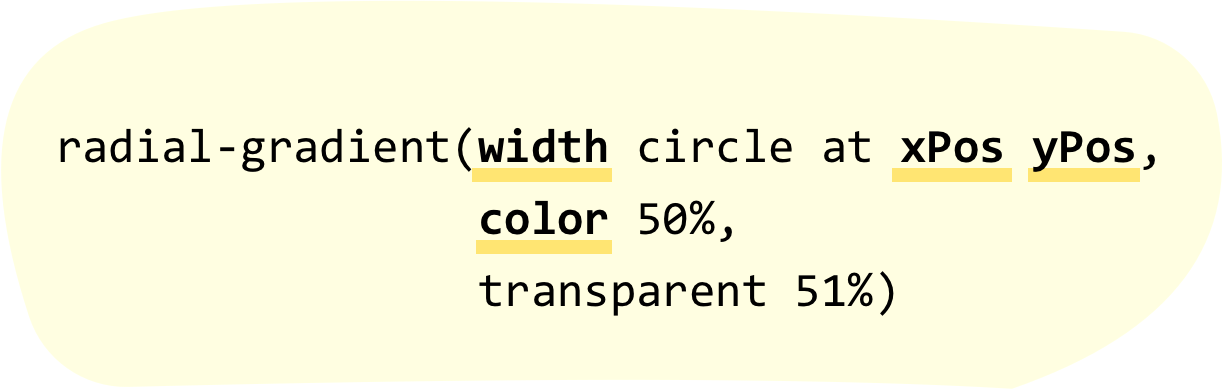
To use this, all we have to do is pair it with an appropriate CSS property (like background) and replace the values for width, xPos, yPos, and color with actual values. For example, if we wanted to draw a reddish circle that is 30 pixels wide, positioned horizontally at the 50px mark, and positioned vertically at the 200px mark, our CSS will look as follows:
background: radial-gradient(30px circle at 50px 200px,
                            #E71D36 50%,
                            transparent 51%);
To see this snippet used as part of a full example, create a new HTML document and add the following into it:
<!DOCTYPE html>
<html>

<head>
  <meta charset="utf-8">
  <title>It's Circle Time!</title>

  <style>
    body {
      background-color: #FFF;
      margin: 50px;
    }
    .circleBody {
      width: 550px;
      height: 450px;
      border: 5px solid #333;
      background: radial-gradient(30px circle at 50px 200px,
                                #E71D36 50%,
                                  transparent 51%);
      background-color: #FFF;
    }
  </style>
</head>

<body>
  <div class="circleBody">

  </div>
</body>

</html>
If you save your document and preview what you see in your browser, you'll see something that looks as follows:
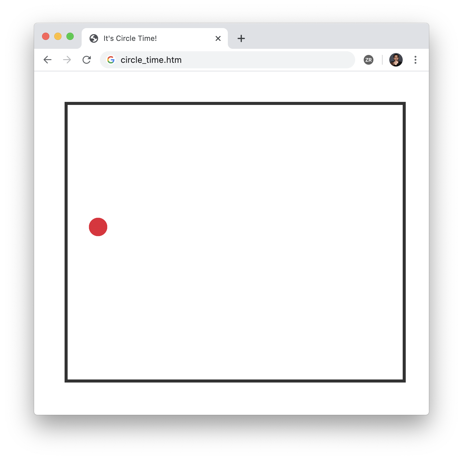
Notice that our lonesome red circle appears exactly as we specified. To have multiple circles appear, we can take advantage of background layering and specify multiple radial-gradient functions separated by a comma. For example, to re-create the example we started off with, replace your circleBody style rule from our earlier example with the following:
.circleBody {
width: 550px;
height: 450px;
border: 5px solid #333;
background: radial-gradient(50px circle at 100px 100px,
#FFFFFF 50%,
transparent 51%),
radial-gradient(75px circle at 300px 400px,
#FD0000 50%,
transparent 51%),
radial-gradient(100px circle at 400px 20px,
#000000 50%,
transparent 51%),
radial-gradient(25px circle at 500px 250px,
#A23B72 50%,
transparent 51%),
radial-gradient(200px circle at 250px 200px,
#00B1FF 50%,
transparent 50.4%),
radial-gradient(10px circle at 50px 420px,
#0079FF 50%,
transparent 51%);
background-color: #FDE964;
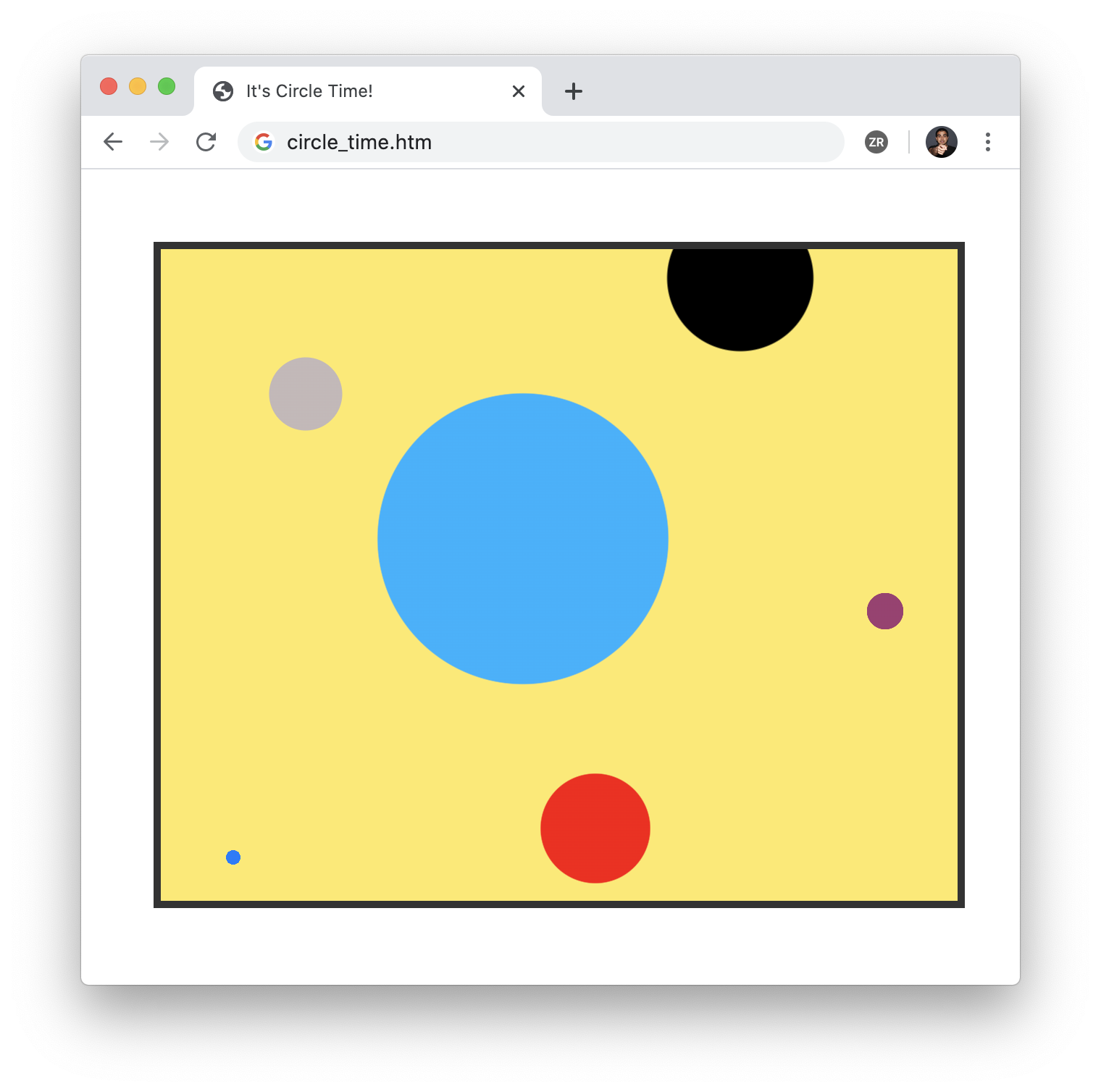
}Notice that we have six radial-gradient calls, each defining a circle with its own unique properties. If we preview this in our browser, what we'll see will (unsurprisingly) be the following:
If all of this seems fairly straightforward, it mostly is. But...there is one major quirk that we should discuss. This has to do with our gradient stops. Notice that our gradient stops in the template were at 50% and 51%. For a sudden change from one color to another, typically the gradient stop values would be the same. Why is there a 1% separation? The reason has to do with providing a smooth, anti-aliased looking border between our circle and the background.
If we kept the gradient stop values the same at 50%, here is what a typical circle will look like:
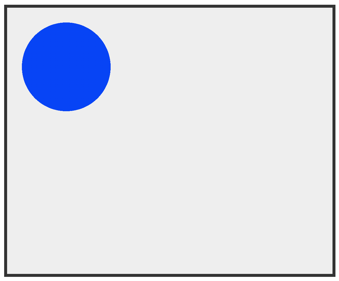
Pay really close attention to the edges of our circle. Notice that it has a jagged, 8-bit video game sort of an edge to it. If that is the effect you are going for, then great. Chances are, you want the circle to look more naturally blended in like the rest of the content on the page. To ensure this natural blending, separating our gradient stops by around 1% gives us the desired result:

Notice that I said around 1% earlier. The reason for not giving a definitive answer is that sometimes a 1% gap may look wrong. If the circle we are drawing happens to be large, a 1% separation results in our circle looking blurry (in a bad way) similar to scaling a small image larger:
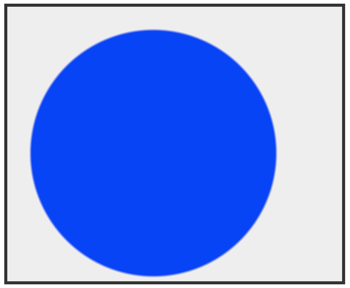
In this case, reducing the separation between our gradient stops to something less than 1% provides a better result:
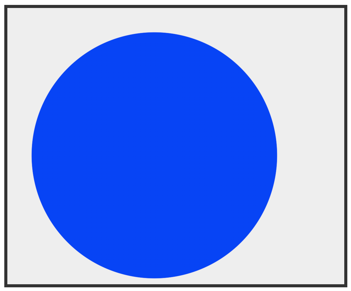
For this 400px wide blue circle, the separation between gradient stops is just .2%:
.circleBody {
  width: 550px;
  height: 450px;
  border: 5px solid #333;
  background: radial-gradient(400px circle at 240px 240px,
                              rgb(0, 60, 255) 50%,
                              transparent 50.2%);
  background-color: #EEE;
}
There is no hard and fast rule on how large the separation between gradient stops should be. Sometimes you will go beyond 1% and sometimes you will go much lower than 1%. Choosing the right value is going to require some degree of experimentation to see what values will work well.
The size value that we specify at the start our radial-gradient definitions is actually the radius. It ends up showing as the width because of our gradient stops, which are at the half-way mark at 50%. This essentially halves the size of our gradient to have our radius value act as the full width (diameter). To see the size value truly act as the radius, shift the gradient stops to the 100% mark (with a subsequent stop at 100.2% or similar). A huge thanks to Morteza who corrected this in this forum post! 🙃
The various functions we have in CSS for setting a background are quite powerful. The radial-gradient function is especially so. The amount of things we can do with radial gradients in this space goes beyond just circles. We can create circular borders/outlines, conical shapes, and more. If you have any interesting examples you would like to share, comment below with a link to your creation.
Just a final word before we wrap up. If you have a question and/or want to be part of a friendly, collaborative community of over 220k other developers like yourself, post on the forums for a quick response!

:: Copyright KIRUPA 2024 //--