 Tutorials
Books
Videos
Forums
Tutorials
Books
Videos
Forums

Increasingly, you are expected to create sites and apps that work well on various screen sizes. What this means is that your content needs to nice adapt to the amount of space available. With text, that is pretty easy. Text naturally tends to flow and wrap as needed without any extra encouragement from you. Images are a bit different. They are less willing to adapt to available space.
If you want your images to resize depending on the amount of space available, you have to do a small amount of extra work. This extra work revolves around ensuring the aspect ratio of the image is maintained as they get resized:

In this short tutorial, you will learn all about this small amount of extra work to ensure your images resize as you would like them to.
Onwards!
The solution we will look at is really simple. To preserve the aspect ratio, all you need to do is set the height and width CSS properties as shown:
.mySelector {
	width: 100%;
	height: auto;
}
Ensure this style rule applies to an image element, and...that's all there is to it.
By setting the width property to 100%, you are telling the image to take up all the horizontal space that is available. With the height property set to auto, your image's height changes proportionally with the width to ensure the aspect ratio is maintained. The end result is an image that scales up or down perfectly.
To see an example of this, copy and paste the following HTML and CSS into a new HTML document and preview it in your browser:
<!DOCTYPE html>
<html>

<head>
<title>Image Scaler 9000</title>
<style>
	body {
		padding: 25px;
		background-color: #EFEFEF;
	}
	#theImage {
		width: 100%;
		height: auto;
	}
	#container {
		width: 50%;
		margin: 0 auto;
	}
}

</style>
</head>

<body>

<div id="container">
	<img id="theImage" src="//www.kirupa.com/html5/examples/blueFeather.png">
</div>

</body>

</html>
When you preview in your browser, you'll see an image of a feather:
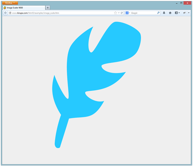
Simply resize your browser window to see the image of the feather scale up or down. Pretty sweet, no?
Tricks such as this fall under the larger bucket of responsive design. Scaling an image up and down is one effective technique to ensure your images size themselves appropriately for the situation. The downside is that a single image cannot effectively display crisply across the range of resolutions and DPIs your content may be viewed in. For a more comprehensive solution, you need to bring in media queries and images of varying sizes to replace a lower resolution image when the time is right.
For a simple, stop-gap solution, though, the approach I've shown here is good enough.
Just a final word before we wrap up. If you have a question and/or want to be part of a friendly, collaborative community of over 220k other developers like yourself, post on the forums for a quick response!

:: Copyright KIRUPA 2024 //--