Text
In Flash: Make it Legible!
Text
In Flash: Make it Legible!
by kirupa
A common problem plaguing Flash sites is not
a lack of design. Often times, the depth and complexity in
some Flash animations easily rival the paintings of famous
contemporary artists. The problem is not the design, but the
problem is the presentation of the content that supports the
design: the text.
The following animation includes examples of
three text styles that I find commonly used on many
animations:
[ click on the 'good', 'bad',
and 'ugly' links to see examples of text ]
Adding Text
As you could tell from clicking the three
links in the animation, the text in the "good" looks the
best. Why? I will give you a brief rundown of why the good
and the
bad and the ugly options are not proper for a Flash animation:
-
The text in the good option is sharp and very
legible. There is no blurriness in the edges and the
spacing is good.
-
Option bad is very similar to option good, but there is
noticeable blurriness. Thank Flash's anti-aliasing feature
for that. Overall, it makes for bad reading.
-
Option ugly is just what the name says...ugly and of very
bad quality! Unless you really want to have your users
look through blurry text that is Times New Roman, you
should consider using a different font besides the age-old
default font.
If your site's text falls into the
bad/ugly categories, don't worry. There are ways to make
your text better, and this tutorial will help you to learn
that.
-
Create a new movie in Flash. Make the movie any size you
want. It really doesn't matter for this tutorial.
-
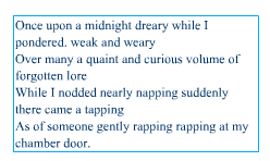
Copy the text from the following text box. Don't paste it
anywhere just yet:
-
Click the Text Tool icon from the toolbox on the left:
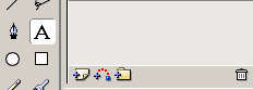
[ the text
tool icon ]
-
After you clicked the Text Tool icon, go to your movie stage
and draw a rectangular box to house the text. After you have
drawn that, paste the text you copied just two steps ago.
Your animation will look like the following image:
[ note the
font selection and the blurriness; may be different on your
screen ]
-
Save the file and preview the animation in your browser.
More likely than not, you probably do not
like what you see. The presentation of the text you are
seeing in your browser is how majority of all Flash sites
present their text. Let's find out how to make the text
better.
Making the Text Sharp and Legible
I am sure you are interested in finding out
how you can make your text better:
-
Go back to the Flash animation and select the text with
your mouse pointer.
-
The Text Properties panel will appear toward the bottom of
your Flash window. Click the Static Text drop-down menu
(the menu to the right of the "A" graphic). Select Dynamic
Text:
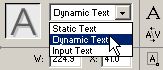
[ select the
Dynamic Text option ]
-
Once you have done that, click the Font drop-down menu and
select a font that you like. For the Font Size, enter an
even value. Most fonts don't scale well when set to an odd
value such as 9, 11, 13, 15, etc. Set your font to size 10
or 12.
-
The next step is for you to set your font to a color that
is easier to see. You should try to achieve contrast
between the text color and your background.
-
The final steps involve some minor formatting. Unless you
want your visitors to highlight the text you have in your
Flash animation, make sure the Selectable button is not
depressed. Also, click the Single Line drop-down menu and
select Multiline.
Your text properties panel for Step V should look like the
following image:
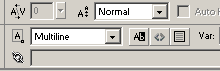
[ the
Multiline and Selectable option and button ]
-
Preview your animation by going to File | Publish Preview
| HTML.
You are finished with this lesson.
You may have noticed that the text in Flash still
looks blurred. The effects of the font formatting will only
be visible in the browser and the Flash Player. To remove
the blurriness seen while editing, go to View | Antialias.
That should fix the problem with blurry text seen while
editing in Flash MX.
|
 |
using the
Fonts For Flash fonts |
| If you are on the
look out for some sharp, pixel fonts that don't blur
regardless of how you place them in Flash, you should
give the fonts over at Fonts For Flash a shot:
http://www.fontsforflash.com.
To make the most out of using their fonts, try to
adhere to the following guidelines:
-
Set your font size to multiples of 8 such as 8,
16, 24. The fonts look odd at other sizes.
-
Your text's position on the Flash movie should be
in actual pixel values. Look in the X: and Y:
fields in the bottom-left of your Flash interface
and ensure that the position is not in a decimal
value such as 11.5, 12.4, etc.
-
Embed the Font outline for the font that you use.
In your Text Properties panel, make sure the text
is Dynamic text, and press the Character
button. The Character Options dialog box should
appear. Select the option that is most
appropriate.
You should be warned that embedding a font's
entire outline can dramatically (Shakespeare
anyone?) increase the file size of the final Flash
SWF file. Try to play with the options in the
Character Options dialog box and make sure you
don't select "Numerals (0-9)" when your text does
not contain any numbers.
|
|
Remember, Flash is not a bad tool for
presenting text on the internet. Flash, when used properly,
can create outstanding results for both personal and
educational sites with a lot of information. Some examples
of good sites that use text in Flash properly:
Thanks to
Stan Vassilev for notifying
me of a technical error I made in reference to a font's
position and making other useful suggestions.
Just a final word before we wrap up. What you've seen here is freshly baked content without added preservatives, artificial intelligence, ads, and algorithm-driven doodads. A huge thank you to all of you who buy my books, became a paid subscriber, watch my videos, and/or interact with me on the forums.
Your support keeps this site going! 😇

|