 Tutorials
Books
Videos
Forums
Tutorials
Books
Videos
Forums


A easy yet oft-overlooked effect anybody can create is the shadow effect. Technically, you are simulating a shadow by copying an object, pasting the object in a lower layer, offsetting the object a few pixels, and changing the color the object to look like a shadow.
The following animation shows an example of the shadow effect applied to a line of text along with something created using a bitmap (Wingding) font:
[ the above is an example of a shadow ]
Creating this Effect:
The following steps will guide you in
creating a shadow:
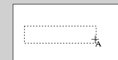
[ use the text tool to draw ]

[ the word shadow I just drew ]
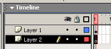
[ insert a
new layer below your existing layer ]

[ the text has been pasted below the original text and moved slightly ]
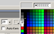
[ select a dark gray color for your text ]

[ the shadow effect is complete ]
Replay!
It may seem like a lot of work to create
a simple shadow effect, but it is actually very simple. I
over-elaborated some of the steps, but if the tutorial were
to be re-written in 6 steps, here is how it would look like:
Create the text and copy the text you created.
Insert new layer to go on the bottom.
Lock the top layer.
Paste In Place (Ctrl + Shift + V).
Select pasted text and move it around to create the location of the shadow.
Change the color of the text to a darker, shadow color.
If you are curious as to how my FLA looks like, click the link below. You should note that my version of the FLA includes the squiggly design that I created using the Wingding font.
|
Just a final word before we wrap up. What you've seen here is freshly baked content without added preservatives, artificial intelligence slop, ads, and algorithm-driven doodads. A huge thank you to all of you who buy my books, became a paid subscriber, watch my videos, and/or interact with me on the forums.
Your support keeps this site going! 😇


:: Copyright KIRUPA 2026 //--
