|
by
kirupa | 4 April 2010
With Expression Blend, it is very easy for you to
create your own visual states. For an introduction
on how to do that, please read my earlier
Using Custom Visual States tutorial.
In this short article, let's look at how you can
use a behavior to make working with states easy.
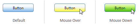
To quickly summarize the state
(ha!) of things, controls in Silverlight and WPF
(starting with version 4) contain pre-defined visual
states that affect how your appllication looks.
For example, a button would have Default, Hover,
and Pressed states:
Beyond just using the states that are provided
for you, you can create your own custom states as
well:

[ I
created two states called Small and Large ]
When working with your own visual states,
creating the visual state is only one part of what
needs to be done. The other part is actually being
able to switch to the visual state at the
appropriate time. For predefined visual states that
you find in your controls, the mechanism for
switching states is built in. For visual states that
you create on your own, you will have to provide
the logic for switching the visual states yourself.
That is where this behavior comes in. The
GoToStateAction allows you to easily switch visual
states given an appropriate event using just your
Properties Inspector. The following screenshot shows
you the standard behaviors UI customized with the
properties exposed by GoToStateAction:

[ the
properties you see with GoToStateAction ]
Let’s look at some of these properties in greater
detail.
Like I
mentioned earlier, this behavior primary
functionality lies in allowing you to change the
visual state. How it does might require some further
inspection, so let’s look at the various properties
in more detail.
The
visual state is set via the
StateName property. By default, you will see
all the states defined in your root scope (ie:
UserControl or Window) regardless of where you
drag/drop this behavior onto. You can change this by
targeting this behavior at another element.
For example, the default target is my UserControl
where I have two states defined:

[ the
StateName property lists the states you can select ]
If I were to target another element, such as a
Button that contains its own states, the StateName
list is populated with those states instead:

[ the
StateName list displays states contained in the
object targeted by TargetName ]
I spoke a lot about changing the target that your
states come from, so let’s look at the TargetName
property where the element you wish to target is
actually specified.
Note:
Expression Blend 4 deprecates TargetName and instead
introduces a very similar (on the surface) property
called TargetObject.
If you
want to target states that live somewhere else such
as another Control or UserControl, you can use the TargetName
property to change the element you want to point to.
As mentioned earlier, the default value for
TargetName is the root scope such as your
UserControl or Window.
YYou can change the default by clicking on the
little circular icon in the value editor to visually
pick another element from your Artboard or Objects
and Timeline panel:

[ you
can easily change the Target ]
If you are trying to pick something that isn’t
easily selectable visually, you can hit the little …
button to see a flat listing of all of your
elements. That is similar to what you see in the
Objects and Timeline panel.
You can either switch states
suddenly, or you can smoothly transition into
states. The UseTransitions property is what
controls what your behavior will do. By default, the
UseTransitions property is checked, but you can
uncheck it if you want a sudden switchover to your
new state.
Just a final word before we wrap up. What you've seen here is freshly baked content without added preservatives, artificial intelligence, ads, and algorithm-driven doodads. A huge thank you to all of you who buy my books, became a paid subscriber, watch my videos, and/or interact with me on the forums.
Your support keeps this site going! 😇

|
 Changing States using GoToStateAction
