|
by
kirupa | 22 November 2008
In the
previous page, we left off with an image you
inserted and resized. In this page, let's move on by
turning your image into a button and looking into
its template.
Going from an
What we want to do is
create rollover effects on a button. While that
conversion is entirely optional, you will find that
it becomes much easier when you go from an image and
towards a control such as a button that has more
functionality for dealing with mouse interactions.
- Once you have appropriately
resized your image, keep it selected, and go to
Tools | Make Button:
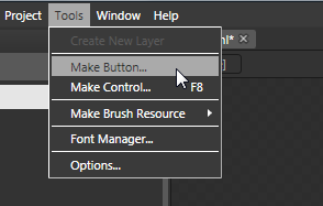
[ with your image selected, go to Tools | Make
Button ]
- When you select Make Button,
the Create Style Resource dialog will appear. In
your Name (Key) field, change the name provided
from ButtonStyle1 to something like
ImageButtonStyle:
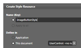
[ give your resource the name ImageButtonStyle ]
Once you have changed the name,
hit OK to close this dialog and to convert your
image into a button.
You will know that your
image has been converted into a button when you look
at your object tree and your image now has a button
icon next to it. If you didn't give your image a name
originally, the default name [Button] text displayed
instead of [Image]:
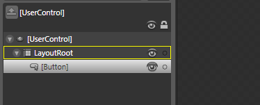
[ you know you have a button when the icon and name
indicates that you do! ]
- With your image now converted into
a button, it is time to dig into its template
and see the internals of what your newly
converted button is made up of. With your button now selected, go
to the breadcrumb bar found towards the top of
your artboard.
Click on the [Button]
button and, from the menu that appears, go to
Edit Control Parts (Template) | Edit Template:
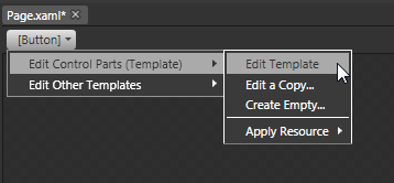
[ you can easily edit the template by using the
breadcrumb bar ]
- You will now find yourself editing your
Button's template. A "template" is basically the
name referring to all of the various things that
make up the internals of your control.
In our case with the Button, your template's
contents look as follows:
[ your control is actually made up of many other
controls! ]
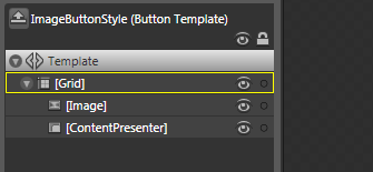
You have your Grid that controls
the layout, and it contains two children - your
Image (which is what you started out with) and the ContentPresenter control
- Select your ContentPresenter control. When
you select it, you will notice that the Button
text that appeared over your image after you
converted it a few steps ago is now selected:
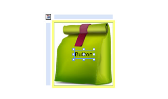
[ when you converted your image into a button, this
Button text appeared ]
This text displayed via your
ContentPresenter is not very important for us, so
hit your Delete key to go ahead and remove it.
Great - you now have your button setup just the
way you want for how it looks by default. The last
thing that remains is adding the different look when
you rollover or click on the button. Let's look into
that on the
next page.
Onwards to the
next page!
|
 Creating a Custom Button - Page 2