Table of Contents
Audio elements are used a lot in web applications. They have a lot of features like muting, increasing and reducing sound volume, pausing and playing, and much more. There are several audio libraries used to achieve all of this functionality, but in this article we’ll look at how to achieve all of this (and more) using nothing but plain JavaScript. By the end of this tutorial, you will have a concise understanding of how to work with audio in your web pages.
To help us understand how to work with audio on the web, below is an example of what we will be deconstructing:
There can be improvements to our example, of course, but this simple demo shows how JavaScript can control the properties of the audio element. Play with the example a little to get familiarized with what capabilities can be built. Once you are ready, let's read on to see how everything works.
If you haven't done so yet, open our Codepen example in a separate tab and look at the HTML, CSS, and JavaScript:
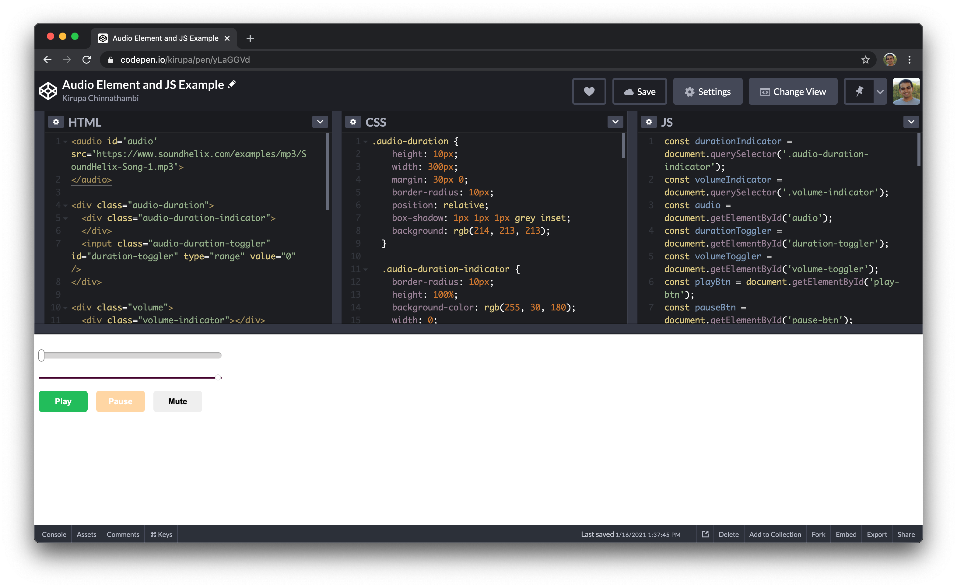
What we are going to do in the next few sections is walk through the interesting pieces of HTML, CSS, and JavaScript that help bring our sound example to life.
The star of this example is the audio element, so let's take a special look at it first. The audio element is a DOM element used for embedding sounds from different sources in a webpage. It is used in this manner:
<audio src='source-of-audio'>
</audio>
Using the element like above shows a blank screen, though the audio is embedded and downloaded by the browser. This is expected because there is nothing visible about sound. It’s just sound! But as you would see on many websites, different controls are attached to sounds to show the status of the sound - either paused, playing, or containing other information. The browser has default controls for the audio element which can be activated when the controls attribute is present:
<audio src='source-of-audio' controls>
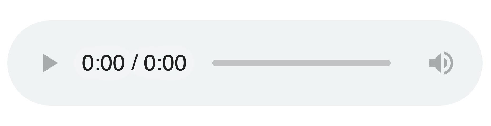
</audio>In Chrome, the default audio controls will look similar to the following:
However, we do not have to stick with the appearance of these controls. There is room for customizability, which is something we’ll also be seeing in this article. Without further ado, let’s get started deconstructing what we have on the codepen shared above.
The HTML for our example looks as follows:
<audio id='audio' src='https://www.soundhelix.com/examples/mp3/SoundHelix-Song-1.mp3'>
</audio>

<div class="audio-duration">
  <div class="audio-duration-indicator">
  </div>
  <input class="audio-duration-toggler" id="duration-toggler" type="range" value="0" />
</div>

<div class="volume">
  <div class="volume-indicator"></div>
  <input class="volume-toggler" id='volume-toggler' type="range" value="100" />
</div>

<button class="btn btn-play" id="play-btn">Play</button>
<button disabled class="btn btn-pause" id="pause-btn">Pause</button>
<button class="btn btn-mute" id="mute-btn">Mute</button>
Diving deeper into this, the first element is the audio element:
<audio id='audio' src='https://www.soundhelix.com/examples/mp3/SoundHelix-Song-1.mp3'>
</audio>
It is not visible on the web page. We are using it only for loading and playing the sound, and the sound used for this example is this from SoundHelix.
Next, there’s a div element with two children:
<div class="audio-duration">
  <div class="audio-duration-indicator">
  </div>
  <input class="audio-duration-toggler" id="duration-toggler" type="range" value="0" />
</div>
The first child shows the progress of the sound, and the second child is a range input that helps us achieve a nice toggle for moving to different sections of the audio.
Next is another div element with two children:
<div class="volume">
  <div class="volume-indicator"></div>
  <input class="volume-toggler" id='volume-toggler' type="range" value="100" />
</div>
The first child is used to indicate the level of the volume, and the second is child is a range input used to help us achieve a nice volume level toggling.
And the last elements are three buttons: the Play button, Pause button and Mute button respectively:
<button class="btn btn-play" id="play-btn">Play</button>
<button disabled class="btn btn-pause" id="pause-btn">Pause</button>
<button class="btn btn-mute" id="mute-btn">Mute</button>
You know what these would do! Next, some styling to give the indicators and buttons a nice appearance!!!
Our full CSS is the following:
.audio-duration {
  height: 10px;
  width: 300px;
  margin: 30px 0;
  border-radius: 10px;
  position: relative;
  box-shadow: 1px 1px 1px grey inset;
  background: rgb(214, 213, 213);
}

.audio-duration-indicator {
  border-radius: 10px;
  height: 100%;
  background-color: rgb(255, 30, 180);
  width: 0;
}

input[type=range] {
  -webkit-appearance: none;
  background: transparent;
}

input[type=range]::-webkit-slider-thumb {
  -webkit-appearance: none;
  transition: transform 300ms;
}

input[type=range]::-webkit-slider-thumb:hover {
  transform: scale(1.3);
}

.audio-duration-toggler {
  width: 100%;
  position: absolute;
  height: 20px;
  top: 0;
  margin-top: -5px;
  left: 0;
}

.audio-duration-toggler::-webkit-slider-thumb {
  border: 1px solid grey;
  height: 20px;
  width: 10px;
  border-radius: 3px;
  background: #ffffff;
  cursor: pointer;
  border-radius: 30px;
  margin-left: -3px;
}

.volume {
  width: 300px;
  height: 3px;
  background-color: rgb(224, 224, 224);
  border-radius: 5px;
  margin-bottom: 20px;
  position: relative;
}

.volume-indicator {
  width: 100%;
  background-color: rgb(68, 3, 47);
  height: 100%;
}

.volume-toggler {
  position: absolute;
  top: 0;
  margin-top: -4px;
  width: 100%;
}

.volume-toggler::-webkit-slider-thumb {
  border: 1px solid rgb(224, 224, 224);
  background: white;
  border-radius: 50%;
  width: 10px;
  height: 10px;
  cursor: pointer;
  margin-left: -3px;
}

.btn {
  border: none;
  padding: 10px;
  width: 80px;
  border-radius: 5px;
  cursor: pointer;
  margin-right: 10px;
}

.btn:disabled {
  opacity: .4;
  cursor: not-allowed;
}

.btn-play {
  background-color: rgb(32, 189, 84);
  color: white;
}

.btn-pause {
  background-color: rgb(255, 153, 0);
  color: white;
}
A lot of the styles should be straightforward to understand, but the following are a bit special:
input[type=range] {
  -webkit-appearance: none;
  background: transparent;
}

input[type=range]::-webkit-slider-thumb {
  -webkit-appearance: none;
  transition: transform 300ms;
}

input[type=range]::-webkit-slider-thumb:hover {
  transform: scale(1.3);
}
These styles are special in that they allow us adjust the browser's treatment of how our audio controls appear. We'll see the-webkit-appearance property appearing a few times. This property is used for specifying the browser-based styles of some elements. A value of none takes away the default styles, thereby giving us room to apply our own custom styles - which we do for the range slider and the slider thumb.
What we have seen so far helps us achieve the layout and appearance of the various audio controls and indicators. What they don't do is connect the audio element and the various other elements into something that works together. For example, the Play button does nothing and the volume toggle does nothing. This is the fun part where JavaScript comes in.
We’ll look at the code bit by bit, so here’s the first part:
const durationIndicator = document.querySelector('.audio-duration-indicator');
const volumeIndicator = document.querySelector('.volume-indicator');
const audio = document.getElementById('audio');
const durationToggler = document.getElementById('duration-toggler');
const volumeToggler = document.getElementById('volume-toggler');
const playBtn = document.getElementById('play-btn');
const pauseBtn = document.getElementById('pause-btn');
const muteBtn = document.getElementById('mute-btn');
All we are doing here is declaring a bunch of variables and using getElementById to reference the various HTML elements in our DOM.
let duration;

audio.addEventListener('loadedmetadata', () => {
  duration = audio.duration;
});
Next we calculate how long our audio file will take to play. The appropriately namedduration property on ouraudio element gives us this information.
To get the duration information, however, we have to do some extra work to ensure we access the duration property only after the audio file has been fetched from the source and loaded. This is where the loadedmetadata event comes in. This event files only after our audio file has loaded enough to the point the metadata (which includes duration) has been read. Once that event is overheard, we know it is a good time to access the duration property and populate ourduration variable with our our audio's duration.
const setCurrentTime = (currentTime) => {
  audio.currentTime = currentTime
}
This function is a fun one where we specify the time (via the currentTime argument) our audio element should be playing from. This is done by setting thecurrentTime property.
getAudioProgress is another function which uses the currentTime argument passed to it to determine how much of the audio file has played as a percentage:
const getAudioProgress = (currentTime) => {
  const progress = currentTime / duration * 100;
  durationIndicator.style.width = progress + '%';
  durationToggler.value = progress;

  return progress;
}
With the percentage value, we can increase the width of the duration indicator element <div class="audio-duration-indicator">. Additionally, this function ensures that the value of the duration toggler is updated to reflect the current progress.
audio.addEventListener('timeupdate', (e) => {
  const currentTime = e.target.currentTime;
  getAudioProgress(currentTime);
});
One thing to note is that the currentTimeproperty on an audio element is continuously updated as the audio plays. The way we can keep an up-to-date reference to the current time value is by listening to the timeupdate event. This event is fired continuously while our audio is playing. In the listener above, we get the audio’s current time and pass it as an argument to the getAudioProgress to update the indicator’s style.
The following three functions make our Play, Pause, and Mute buttons work:
playBtn.onclick = () => {
  playBtn.disabled = true;
  pauseBtn.disabled = false;
  audio.play();
}

pauseBtn.onclick = () => {
  pauseBtn.disabled = true;
  playBtn.disabled = false;
  audio.pause();
}

muteBtn.onclick = () => {
  if (audio.muted) {
    audio.muted = false;
    muteBtn.innerText = 'Mute';
  } else {
    audio.muted = true;
    muteBtn.innerText = 'Unmute';
  }
}
Starting with the first, clicking the play button disables the play button (since an already playing audio cannot be played again), enables the pause button, and calls the audio element's play method.
The pause button does the same thing when clicked: disables the pause button, activates the play button, and calls the pause method of the audio element.
The mute button on the other hand updates both the mute property of the audio element and the text the button contains depending on the previous mute status.
And now, the last two event listeners that tie together so much of the code we have seen so far:
durationToggler.addEventListener('input', (e) => {
  const progress = parseInt(e.target.value)
  const time = progress / 100 * duration
  setCurrentTime(time)
  getAudioProgress(time);
});

volumeToggler.addEventListener('input', (e) => {
  const value = e.target.value;
  const volume = value / 100;
  audio.volume = volume;
  volumeIndicator.style.width = value + '%';
});
The first one listens to an input change on the durationToggler element. The input event fires when the range input changes value (either by sliding to the left or to the right). On every change, the currentTime of the audio is set using our setCurrentTime function (so the audio can continue playing from there) and the indicators updated through getAudioProgress.
For the next event listener, an input event is listened for on the volumeToggler element. On every change, the volume (which has a minimum of 0 and maximum of 1) is calculated, and the volume property of the audio is updated. Adding to this, the indicator’s width is updated to show the level. A nice addition to this is making the element in the form of a triangle to depict low to high levels.
And that’s it for this audio element tutorial. Like I mentioned at the beginning, a lot of the audio libraries do all of what we saw behind the scenes. Here we got a more direct look using vanilla JavaScript. The cool thing is that we can even do more than was shown above. JavaScript has access to the DOM, which makes it possible to read and write (if supported) the values of the attributes of the audio element.
I do hope that from this article, you’ve learned few CSS tricks (like using -webkit-appearance to toggle the default browser look) and general audio tricks that you can include on your next project.