# Components
## Agent Instructions
You are composing a current-shell KIRUPA page. Read /design/components.json and the relevant entry in /design/sections/components.md for selectors, variants, source files, and usage. Start from an adjacent working page and reuse its SSI structure and named component classes. When a link needs to look like a link inside the tutorial body, add the blueEmphasis class to its anchor, including in component examples. Style class names, IDs, and code identifiers in explanatory prose with inlineCode. Choose semantic HTML before adding JavaScript. Use visible labels, keyboard-operable controls, clear focus, and explicit loading/error/empty states. Keep forms inert in documentation specimens and label demo output. Preserve the article's reading rhythm and code overflow containment. Verify the component in each visual style and both modes. Do not initialize onboarding, tracking, a live chat request, or a subscription in a preview. Keep reference and navigation descriptions short and factual.
Follow WCAG 2.2 AA for new or changed content: semantic HTML, keyboard access, visible focus, readable contrast in every theme, text alternatives, labeled controls, and explicit errors. Support zoom/reflow, respect reduced motion, and keep sound optional. Read /design/sections/accessibility.md for acceptance checks. Report unresolved barriers; automated checks alone do not establish conformance.
## Reference
Native interface elements with independent theme previews, markup, selectors, and source references.
Current articles use `#mainBody`, `#mainContent`, `#tutorialInformation`, `.authorText`, `.tutorialInfo`, and the shared shell includes. Reuse `.kirupaButton`, `.kirupaInput`, `.inlineCode`, `.blueEmphasis`, `.callout`, `.articleList`, and `.embed-container` instead of drawing near-duplicates.
Use `.blueEmphasis` on anchors that need the standard link treatment inside tutorial body content, including links in component examples. Keep their text descriptive. Use `.inlineCode` when naming CSS classes, IDs, or code identifiers in the explanation.
> **Example: Use the reading classes directly**
> Give the identifier its inline-code treatment and the destination its link treatment.
```html
```
Use real buttons for actions, anchors for destinations, visible input labels, scope on table headers, and a caption or accessible name for tables. Focus is a state, not an optional decoration. Label disabled controls and empty states so readers understand what can happen next.
[Buttons and form states](/design/components.htm#specimen-components)
Tutorial content has a title and byline, a reason to care, an example, and a clear progression. Code and illustrations must agree. Long examples can scroll inside their own container; the whole page must not become a sideways adventure. Here is a reading detail from [Building Your First Interactive Web Page](https://www.kirupa.com/html5/building_your_first_web_page.htm):
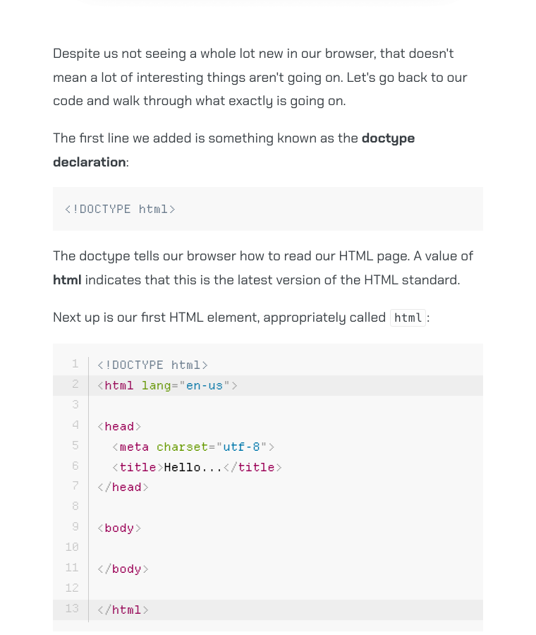
[Reading patterns in a real tutorial](https://www.kirupa.com/html5/building_your_first_web_page.htm). Fixed capture from 2026-10-19.
The theme picker is a dialog with color swatches, a custom color, mode choices, and style cards. Onboarding is a separate once-only interaction that can record choices. These are production behaviors, not things to initialize when showing an innocent design preview.
The catalog below covers shared article patterns, navigation, book and newsletter promotions, theme controls, search, chat, media, and the visitor globe. Each entry identifies its implementation and any preview limitations. Tutorial-specific games and visualizers, legacy Flash interfaces, and third-party Discourse internals are outside this shared-component catalog. Preview actions stay local; they never submit a subscription, chat message, search query, or presence event to production.
## Component catalog
Current shared tutorial elements, homepage and podcast cards, promotions, navigation, theme controls, and signature widgets. Examples reuse native CSS and extracted source markup. Lesson-specific demos, legacy Flash layouts, and the unversioned Discourse theme are not a shared component library.
[Download component metadata](/design/components.json).
### Article title and metadata
ID: `article-heading`. Native article title, author block, and Filed under metadata.
Selectors: `#tutorialInformation`, `.authorText`, `.tutorialInfo`.
Properties: `--headerText`, `--bodyText`.
Keep the shared title size and font. Do not introduce a separate hero or display treatment.
[Independent preview](/design/components.htm#component-article-heading).
**Article title and metadata.** Example composed with native selectors. [Rendered markup](/design/generated/components/article-heading-default.htm).
```html
```
Sources: [ssi/newDesign/src/kirupa.css](https://github.com/kirupa/kirupaWWW/blob/main/ssi/newDesign/src/kirupa.css), [design/template.htm](https://github.com/kirupa/kirupaWWW/blob/main/design/template.htm), [html5/building_your_first_web_page.htm](https://github.com/kirupa/kirupaWWW/blob/main/html5/building_your_first_web_page.htm).
### Headings, links, code, and emphasis
ID: `reading-type`. Article heading levels and inline treatments using the site's existing selectors.
Selectors: `#mainContent h2`, `#mainContent h3`, `#mainContent h4`, `.blueEmphasis`, `.inlineCode`, `strong`, `em`.
Properties: `--serifFonts`, `--monoFonts`, `--headerText`, `--linkForeground`, `--linkHoverBackground`.
Links that need to look like links in tutorial body content require blueEmphasis. Use inlineCode for identifiers; do not apply it to a whole code block.
[Independent preview](/design/components.htm#component-reading-type).
**Headings, links, code, and emphasis.** Example composed with native selectors. [Rendered markup](/design/generated/components/reading-type-default.htm).
```html
```
Sources: [ssi/newDesign/src/kirupa.css](https://github.com/kirupa/kirupaWWW/blob/main/ssi/newDesign/src/kirupa.css).
### Buttons and size variants
ID: `buttons`. Primary actions, the historical greenButton alias, and the compact button modifier.
Selectors: `.kirupaButton`, `.greenButton`, `.kirupaButtonSmall`.
Properties: `--primary`, `--primaryDarker`, `--textOnPrimary`.
Use buttons for actions and anchors for navigation. greenButton is a historical name; its color follows the palette. The compact modifier does not guarantee a 44px touch target. Check focus, disabled behavior, and hit area in the actual context.
[Independent preview](/design/components.htm#component-buttons).
**Buttons and size variants.** Example composed with native selectors. [Rendered markup](/design/generated/components/buttons-default.htm).
```html
Open reference
```
Sources: [ssi/newDesign/src/kirupa.css](https://github.com/kirupa/kirupaWWW/blob/main/ssi/newDesign/src/kirupa.css).
### Article lists and ordered steps
ID: `lists`. Native linked topic lists, ordinary bullet lists, and ordered instructions.
Selectors: `.articleList`, `#mainContent ul`, `#mainContent ol`.
Properties: `--bodyText`, `--primary`, `--linkForeground`.
articleList has its own link and icon treatment. Ordinary inline reading links still use blueEmphasis. Keep list semantics instead of imitating bullets with text.
[Independent preview](/design/components.htm#component-lists).
**Article lists and ordered steps.** Example composed with native selectors. [Rendered markup](/design/generated/components/lists-default.htm).
```html
```
Sources: [ssi/newDesign/src/kirupa.css](https://github.com/kirupa/kirupaWWW/blob/main/ssi/newDesign/src/kirupa.css), [javascript/learn_javascript.htm](https://github.com/kirupa/kirupaWWW/blob/main/javascript/learn_javascript.htm).
### Notes, downloads, and archive notices
ID: `notices`. Three existing callout patterns with different purposes.
Selectors: `.callout`, `.downloadCallout`, `.legacyArchiveNote`.
Properties: `--highlighter`, `--lighter`, `--darkTextSecondary`.
A note explains an exception; a download callout exposes a file; an archive notice prevents an old pattern being mistaken for current guidance.
[Independent preview](/design/components.htm#component-notices).
**Note.** Example composed with native selectors. [Rendered markup](/design/generated/components/notices-note.htm).
```html
```
**Download.** Example composed with native selectors. [Rendered markup](/design/generated/components/notices-download.htm).
```html
```
**Archive notice.** Example composed with native selectors. [Rendered markup](/design/generated/components/notices-archive.htm).
```html
```
Sources: [ssi/newDesign/src/kirupa.css](https://github.com/kirupa/kirupaWWW/blob/main/ssi/newDesign/src/kirupa.css), [design/archive.htm](https://github.com/kirupa/kirupaWWW/blob/main/design/archive.htm).
### Syntax-highlighted code
ID: `code`. Native Prism code presentation, including real highlighting and overflow behavior.
Selectors: `pre[class*="language-"]`, `code[class*="language-"]`, `.token`.
Properties: `--monoFonts`, `--codeFilter`.
Put the language on both pre and code so the unhighlighted block has stable geometry. The normal shell loads Prism near the viewport; the isolated example loads the same library explicitly.
[Independent preview](/design/components.htm#component-code).
**Syntax-highlighted code.** Example composed with native selectors. [Rendered markup](/design/generated/components/code-default.htm).
```html
const count = 3;
```
Sources: [ssi/newDesign/src/kirupa.css](https://github.com/kirupa/kirupaWWW/blob/main/ssi/newDesign/src/kirupa.css), [ssi/newDesign/src/kirupa.js](https://github.com/kirupa/kirupaWWW/blob/main/ssi/newDesign/src/kirupa.js), [js/prism_v1.js](https://github.com/kirupa/kirupaWWW/blob/main/js/prism_v1.js).
### Images and embedded-media frames
ID: `images`. Bordered images, borderless artwork, and the shared iframe frame.
Selectors: `.centerImage`, `.centerImageNoBorder`, `.centerIframe`, `.imageCaption`.
Properties: `--mediaBorder`.
Introduce figures in the surrounding prose. Preserve intrinsic dimensions and purposeful alt text. The embed preview only demonstrates the frame; it does not load a player or third-party service.
[Independent preview](/design/components.htm#component-images).
**Bordered image.** Example composed with native selectors. [Rendered markup](/design/generated/components/images-bordered.htm).
```html
```
**Borderless illustration.** Example composed with native selectors. [Rendered markup](/design/generated/components/images-borderless.htm).
```html
```
**Embedded-media frame.** Example composed with native selectors. [Rendered markup](/design/generated/components/images-embed.htm).
```html
```
Sources: [ssi/newDesign/src/kirupa.css](https://github.com/kirupa/kirupaWWW/blob/main/ssi/newDesign/src/kirupa.css), [data_structures_algorithms/understanding_merkle_trees.htm](https://github.com/kirupa/kirupaWWW/blob/main/data_structures_algorithms/understanding_merkle_trees.htm).
### Book promotions
ID: `books`. Inline book callouts and the older cover-and-copy book blocks.
Selectors: `#kbook_callout`, `.lightbulb_callout`, `.lightbulb`, `.bookContent`, `#bookImage`, `#bookContent`, `.greenButton`.
Properties: `--lighter`, `--light`, `--primaryLightest`, `--mediaBorder`.
Markup and inline styles are extracted from the real includes. Render one variant at a time because several share IDs. 3dBook.shtml currently repeats the animation promotion; it is not a separate 3D-book design. Older includes may need accessibility and mobile updates before reuse.
[Independent preview](/design/components.htm#component-books).
**Data Structures and Algorithms.** Source-extracted markup. [Rendered markup](/design/generated/components/books-algorithms.htm).
```html
```
**JavaScript.** Source-extracted markup. [Rendered markup](/design/generated/components/books-javascript.htm).
```html
```
**Canvas.** Source-extracted markup. [Rendered markup](/design/generated/components/books-canvas.htm).
```html
```
**Arrays.** Source-extracted markup. [Rendered markup](/design/generated/components/books-arrays.htm).
```html
```
**React.** Source-extracted markup. [Rendered markup](/design/generated/components/books-react.htm).
```html
```
**Web Animation.** Source-extracted markup. [Rendered markup](/design/generated/components/books-animation.htm).
```html
```
Sources: [ssi/newDesign/inline_algorithms.shtml](https://github.com/kirupa/kirupaWWW/blob/main/ssi/newDesign/inline_algorithms.shtml), [ssi/newDesign/jsBook.shtml](https://github.com/kirupa/kirupaWWW/blob/main/ssi/newDesign/jsBook.shtml), [ssi/newDesign/canvasBook.shtml](https://github.com/kirupa/kirupaWWW/blob/main/ssi/newDesign/canvasBook.shtml), [ssi/newDesign/arrayBook.shtml](https://github.com/kirupa/kirupaWWW/blob/main/ssi/newDesign/arrayBook.shtml), [ssi/newDesign/reactBook.shtml](https://github.com/kirupa/kirupaWWW/blob/main/ssi/newDesign/reactBook.shtml), [ssi/newDesign/animBook.shtml](https://github.com/kirupa/kirupaWWW/blob/main/ssi/newDesign/animBook.shtml), [ssi/newDesign/3dBook.shtml](https://github.com/kirupa/kirupaWWW/blob/main/ssi/newDesign/3dBook.shtml), [ssi/newDesign/src/kirupa.css](https://github.com/kirupa/kirupaWWW/blob/main/ssi/newDesign/src/kirupa.css).
### Inline newsletter callout
ID: `newsletter-inline`. Mail artwork, newsletter copy, and a linked action inside an article.
Selectors: `#newsletter_callout`.
Properties: `--lighter`, `--light`, `--mediaBorder`.
Reuse the include and its ID so style-specific artwork remains attached. The preview never subscribes or opens the newsletter service.
[Independent preview](/design/components.htm#component-newsletter-inline).
**Inline newsletter callout.** Source-extracted markup. [Rendered markup](/design/generated/components/newsletter-inline-default.htm).
```html
```
Sources: [ssi/newDesign/inline_newsletter.shtml](https://github.com/kirupa/kirupaWWW/blob/main/ssi/newDesign/inline_newsletter.shtml), [ssi/newDesign/src/kirupa.css](https://github.com/kirupa/kirupaWWW/blob/main/ssi/newDesign/src/kirupa.css).
### Footer newsletter block
ID: `newsletter-footer`. The shared newsletter heading, copy, and action above the site footer.
Selectors: `#sigNewsletter`, `.newsletterContainer`, `.greenButton`.
Properties: `--primary`, `--bodyText`, `--textOnPrimary`.
The specimen extracts only the visual block. In a real page, include the shared footer once; do not copy its service bootstraps into another widget.
[Independent preview](/design/components.htm#component-newsletter-footer).
**Footer newsletter block.** Source-extracted markup. [Rendered markup](/design/generated/components/newsletter-footer-default.htm).
```html
```
Sources: [ssi/newDesign/src/footer.shtml](https://github.com/kirupa/kirupaWWW/blob/main/ssi/newDesign/src/footer.shtml), [ssi/newDesign/src/kirupa.css](https://github.com/kirupa/kirupaWWW/blob/main/ssi/newDesign/src/kirupa.css).
### Header and utility controls
ID: `header`. KIRUPA branding, animated background, visitor count, and header controls.
Selectors: `#mainHeader`, `#backgroundHeader`, `#soundToggle`, `#onlineCountLink`.
Properties: `--headerBackground`, `--logoTextColor`, `--primary`.
The preview runs the real visual scripts with fictional visitor data. Navigation and sound actions are local demonstrations. The production include retains its normal behavior.
[Independent preview](/design/components.htm#component-header).
```html
```
Sources: [ssi/newDesign/src/header.shtml](https://github.com/kirupa/kirupaWWW/blob/main/ssi/newDesign/src/header.shtml), [ssi/newDesign/src/kirupa.css](https://github.com/kirupa/kirupaWWW/blob/main/ssi/newDesign/src/kirupa.css), [ssi/newDesign/styles/](https://github.com/kirupa/kirupaWWW/tree/main/ssi/newDesign/styles/).
### Tutorial left navigation
ID: `left-rail`. Native section headings, topic links, and current-article state.
Selectors: `.leftNavContainer`, `.leftNav`, `.leftNavContents`, `.currentArticle`.
Properties: `--leftNavLight`, `--structureBorder`, `--bodyText`.
The preview reveals the desktop rail inside a bounded scroll region even at a small iframe width. It preserves the real link formatting. The live shell hides the rail at its responsive breakpoint.
[Independent preview](/design/components.htm#component-left-rail).
**Tutorial left navigation.** Source-extracted markup. [Rendered markup](/design/generated/components/left-rail-default.htm).
```html
```
Sources: [ssi/newDesign/left_js.shtml](https://github.com/kirupa/kirupaWWW/blob/main/ssi/newDesign/left_js.shtml), [ssi/newDesign/src/kirupa.css](https://github.com/kirupa/kirupaWWW/blob/main/ssi/newDesign/src/kirupa.css), [design/template.htm](https://github.com/kirupa/kirupaWWW/blob/main/design/template.htm).
### Previous and next article links
ID: `article-navigation`. Native arrow artwork and labels at the end of an article.
Selectors: `.articleNavigation`, `#previousArticle`, `#nextArticle`, `.navText`.
Properties: `--linkForeground`, `--linkHoverBackground`.
Retain readable link labels, actual destinations, rel values, and the native SVG arrows. The shared runtime derives the sequence from the navigation.
[Independent preview](/design/components.htm#component-article-navigation).
**Previous and next article links.** Generated from the native source. [Rendered markup](/design/generated/components/article-navigation-default.htm).
```html
```
Sources: [ssi/kirupa_sig.shtml](https://github.com/kirupa/kirupaWWW/blob/main/ssi/kirupa_sig.shtml), [ssi/newDesign/src/kirupa.css](https://github.com/kirupa/kirupaWWW/blob/main/ssi/newDesign/src/kirupa.css), [tools/build_design_system.mjs](https://github.com/kirupa/kirupaWWW/blob/main/tools/build_design_system.mjs).
### Site footer
ID: `footer`. Branding, social icons, topic links, and site information.
Selectors: `#newFooter`, `.footerSocials`, `.popularTags`, `.aboutFooter`.
Properties: `--bodyText`, `--structureBorder`, `--primary`.
Only the visual footer is rendered here. Social destinations remain inert. Its native layout adapts to the iframe width; do not duplicate the shared footer's scripts.
[Independent preview](/design/components.htm#component-footer).
**Site footer.** Source-extracted markup. [Rendered markup](/design/generated/components/footer-default.htm).
```html
```
Sources: [ssi/newDesign/src/footer.shtml](https://github.com/kirupa/kirupaWWW/blob/main/ssi/newDesign/src/footer.shtml), [ssi/newDesign/src/kirupa.css](https://github.com/kirupa/kirupaWWW/blob/main/ssi/newDesign/src/kirupa.css).
### Homepage content cards
ID: `home-cards`. Latest-content cards for tutorials, the newsletter, podcasts, and forum discussions.
Selectors: `#latest`, `.latest-card`, `.latest-card-heading`, `.latest-art`, `.latest-posts`, `.latest-more`.
Properties: `--latest-panel`, `--latest-ink`, `--latest-radius`, `--latest-shadow`.
Each variant is an actual homepage card with the homepage's inline CSS. Text is the checked-in snapshot, not a live feed. The scoped latest-* tokens belong to this component, not the global token set.
[Independent preview](/design/components.htm#component-home-cards).
**Tutorials.** Source-extracted markup. [Rendered markup](/design/generated/components/home-cards-articles.htm).
```html
```
**Newsletter.** Source-extracted markup. [Rendered markup](/design/generated/components/home-cards-newsletter.htm).
```html
```
**Podcasts.** Source-extracted markup. [Rendered markup](/design/generated/components/home-cards-podcasts.htm).
```html
```
**Forum discussions.** Source-extracted markup. [Rendered markup](/design/generated/components/home-cards-forums.htm).
```html
```
Sources: [index.html](https://github.com/kirupa/kirupaWWW/blob/main/index.html).
### Theme customizer
ID: `theme-customizer`. Native style cards, palette swatches, custom-color input, and mode controls.
Selectors: `#themeWrapper`, `#themePanel`, `.themeStyles`, `.themeSwatches`, `.themeSegments`.
Properties: `--themeCardBg`, `--mediaBorder`, `--primary`.
Markup is generated by the native dialogMarkup function without running its persistence controller. Form controls demonstrate local selection only; the controls above the preview set its actual theme. Closing or resetting this example never changes saved site preferences.
[Independent preview](/design/components.htm#component-theme-customizer).
**Theme customizer.** Generated from the native source. [Rendered markup](/design/generated/components/theme-customizer-default.htm).
```html
```
Sources: [ssi/newDesign/src/kirupa.js](https://github.com/kirupa/kirupaWWW/blob/main/ssi/newDesign/src/kirupa.js), [ssi/newDesign/src/kirupa.css](https://github.com/kirupa/kirupaWWW/blob/main/ssi/newDesign/src/kirupa.css).
### Search dialog
ID: `search`. The real search interface with a local result provider and keyboard navigation.
Selectors: `.DocSearch-Button`, `.DocSearch-Modal`, `.DocSearch-Input`, `.DocSearch-Hit`.
Properties: `--pageBackground`, `--bodyText`, `--primary`, `--docsearch-muted-color`.
Open the dialog and search for grid or code. Results are local fixtures and search storage stays in memory within the preview; no query, analytics event, or saved-search entry is sent to production. Escape closes the example.
[Independent preview](/design/components.htm#component-search).
```html
```
Sources: [ssi/newDesign/src/footer.shtml](https://github.com/kirupa/kirupaWWW/blob/main/ssi/newDesign/src/footer.shtml), [ssi/newDesign/search.js](https://github.com/kirupa/kirupaWWW/blob/main/ssi/newDesign/search.js), [ssi/newDesign/src/docsearch.css](https://github.com/kirupa/kirupaWWW/blob/main/ssi/newDesign/src/docsearch.css).
### kirupaBot launcher and chat panel
ID: `chat`. Launcher, welcome message, composer, answer, loading, and error states.
Selectors: `#kirupabot-widget`, `.kbw-launcher`, `.kbw-panel`, `.kbw-message`, `.kbw-typing`.
Properties: `--primary`, `--bodyText`, `--inputBackground`.
Select each state in the example or type a local demo message. Responses are fixtures. No real question is sent and no chat history is persisted.
[Independent preview](/design/components.htm#component-chat).
```html
```
Sources: [ssi/newDesign/src/kirupabot-widget.js](https://github.com/kirupa/kirupaWWW/blob/main/ssi/newDesign/src/kirupabot-widget.js), [ssi/newDesign/src/kirupabot-widget.css](https://github.com/kirupa/kirupaWWW/blob/main/ssi/newDesign/src/kirupabot-widget.css).
### Visitor globe and table
ID: `online`. Real globe renderers with visitor markers and a semantic location table.
Selectors: `#clayGlobeStage`, `#clayGlobe`, `.clay-presence-table`, `.clay-table-location`.
Properties: `--pageBackground`, `--bodyText`, `--primary`, `--structureBorder`.
Uses the actual renderers with fictional locations and no presence service. Preserve an accessible text/table equivalent and honor reduced motion.
[Independent preview](/design/components.htm#component-online).
```html
```
Sources: [whos-online/index.php](https://github.com/kirupa/kirupaWWW/blob/main/whos-online/index.php), [whos-online/clay-globe.js](https://github.com/kirupa/kirupaWWW/blob/main/whos-online/clay-globe.js), [whos-online/clay-globe.css](https://github.com/kirupa/kirupaWWW/blob/main/whos-online/clay-globe.css).
### Podcast index card
ID: `podcast-card`. Episode artwork, guest name, title, date, and duration.
Selectors: `.podcastGrid`, `.podcastCard`, `.podcastCardCopy`, `.podcastGuest`, `.podcastRuntime`.
Properties: `--structureBorder`, `--pageBackground`, `--bodyText`, `--primaryLighter`.
The example extracts the actual first card and scoped CSS from the podcast index. A cover that repeats the neighboring title can use empty alt text.
[Independent preview](/design/components.htm#component-podcast-card).
**Podcast index card.** Source-extracted markup. [Rendered markup](/design/generated/components/podcast-card-default.htm).
```html
```
Sources: [podcast/index.htm](https://github.com/kirupa/kirupaWWW/blob/main/podcast/index.htm).
### Episode media
ID: `podcast`. A real interview cover in a locally themed media context.
Selectors: `.centerImage`, `.centerImageNoBorder`.
Properties: `--mediaBorder`, `--pageBackground`.
The photograph is fixed artwork. The example is a cover and episode link, not a working video player.
[Independent preview](/design/components.htm#component-podcast).
```html
```
Sources: [podcast/dave_thackeray_staying_human.htm](https://github.com/kirupa/kirupaWWW/blob/main/podcast/dave_thackeray_staying_human.htm), [ssi/newDesign/src/kirupa.css](https://github.com/kirupa/kirupaWWW/blob/main/ssi/newDesign/src/kirupa.css).
### Short-form video and captions
ID: `short`. Caption placement and real portrait or square video reference frames.
This is an export pattern, not a CSS component. The caption font is author-confirmed but not bundled; the layout diagram labels its fallback. No video or audio starts.
[Independent preview](/design/components.htm#component-short).
```html
```
Sources: [learn/videos.htm](https://github.com/kirupa/kirupaWWW/blob/main/learn/videos.htm), [.github/skills/kirupa-podcast/references/highlight-clips.md](https://github.com/kirupa/kirupaWWW/blob/main/.github/skills/kirupa-podcast/references/highlight-clips.md).
### Forum post structure
ID: `forum-post`. Author identity, post content, code, spacing, and visible bot labeling.
Explicitly a layout contract with fictional posts, not a copy of the live Discourse theme or a reusable Discourse plugin.
[Independent preview](/design/components.htm#component-forum-post).
```html
```
Sources: [design/system.source.json](https://github.com/kirupa/kirupaWWW/blob/main/design/system.source.json), [design/screenshots/manifest.json](https://github.com/kirupa/kirupaWWW/blob/main/design/screenshots/manifest.json).
### Agent Instructions disclosure
ID: `agent-instructions`. The design reference's collapsible, copyable prompt with direct Markdown and text downloads.
Selectors: `.agent-instructions`, `.action-row`, `[data-copy]`.
Properties: `--inputBorder`, `--primaryLightest`, `--darkTextSecondary`.
Use the generator's shared disclosure, not a separate copy of the prompt. The example supports native expand/collapse and local clipboard copying; the outer page's instructions remain independent.
[Independent preview](/design/components.htm#component-agent-instructions).
**Agent Instructions disclosure.** Generated from the native source. [Rendered markup](/design/generated/components/agent-instructions-default.htm).
```html
Agent Instructions / section-id
```
Sources: [tools/build_design_system.mjs](https://github.com/kirupa/kirupaWWW/blob/main/tools/build_design_system.mjs), [design/design.css](https://github.com/kirupa/kirupaWWW/blob/main/design/design.css), [design/design.js](https://github.com/kirupa/kirupaWWW/blob/main/design/design.js).
- Do keep labels short, specific, and verb-led: Play, Stop, Download, Copy instructions.
- Do distinguish loading, empty, success, and error states in text, not color alone.
- Do not turn every paragraph into a card or use arbitrary decorative separators.
## Sources
- [ssi/newDesign/src/kirupa.css](https://github.com/kirupa/kirupaWWW/blob/main/ssi/newDesign/src/kirupa.css)
- [ssi/newDesign/src/header.shtml](https://github.com/kirupa/kirupaWWW/blob/main/ssi/newDesign/src/header.shtml)
- [ssi/newDesign/src/onboarding.js](https://github.com/kirupa/kirupaWWW/blob/main/ssi/newDesign/src/onboarding.js)
- [ssi/newDesign/src/kirupa.js](https://github.com/kirupa/kirupaWWW/blob/main/ssi/newDesign/src/kirupa.js)
[Section page and specimens](/design/components.htm) | [Instruction index](/design/index.md) | [Plain prompt](/design/agent/components.txt)


