Table of Contents

Learn how to smoothly animate drop shadows and give your elements both depth and life!
Ah, the humble drop shadow! It is ever present in a world filled with light sources, solid objects, and things that go bump in the night. It shouldn't at all be a surprise that many of us want to bring them into our web content to both give our elements the illusion of depth even animate them in fun ways to give that depth some life. In this article, we are going to focus on the animation part. How do we animate drop shadows? How do we do this in a way that ensures our animations stay silky smooth and run at 60fps? Do we still need to use the old drop shadow animation approaches that we've had forever? This article will answer these questions and more.
Onwards!
Before we look into animating drop shadows, let's take a moment to talk about how we want to define a drop shadow by looking at our two options.
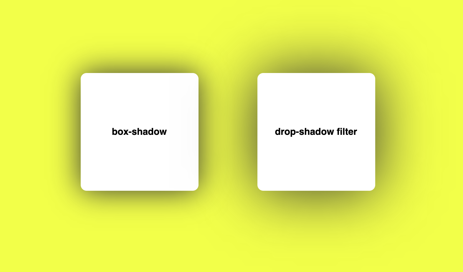
Historically, the way we specified a drop shadow was by using the box-shadow property:
box-shadow: 0px 0px 50px #333;These four values correspond to the shadow's:
The box-shadow property supports a few more values, and the MDN documentation goes into more detail if you want to dive into that.
A more modern way to define a drop shadow is by using the drop-shadow filter:
filter: drop-shadow(0px 0px 50px #333);The drop-shadow filter takes four values, and they correspond to the same four values our older box-shadow takes as well:
Unlike box-shadow, the drop-shadow filter doesn't accept additional values for inset-ness or shadow spread size. These four values are it.
We took a lightning fast look at the two types of drop shadows we can create using the box-shadow property and the drop-shadow filter. The end result of a shadow defined using either of these approaches is nearly identical:
Unless you happen to be adding a drop shadow to an SVG element, it is hard to pick one approach over the other when all we want to do is just apply a drop shadow to an element.
The situation changes when it comes to animations, though. Unlike box-shadow, almost all modern browsers hardware accelerate the drop-shadow filter. This means you get faster screen updates as the drop shadow is doing its thing when animating from one state to another. This reason alone is huge, and this makes the drop-shadow filter the perfect (and only!) choice when using drop shadows that we also want to animate.
To animate our drop shadow, we have a great deal of flexibility. We can use CSS Animations, CSS Transitions, JS-based requestAnimationFrame Animations, or the Animate method. Because the drop-shadow filter is hardware accelerated by default, there isn't a lot of extra performance-related hoops we need to jump through. The only step we should follow as a good practice is to give our browser a heads-up that we will be animating the filter property. That we can do by using will-changewith a value of filter:
.thingToAnimate {
  will-change: filter;
}
To put all of this together, below is an example where we have a drop shadow animate in (via a transition) on hover:
.box {
  width: 200px;
  height: 200px;
  border-radius: 10px;
  background-color: #f75590;

  will-change: filter;

  transition: filter .2s ease-out;
}

.box:hover {
  filter: drop-shadow(0px 0px 50px #333);
}
To see this example live, click here for the CodePen version.
Creating nice drop shadow animations was historically a challenge due to performance issues. The internet is filled with tricks to work around those, such as the really awesome pseudoelement opacity trick by Tobias Ahlin. Luckily, with hardware acceleration now available by default via the filter property, we can all spend more time creating really nice user experiences and less time fiddling with the technical fallout from poorly performing properties.
Just a final word before we wrap up. If you have a question and/or want to be part of a friendly, collaborative community of over 220k other developers like yourself, post on the forums for a quick response!
