Table of Contents

Today, you have three very distinct approaches for animating things on the web: CSS animations, CSS transitions, and requestAnimationFrame. This distinction is necessary given what each approach does:
In isolation, each of these approaches are great. When you mix and match them together - like you would in many realistic scenarios, you get trouble. One area you see a lot of trouble is when you mix JavaScript and the CSS animations together. Just like werewolves and vampires, CSS animations and JavaScript have never gotten along. If you wanted to modify a CSS animation using JavaScript, you really can't do much without passing around raw CSS tags (which is wholly disgusting). If you wanted to inspect the state of a running CSS animation or transition, the limited ways you have using getComputedStyle are...well, limiting. Lastly, you also have performance problems to deal with. Despite the awesomeness that is requestAnimationFrame, it suffers when pitted against an animation created in CSS. I elaborate a bit more on that later, but enough about the troubles.
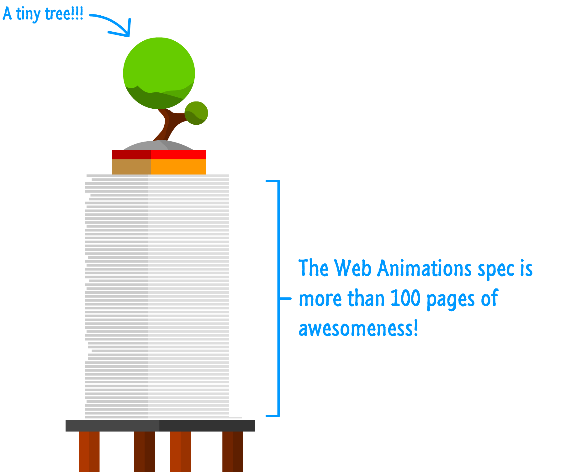
Things are slowly changing. For the past few years, the W3C has been working on something known as Web Animations:
Instead of making small band-aid fixes, the proposals laid out in the Web Animations spec take a hammer to the old animation implementations that lie deep in the fiery depths of your browser. What you get is a brand new animation engine that unifies all of the animation approaches across CSS and JavaScript into something that works really well both in isolation as well as together.
Because of how new Web Animations is, it is only supported in a handful of browsers. To use this API today while ensuring almost all of your visitors can use it, be sure to use this handy polyfill!
Before you start panicking and sounding the alarms, everything you knew about how to work with animations stays. That means all the techniques and tricks (and syntax!) you've learned the hard way for both CSS and JavaScript will still apply in this new world. If you happened to buy my awesome animation book, it is still relevant. Now, that doesn't mean there isn't anything new, though. There is a bunch of new stuff, and this article will start taking you down the path of exploring them all...starting with the animate method.
Let's get started!
The animate method allows you to easily create animations that are as performant and expressive as their CSS counterparts. I can't emphasize the "easily" part enough. In case your eyebrows are raised in suspicion that something so magical can exist, take a look at the following example:
This is a very simple animation where a blue circle slides from top-to-bottom. As it slides, it shrinks ever so slightly with a subtle fade-in. All of this was done using nothing more than the animate method and just a few lines of easy-to-follow code. Speaking of which, let's start looking at how to use the animate method beyond vague generalities.
At its most basic level, the animate method allows you to specify the following things in order to create a sweet animation:
If all of this sounds very similar to what you would specify as part of defining a CSS animation, that makes two of us! The animate method in many ways is the JavaScript equivalent of the CSS animation you would define in markup. As you can see in the code for our sliding animation from earlier, that should be quite apparent:
animElement.animate([{
  opacity: ".5",
  transform: "translate3d(100px, -800px, 0) scale(3, 3)"
}, {
  opacity: "1.0",
  transform: "translate3d(100px, 600px, 0) scale(.5, .5)"
}], {
  direction: "normal",
  duration: 1000,
  iterations: Infinity
});
Take a few moments to read through this code and see how it maps to to the things we listed earlier. Once you've done that, read on - we'll walk through the code together and call out important details.
The first thing to note is that the animate method is called on the element you wish to apply the animation on:
animElement.animate([{
  opacity: ".5",
  transform: "translate3d(100px, -800px, 0) scale(3, 3)"
}, {
  opacity: "1.0",
  transform: "translate3d(100px, 600px, 0) scale(.5, .5)"
}], {
  direction: "normal",
  duration: 1000,
  iterations: Infinity
});
You can specify almost any DOM element as the target of an animation. The animate method isn't general purpose enough to work on JavaScript objects and other non-DOM things. It is just as picky as CSS.
What you animate with the animate method are CSS properties, and that is the first piece of information you pass in:
animElement.animate([{
  opacity: ".5",
  transform: "translate3d(100px, -800px, 0) scale(3, 3)"
}, {
  opacity: "1.0",
  transform: "translate3d(100px, 600px, 0) scale(.5, .5)"
}], {
  direction: "normal",
  duration: 1000,
  iterations: Infinity
});
You can specify anything from a single keyframe for a single state change to multiple keyframes like you can see in this example. In the Web Animations world, these separate collections of CSS properties are not known as keyframes, but for the sake of simplicity, let's just refer to them as such. We'll get more formal and more detailed later.
These keyframes specify the exact details of what your animation will do. In our case, you can see that the opacity goes from .5 to 1.0, the vertical position changes from -800px to 600px, and the size of the circle shrinks from being 3X the normal size to just half the normal size.
The last thing to do once you've defined what exactly you will be animating is to specify the properties that characterize the overall animation itself:
animElement.animate([{
  opacity: ".5",
  transform: "translate3d(100px, -800px, 0) scale(3, 3)"
}, {
  opacity: "1.0",
  transform: "translate3d(100px, 600px, 0) scale(.5, .5)"
}], {
  direction: "normal",
  duration: 1000,
  iterations: Infinity
});
You have a bunch of properties that you can set here:
Of all these properties, the only one you absolutely should specify to see an animation is the duration property. Otherwise, you just have a sudden jump from one state to another...and that isn't very nice at all. And with that final transfer of wisdom, we have completed our introductory look at the animate method. In future articles, we will go deeper and broader as we cover more of the new Web Animations functionality.
Historically, requestAnimationframe is what all the cool kids have used to create smooth animations that mixed CSS and JavaScript. This is because requestAnimationFrame tries to ensure a smooth frame rate by timing its looping with the appropriate paint events the browser fires. To state differently, this meant that if your browser was busy, if your page was hidden by other tabs, or if something else was pegging the browser's resources, your animation loop would dynamically adapt.
There is one major downside with this approach. While your animation loop does gets called at the appropriate time, your code runs on the main thread where the bulk of your other app code is also running. To put this differently, it doesn't matter how nice of an engine you have in your car if you are going to be going through a traffic-infested part of town. In the ideal case, animations created with requestAnimationFrame are on par with animations created in CSS in terms of how well they run. On average, requestAnimationFrame will always a bit sluggish when paired against CSS. Web Animations address this performance discrepancy.
With that said, there is one important detail that I omitted and only casually hinted at throughout the article. The animate method only allows you to animate CSS properties on DOM elements. The requestAnimationFrame method isn't very strict like that. Because requestAnimationFrame simply allows you to run any JavaScript code, you can animate whatever you want. You can even choose to not animate anything at all and use requestAnimationFrame to just increment some values or do other boring things.
The Web Animations APIs shouldn't be seen as a replacement for the CSS and requestAnimationFrame-based animation approaches we have been using. It is simply one more tool that you can rely on. In the following articles, we'll dive deeper into what the animate method brings to the table so you know exactly when to use it and, more importantly, when not to use it.
Just a final word before we wrap up. If you have a question and/or want to be part of a friendly, collaborative community of over 220k other developers like yourself, post on the forums for a quick response!
