Table of Contents

In our Introduction to Animation in HTML tutorial, we mentioned that there are three ways to create an animation. One way is by using the appropriately named CSS animations. Another way is by using CSS transitions. The third and final way is by writing code in JavaScript. If you are a huge JavaScript fan, you'll feel right at home here. If you are not a huge JavaScript fan...well, hopefully you will change your mind once you see all the types of cool animations you can create in code that you simply cannot do using just CSS.
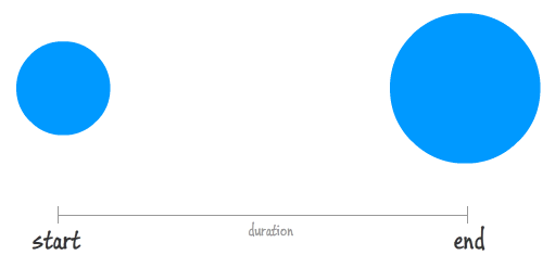
When you are animating something in CSS using transitions or animations, your browser does a lot of the actual animating for you. For both transitions and animations, all you really do is just define the starting state and the ending state:
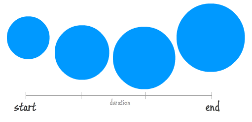
If your animation has keyframes, you define a few intermediate states as well, but that's basically it:
What you have right now is not an animation. You just have arbitrary property values defined at certain points in the animation's life. It is the interpolation of the values between these points that are very important to making the animation work:
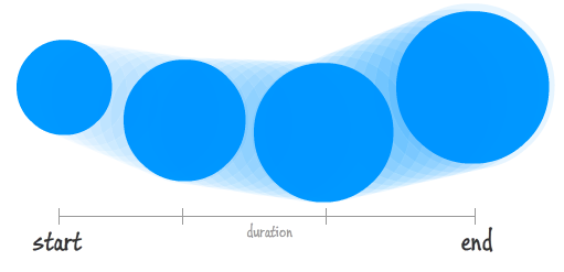
It is exactly this interpolation that your browser does for you. While life is pretty good when your browser helps you out so much, this help does come at a cost. You need to be pretty precise about your keyframes the various points in time you want your properties to have a certain value. This precision makes animating many realistic scenarios very difficult. Some scenarios include moving an element around on a curve, simulating an object free-falling under the influence of gravity, adjusting properties by a random value, dynamically changing the interpolation, using custom timing functions, oscillating a value in random amounts each cycle, and many MANY more.
With JavaScript, because you have greater control over all aspects of how your animation will behave, the door is wide open for you to create any type of animation you want without worrying about technical feasibility. For example, creating something like the falling snow effect without using JavaScript would be very difficult:
Starting with this tutorial and continuing on for a bunch more, we'll take a look at what animating using JavaScript entails and how to become a rockstar at it!
Onwards!
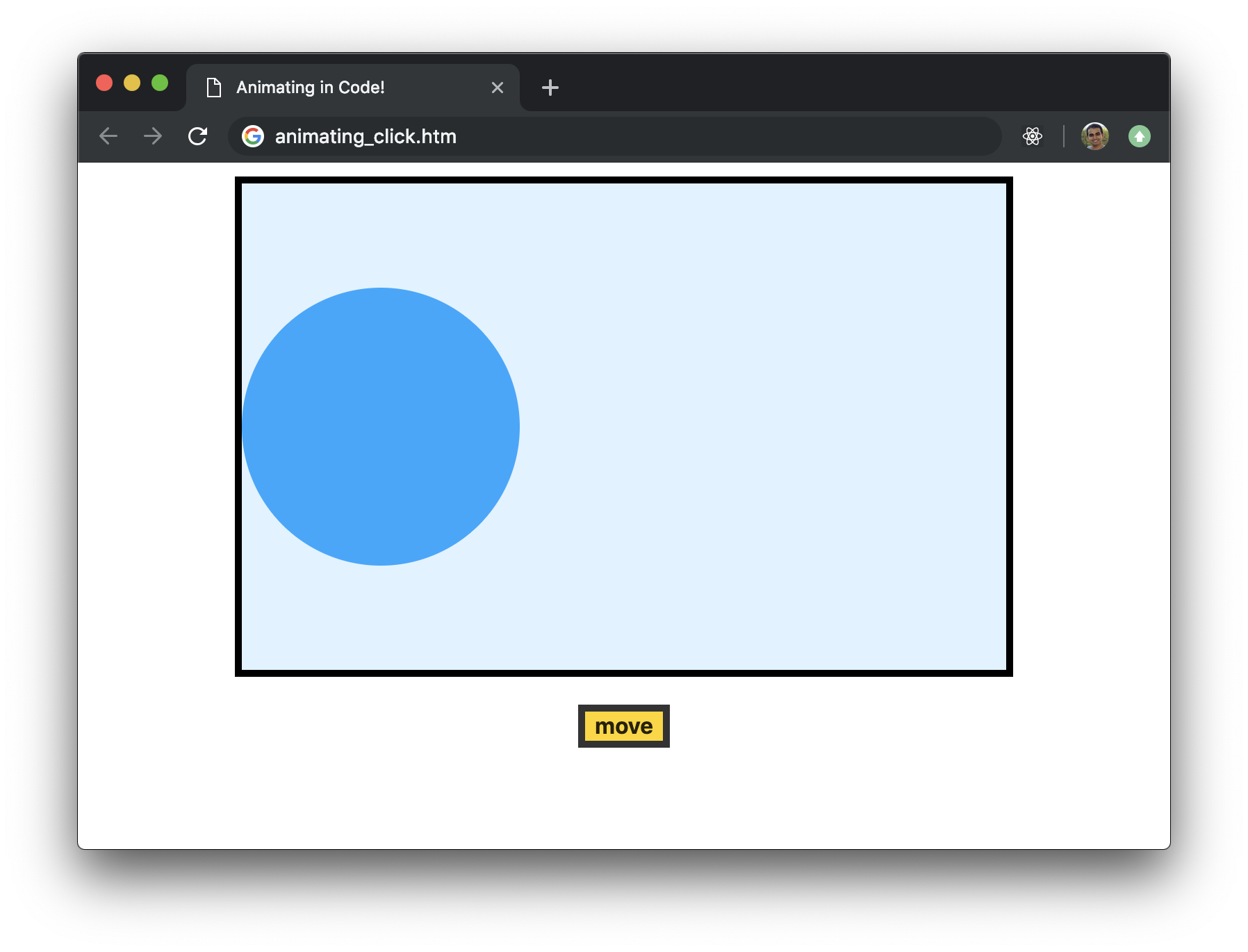
Let's start this party swinging. The biggest technical difference that separates animations we create in CSS from animations we create in JavaScript is this thing known as the animation loop. The animation loop is a function that gets called at repeated intervals (typically at 60 frames per second), and it contains all the code responsible for setting and changing the property values that make up our animation. To help this actually make sense, take a look at the following example (launch in separate window):
What you will see is a blue circle sitting very still. Click or tap on the move button and notice what happens. The blue circle slides a little bit to the right. Keep pressing the move button to continue sliding the circle right. The faster you press the move button, the faster the circle will move. After a bunch of presses, the circle will eventually disappear on the right, but don't worry. If you keep pressing the move button, the circle will reappear on the left hand side and continue its journey rightward.
The markup and code for making our circle move each time we click on the move button looks as follows:
<!DOCTYPE html>
<html>

<head>
  <meta charset="utf-8">
  <title>Animating in Code!</title>
  <style>
    body {
      background-color: #FFF;
      margin: 30px;
      margin-top: 10px;
      display: flex;
      align-items: center;
      justify-content: center;
      flex-direction: column;
    }

    #contentContainer {
      width: 550px;
      height: 350px;
      border: 5px black solid;
      overflow: hidden;
      background-color: #DFF2FF;
      display: flex;
      align-items: center;
    }

    #circle {
      width: 200px;
      height: 200px;
      background-color: #20A6FF;
      border-radius: 50%;
    }

    #move {
      background-color: gold;
      margin-top: 20px;
      font-size: 16px;
      font-weight: bold;
      border: 5px solid #333;
      outline: none;
    }
    #move:hover {
      background-color: coral;
    }
    #move:active {
      background-color: yellowgreen;
    }
  </style>
</head>

<body>
  <div id="contentContainer">
    <div id="circle"></div>
  </div>

  <input id="move" type="button" value="move"></input>

  <script>
    var circle = document.querySelector("#circle");

    var button = document.querySelector("#move");
    button.addEventListener("click", animate, false);

    var xPos = 0;

    function animate() {
      xPos += 10;

      circle.style.transform = `translate3d(${xPos}px, 0, 0)`;

      if (Math.abs(xPos) >= 900) {
        xPos = -500;
      }
    }
  </script>
</body>

</html>
If you want to follow along and play with the code on your own machine, create a new HTML document and copy/paste everything you see above into it. Save the file as something interesting like animating_click.htm and open it in your browser. You should see the same example you saw earlier now running locally on your own computer:
Now, take a moment to walk through all the details that make up this example. Besides tiring out your fingers from clicking the move button repeatedly, this example is a good test of your familiarity with some of the basic HTML, CSS, and JS concepts you need to know to make the rest of what you'll see around animating in JavaScript less confusing. If any part of this example's implementation doesn't make sense, take a step back and quickly brush up on the confusing parts. If you don't know where to begin, I suggest starting with the tutorials under The DOM in Learning JavaScript.
Anyway, getting back to our example, the way our circle moves is by having our animate function get called each time our move button overhears a click event:
var button = document.querySelector("#move");
button.addEventListener("click", animate, false);
The code surrounding our animate function looks as follows:
var xPos = 0;

function animate() {
  xPos += 10;

  circle.style.transform = `translate3d(${xPos}px, 0, 0)`;

  if (Math.abs(xPos) >= 900) {
    xPos = -500;
  }
}
We start with our xPos variable set to a value of 0. With each time the animate function gets called, we increment the value of xPos by 10. All of this incrementing results in our circle moving to the right thanks to this line of code:
circle.style.transform = `translate3d(${xPos}px, 0, 0)`;We are setting a translate3d transform and setting the horizontal position to the value stored by the xPos variable. When the value of xPos gets large and our circle disappears beyond what we can see on the right, we reset the value of xPos to -500:
if (Math.abs(xPos) >= 900) {
  xPos = -500;
}
This leads to the circle's position jumping to the left and appearing from the left side as we keep clicking the move button. Pretty straightforward, right?
Now, what we have currently is not an animation. We keep clicking on the move button, and each click causes our animate function to move our circle a a few pixels to the right. What we want is for our circle to move automatically, and that can be done by calling our animate function repeatedly in a regular interval. This is where the animation loop will help. Here is the deal. The animation loop is nothing more than a function that gets called repeatedly thanks to a boring old timer function. The boring timer function we are going to use for performing this important task is requestAnimationFrame. Let's modify our example to use it!
Inside our script tag, take a look (or make, if you are playing along!) at the following highlighted modifications:
var circle = document.querySelector("#circle");

var xPos = 0;

function animate() {
  xPos += 10;

  circle.style.transform = `translate3d(${xPos}px, 0, 0)`;

  if (Math.abs(xPos) >= 900) {
    xPos = -500;
  }

  requestAnimationFrame(animate);
}
animate();
All we've done is two things:
We also removed any code related to making the move button work, for we no longer need it, but that is just an optional cleanup. If we were to preview the animation in its current state, it would look as follows:
Notice that we really didn't change a whole lot, but by adding the requestAnimationFrame call we turned our boringanimate function into an exciting animation loop that is now responsible for moving our circle to the right by 10 pixels at every frame update.
We are in a good spot right now. So far, you learned about the animation loop, and (in the previous section) even caught a live JavaScript animation and saw how it worked. There is one problem with the previous example. That sliding circle could easily be done using a CSS animation involving just two keyframes. You don't need to write any code whatsoever for it. In this section, let's make some alterations to our previous example so that it truly shows off the capabilities of an animation created entirely in code. To make this happen, we'll continue modifying the previous example's code.
Take a look at the following highlighted lines and add/modify your code with the changes:
var circle = document.querySelector("#circle");

var xPos = 0;
var yPos = 0;
var angle = 0;

function animate() {
  xPos += 5;
  angle += .1;

  yPos = Math.round(50 * Math.sin(angle));

  circle.style.transform = `translate3d(${xPos}px, ${yPos}px, 0)`;

  if (Math.abs(xPos) >= 900) {
    xPos = -500;
  }

  if (angle > 2 * Math.PI) {
    angle = 0;
  }

  requestAnimationFrame(animate);
}
animate();
What these changes do is add an extra bounce to the circle as it is moving across the screen. Our animation will now look as follows (launch in separate window):
Take a look at the code, but don't worry if it all doesn't fully make sense. This bounce is made possible due to the magic of the Math.sin() function, and we'll take a deeper look at it and its ilk when looking at trigonometric functions later on. The goal of this example was purely to show off some animation-ness that you can do in JavaScript that you can't easily do using CSS. Are you sorta kinda impressed...in a small way at least?
What we've seen here barely scratches the surface of the types of animations we can create in JavaScript. All great journeys have to start somewhere, and we are starting ours here. In future tutorials, we'll go deeper into understanding all the various ins and outs that go into create cool, performant, and accessible animations with very little CSS dowsing up our style!
Just a final word before we wrap up. If you have a question and/or want to be part of a friendly, collaborative community of over 220k other developers like yourself, post on the forums for a quick response!
