
From the very beginning, the web was two dimensional. Nobody thoughtfully decided that it would be so. It just was. After all, the primary purpose of the web was to deal with displaying boring documents:
For displaying mountains of text separated by the occasional image, two dimensions were plenty. If you wanted to do something more, you had to look outside the two dimensional cage that HTML, CSS, and JavaScript saw the world in. You looked towards awesome plug-in based technologies like Java, Shockwave, and Flash that provided great support for displaying 3D content. If you really hated yourself, you may have also dabbled with WebGL.
Now, as web content shifted away from documents and towards apps with richer UIs, what we needed wasn't a special, plug-in enhanced rectangular region on your page where your 3D content would live. Nope! We needed something more natural - something that played well with the rest of the content in our page and didn't need special tools (or programming languages) to do its thing. Most importantly, we needed something that actually worked on mobile devices like the iPhone that blocked plug-ins.
At this point, what we need sounds almost magical, doesn't it? Where can we go to find something that allows us to define things in 3D, works nicely with the content on our page, and works without relying on something like a plug-in? As it turns out, we didn't have to go very far. Starting in 2009, 3D support was introduced to CSS via the transform property and its friends. This support started with Safari and spread to all the majors browsers over the next few years. Today, almost everybody on the web is on a browser that can deal with any 3D thing you throw at it. In this tutorial, we'll take a look at what those 3D things are and lay the groundwork for creating some totally awesome 3D effects using just CSS.
Onwards!
To kick your animations skills into the stratosphere, everything you see here and more (with all its casual clarity!) is available in both paperback and digital editions.
BUY ON AMAZONBefore we talk about all the cool 3D things you can do using CSS, let's take a few moments and recap some common concepts and terminology we'll be encountering when talking about the...THIRD DIMENSION!
First of all, let's say that your screen looks a bit like this:
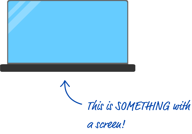
Your screen is a flat surface. When you display something inside it, you typically worry about where it will appear horizontally or vertically. The horizontal position is represented by a value commonly referred to as x. The vertical position is represented by a value commonly referred to as y. The reason these two letters are used goes back to mathematicians (or physicists or wizards) and what they defined as the labels for the horizontal axis (x-axis) and the vertical axis (y-axis) in a two dimensional surface like our screen:
All of this should be very familiar. Now that we've sufficiently covered something that you were probably already really familiar with, it's time to introduce the star of this tutorial: the third dimension.
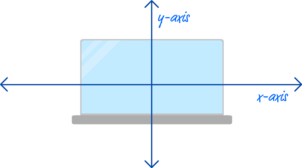
The way to think about the third dimension is as follows: If two dimensions were all about where something would be positioned horizontally and vertically, the third dimension is all about the depth we position something in. I know that sounds really bizarre, but here is a visualization of what depth looks like by slightly rotating our screen example from earlier:
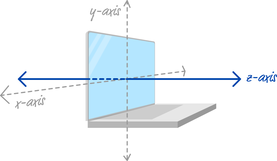
We have our x-axis and y-axis as before for representing the horizontal and vertical positions, but we now have a new z-axis that looks like it is coming straight for us if we were sitting in front of the screen. That is depth, and the way it works is pretty simple. Its value is commonly represented by the letter z, and the higher the z value, the closer something will appear to us:
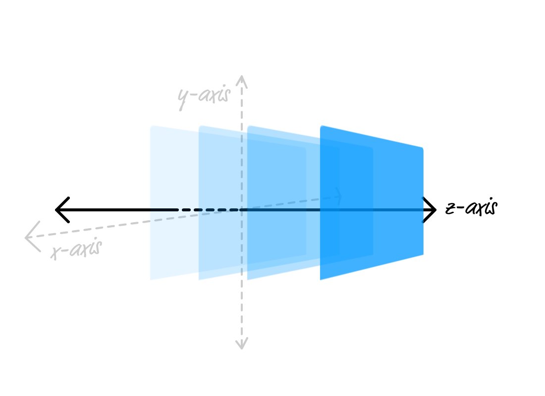
The smaller the z value, the further away something will look like instead:
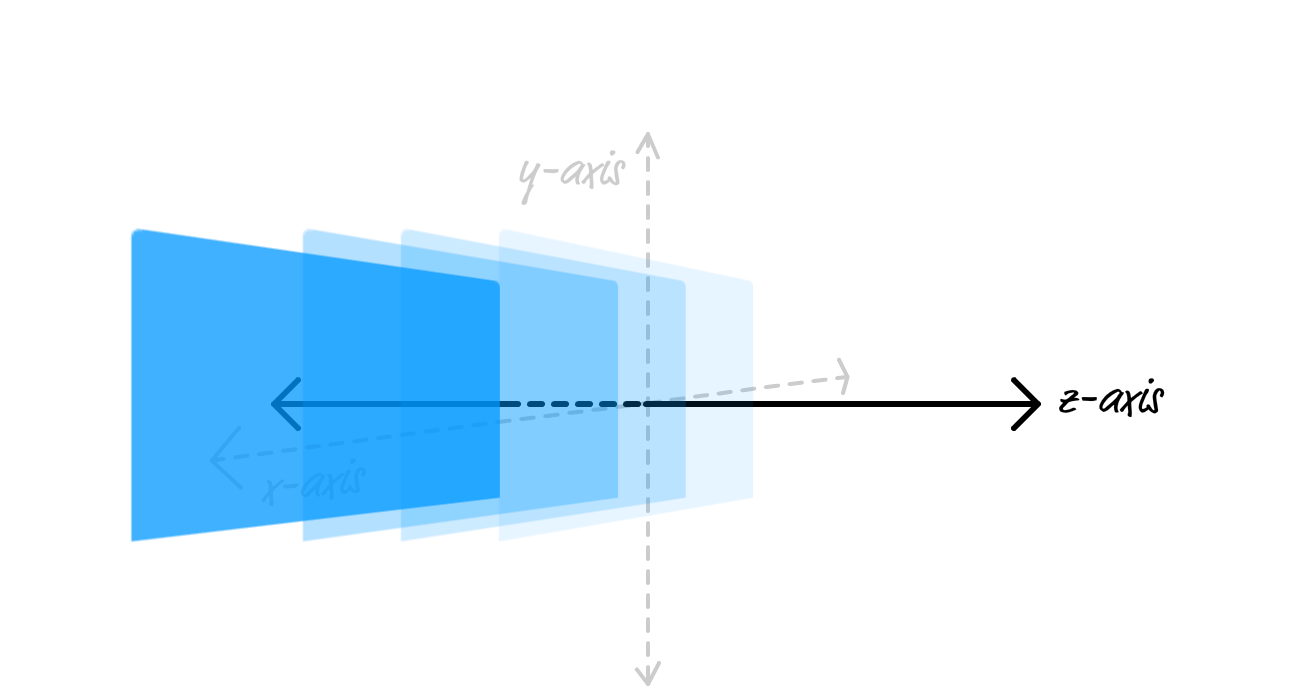
When it comes to making sense of the z-axis, that's really all there is to it. The main thing to keep in mind is that what you ultimately see depends on the angle that you are viewing your content in. When viewing the z-axis from the side like we have been, you'll see your content moving in a more noticeable way back and forth. If you are looking at our content directly from the front, similar to the screen example we started with, adjusting the z values looks more like you are making something bigger or smaller:
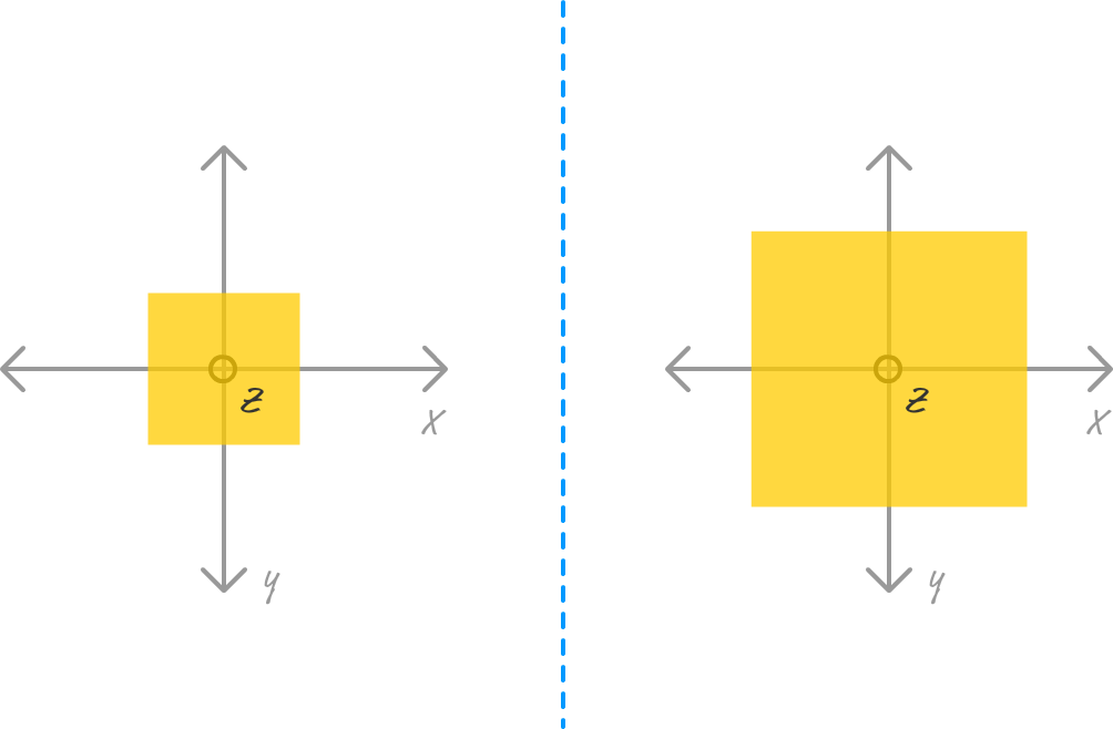
In the left part of the image, our content has a low z value. On the right, our content is being displayed with a large z value. This mimics what you see in the real world. Things further away appear smaller. Things closer look bigger. Now, you combine this with the horizontal and vertical position stuff you've been dealing with for a long time, you have the basic ingredients for doing cool things in 3D.
Finally! We are at the part of this tutorial you've been patiently waiting for. We are going to take all of this theoretical 3D knowledge and turn it into something we can see in our browser using just a few bits and pieces of CSS. To help with all of that, we are going to fiddle with an example.
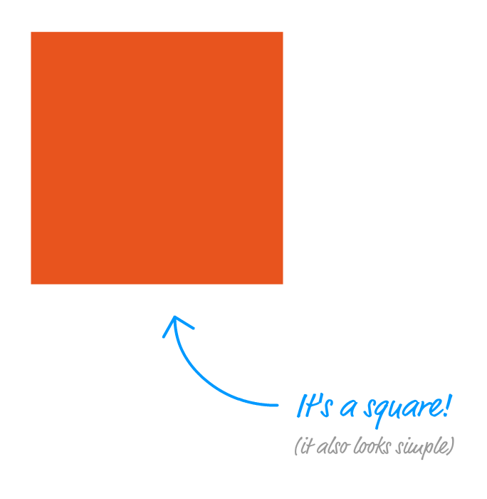
Let's say that we have a div element styled to look like a simple square:
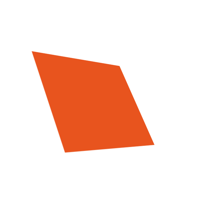
What we want to do is rotate this square in 3D space to look a little like the following:
As part of creating this example, we will look at the CSS properties and values that we need to become familiar with. Along the way, we'll cover other relevant details that you'll run into and need to know how to handle.
To follow along with building our example, create a new HTML document and add the following content into it:
<!DOCTYPE html>
<html>

<head>
	<title>3D in CSS</title>
	<style>
		body {
			padding: 100px;
			display: flex;
			justify-content: center;
		}
		#square {
			width: 175px;
			height: 175px;
			background-color: #E8541E;
		}
	</style>
</head>

<body>
	<div id="container">
		<div id="square"></div>
	</div>
</body>

</html>
Once you've added all this, save your HTML document and preview what you have in your browser. You should see something that looks as follows:
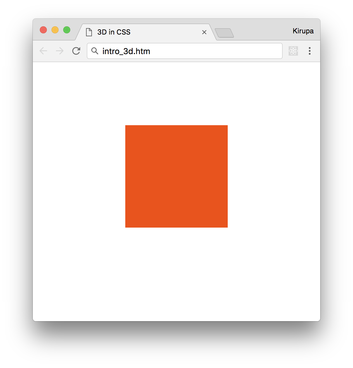
What you will see is a reddish colored square. Based on what we set out to do and what currently lives in our HTML and CSS, that shouldn't really be a surprise. What we have in our markup is a div element with an id value of square and a style rule that targets it:
#square {
	width: 175px;
	height: 175px;
	background-color: #E8541E;
}
That's pretty much it. There is nothing unique or crazy about what we've just done. Our content still lives in the boring two dimensional world, but we're going to fix that up next.
To move our content into 3D space, we need to do just one thing. We need to specify what is known as the perspective. What perspective represents is the distance from the viewer (aka you) and the point where our z position is 0:
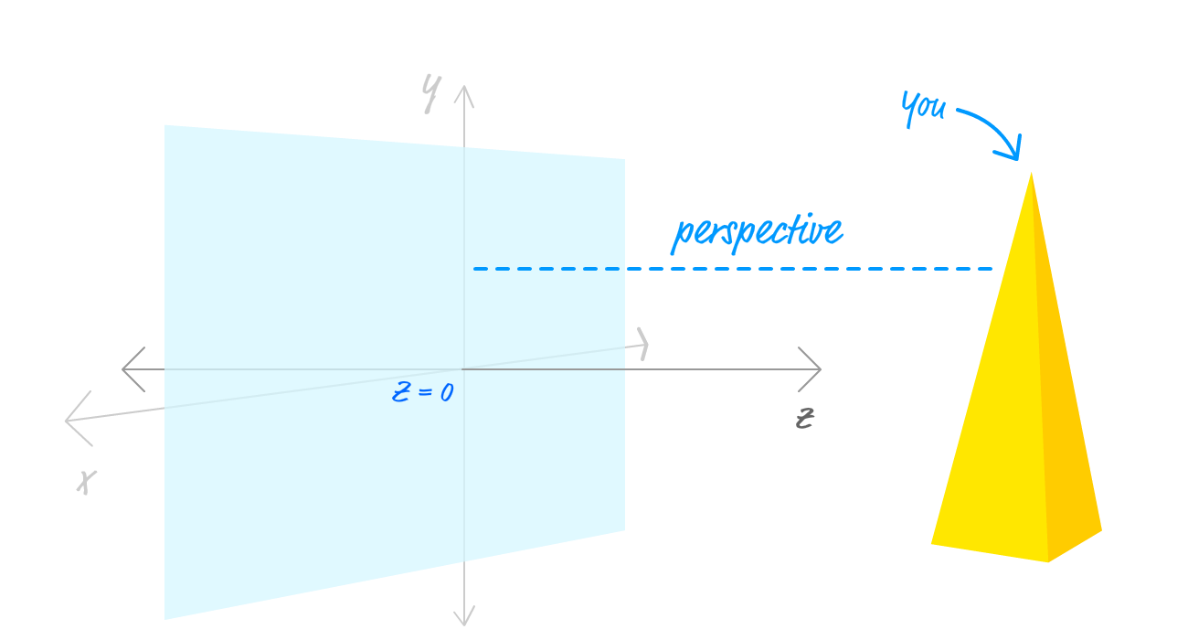
What we specify as our perspective determines how noticeable our 3d manipulations will be. A small perspective value means that you are very close to the element you are affecting, and our 3d manipulations will be very noticeable. A large perspective value means that we are far away from the element we are affecting and any 3d manipulations will be more subtle. We will cover all of this in greater detail later, but this basic understanding of perspective is good enough for now.
To specify the perspective in CSS, we have several ways of being able to do that. One way is via the perspective CSS property, and we are going to use that on our container element that houses our square. Inside your style region, add the following style rule:
#container {
	perspective: 450px;
}
All we have done is target our container element and set the perspective property to a value of 450px. Once you've made this change, take a look at what our square looks like right now. It should look identical to what it did before you set the perspective property. The reason is that going from 2D space to 3D space doesn't visually affect your content. It merely opens the door for your content to be manipulated across all three dimensions when you decide to do so.
Now that our square element is primed and ready to be manipulated in 3D space, the way we actually manipulate them is by using the transform property. You aren't reading that incorrectly! The same property we've used all this time for moving, rotating, and scaling things in the 2D world is the same one we are going to use in the 3D one as well. We just have to become familiar with the handful of additional functions that are specific to manipulating content in a 3D space.
These additional functions are:
We will dive into all of these functions in much greater detail in the future, but for creating our example, the only ones we are going to use are the rotate ones. The way they work is pretty simple once you visualize how the x, y, and z-axis arrange their content.
The rotateX function rotates an element around the x-axis:
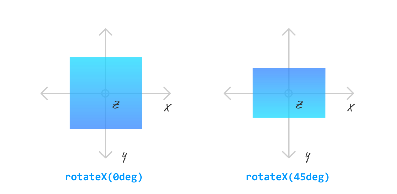
You may think this would involve rotating our element left and right. That isn't the case. Think of using the rotateX function being similar to holding a skewer of food horizontally and spinning it using your fingers:
The items on the skewer will seem to rotate towards you while the skewer still remains horizontally aligned. If you turn your skewer vertically and spin, you get the rotateY behavior. With this function, you rotate your content around the y-axis:
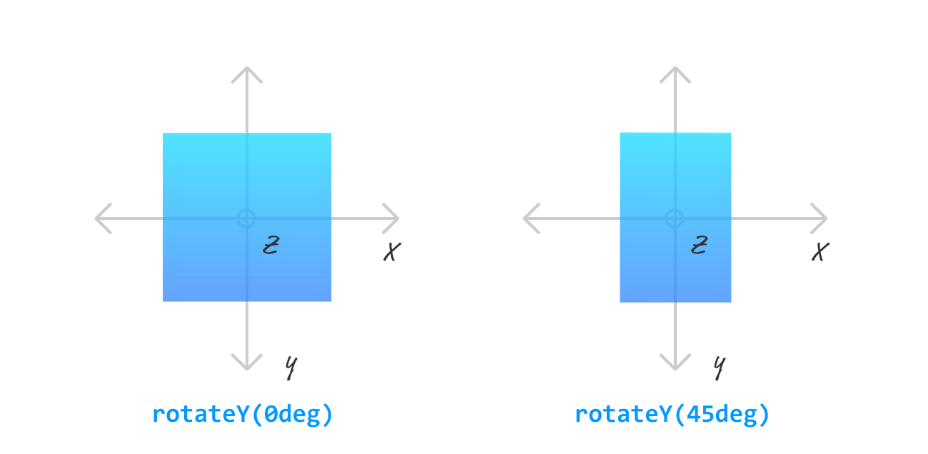
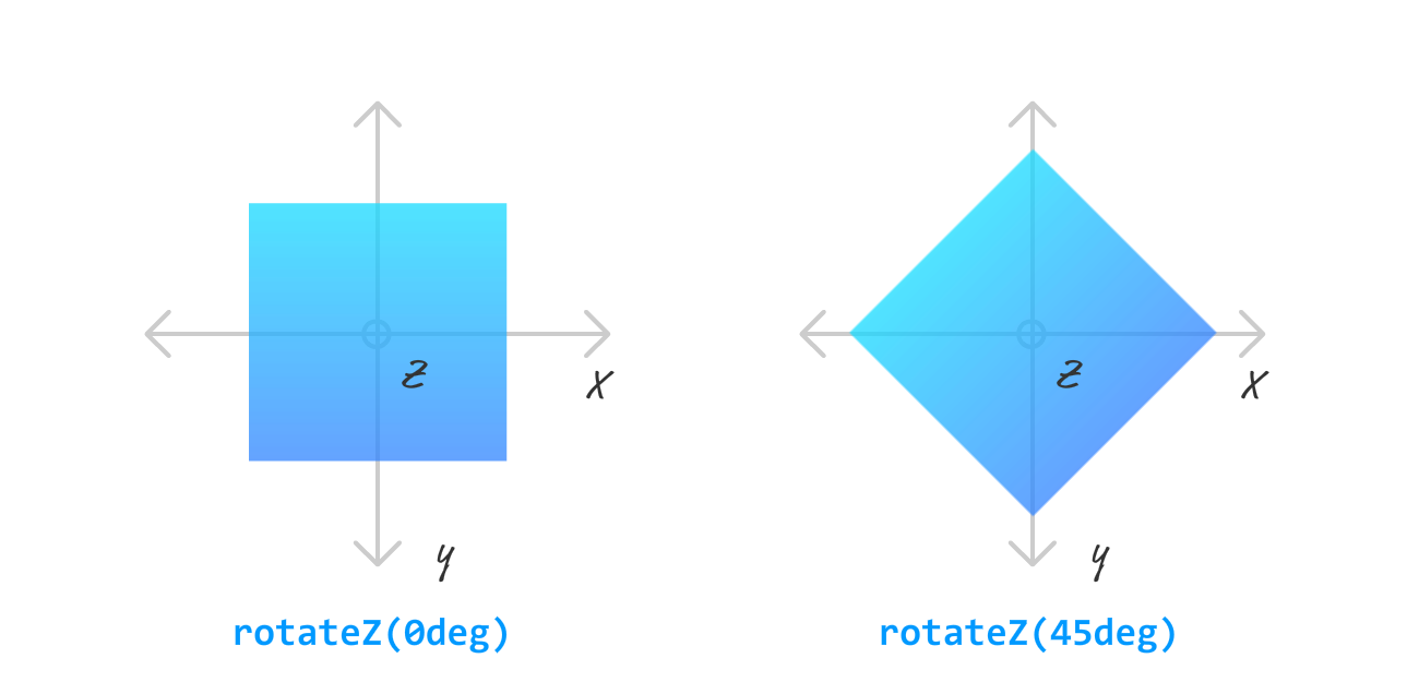
As you can see, rotating an element around an axis means that we rotate along side it as opposed to being perpendicular to it. This means that the rotateZ function rotates the content as follows:
A combination of these three transforms along with adjusting our perspective value will give you a wide range of 3D effects you can implement. Closer to home, it is also all we need to re-create the example that we are going for. I wish it were more complicated, but it really isn't.
To use these transforms, simply add the following line into your style region:
#square {
	width: 175px;
	height: 175px;
	background-color: #E8541E;
	transform: rotateY(20deg) rotateX(20deg) rotateZ(-5deg);
}
What we are doing is rotating our element by -5 degrees on the z-axis, 20 degrees on the x-axis, and 20 degrees on the y-axis. Once you've done this, this is what our square will look like:
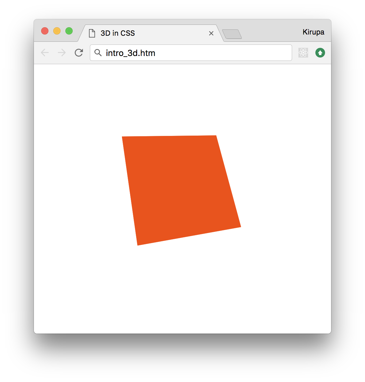
Notice that this looks pretty close to what we set out to do. You can totally call it a day and be happy about the progress we've made so far. If you think it still doesn't look exactly the same as what we tried to create, read the following Note.
If you happen to be curious to know what you can do to make our square look even more like the example we set out to create, there is just one more adjustment that needs to be made. Add the following highlighted line to our #container style rule:
#container {
	perspective: 400px;
	perspective-origin: 0px 200px;
}
The perspective-origin property allows you to specify the vanishing point. By playing with its horizontal and vertical positions, you can drastically affect how your element looks. We'll cover this property in much greater detail when we exclusively talk just about perspective.
Who knew that adding just two lines of CSS for the perspective and transform properties would require so much background and explanation? The thing is, we didn't fully explain everything yet either. There is more to both these properties and how 3D in CSS works, so this introduction is really just a teaser for greater things that we'll learn. Fasten your seat belts, put on your helmets, and sit comfortably in your computer chair. This is going to be one long and crazy awesome ride! :P
Just a final word before we wrap up. If you have a question and/or want to be part of a friendly, collaborative community of over 220k other developers like yourself, post on the forums for a quick response!
