Logo
Replication
Logo
Replication
by Ben Taylor
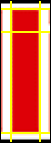
Have you ever wanted to use a
band or company's logo in a flash animation? The problem
with that is, you'd have to import an image of the logo,
which wouldn't move smoothly and would lose quality. This
tutorial will show you how to replicate the logo of your
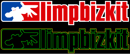
choice. We're going to be using Limp Bizkit's logo, here's
how it will look when finished:
-
Open a new file in flash, the window size
doesn't matter.
-
Download
this file and
import it into the movie.
-
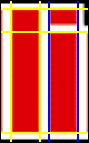
Lock the layer and create a new layer
above it.
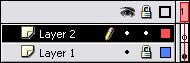
[ lock the layer ]
-
Now choose the
 Line
Tool. Line
Tool.
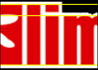
You'll notice that the top of the left box of the logo
and all the letter heights match. So first thing's first,
draw three lines, one at the top of the logo, one at the
bottom and one at the top of the smaller letters (All lines
should go on Layer 2).
Now, I'm going to take a wild guess and bet that you
don't have the font that Limp Bizkit is written in. Ah, well
in that case you can't continue with this...Just kidding,
shall we continue?
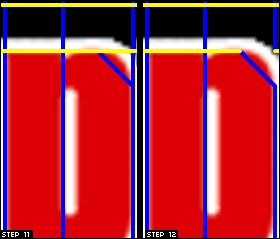
- Draw a vertical line and move it
into position to the left of the "L", then another and
move that into the position to the right of the "L".
Congratulations! You now have your very first letter! I
know you're thinking I'm not congratulating much, but by
doing the "L" first, it means you can get the other
letter's sizes correct.
- Left click once on the left line of
the "L", then hold down the shift key and left click once
on the right line of the "L".
- Press Ctrl-D and the lines will duplicate.
Now hold down the shift key and press the up arrow once.
Now shimmy the two selected lines right a bit until they
line up with the "i".
[ I made the
lines blue just to show you where to put them. ]
- Add the rest of the lines to finish off the
"i".
- If you left click once on a small section of
line that is no longer needed, you can select it and press
delete. Be careful though, because if you double click,
it'll select all the lines touching it and you will delete
them all.
So now you pretty much know how to complete the rest of
the letters, you duplicate the lines and put them wherever
you see similar looking sizes. But I hear you asking "How
do I do the curves?!", this is the fun bit!
- We'll use the letter "p" as our example. As
we said in Step 7, duplicate the two lines and
bring them over. Now duplicate just one of them and move
it to the right of "p".

[ Again, I made the
lines blue just to show you where to put them. ]
- Now make a line from the start of the "p"
curve to the bottom of it (as shown).
- As said in Step IX, you can
now delete some lines. Look at the right of the screenshot
to see which lines I deleted.
- Now if you move your cursor to the middle of
that new diagonal line and just above you will see a
little curve simple appear under it. Click and hold, then
move your mouse up a bit and you'll see the line start to
curve (Note: Don't click the line).

Congratulations! You now know how to curve! Curving can
be a little tricky at first, but that's what the Undo option
is there for. If it isn't perfect, just undo it and try
again.
Going through the whole logo would mean a lot of writing
for me and a lot of reading for you. If you've read through
this tutorial, you now have the skills to complete the rest
of the logo. After you've finished the lines, you can then
fill the logo and it'll look great.
Thanks for reading and good luck!
 Ben
Taylor Ben
Taylor
|