|
by
kirupa | 22 January 2008
In the
previous page, we finally got rid of the second
image and got a brief glimpse at how you can use
XPath to more precisely select the data that you
want. In this page, we'll do something much easier
by rearranging and formatting how our data is
currently displayed.
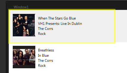
For the past six pages, we've focused on getting the
right data displayed into your listbox. Now, it's
time to put our designer hats on and rearrange our
existing data more nicely. Currently, you should
still be editing your ItemTemplate, and you probably
still have your ItemsControl selected.
[ you should still be editing your listbox's
ItemTemplate ]
First, let's simply reposition the controls so
that everything isn't vertically stacked. In order
to do that, let's flatten our hierarchy of controls
by placing them all under one parent. You can do
that by dragging each nested element (contained in
its own stack panel) and dropping it
onto our root StackPanel layout control.
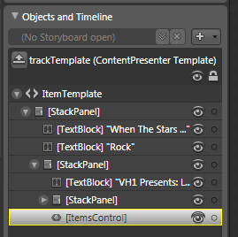
Your Objects and Timeline panel should look like
the following:
[ what your Objects and Timeline panel looks like ]
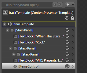
Notice that all of our elements are now rooted by
a single stack panel. You will now also have the two
empty stack panels, so select them both and delete
them. Be careful to expand the stack panels to make
sure they don't contain any children. The goal is to
get rid of the extraneous Stack Panels only. We want
to preserve any controls they host.
You will now see just one Stack Panel and all
of your child controls displayed below it:
[ flatten your tree by moving all nested children to
the parent ]
Our next order of business is to replace our
stack panel with something more customizable...such as
a Grid. To do that easily, right click on the [StackPanel],
and from the menu that appears, go to Change Layout
Type and select Grid:
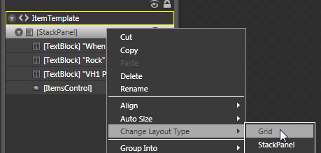
[ change the Layout Type from StackPanel to Grid ]
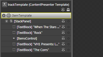
Once you have done that, you now have full
freedom to resize and reposition your individual
elements as you want. For example, the following is
how I arranged the controls inside the grid:
[ making simple layout changes is now easier now
that your parent control is a Grid ]
As you are resizing your Grid, you may find that
your ItemsControl (which hosts the Image control
used for displaying the image) simply takes up more
and more space. To avoid that, select your
ItemsControl and simply use the adorners to resize it. Because its size was
originally set to Auto, resizing it will give it a
fixed width and height so that you have space to
work with without your ItemsControl taking all of it
up!
Also, the buffer between your current entry and
the next entry in the listbox is determined by the
size of your parent Grid element. As you see above,
the wide yellow outline surrounding my shape
corresponds to the size of my Grid in the listbox.
Because each item in our listbox is identical with
the exception of the data it is displaying, all of
your listbox items will contain the same width and
height as the Grid you are currently working in.
Finally, feel free to go creative on what you see
now and modify the type of font, coloring, etc. as
you want. For example, I changed the font size,
added a Drop Shadow bitmap effect to my
ItemsControl, and I deleted the text field
corresponding to genre:
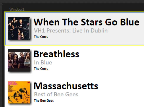
[ this looks a lot better than what you saw a few
pages ago - progress is being made! ]
Phew! We are almost done with this tutorial. In
this page we wrapped up all that we set out to do.
In the
next page, let's take a review of what we did
and tie up any loose ends.
Onwards to the
next page.
|
 Data Binding to XML Data - Page 7

